
Foundation & Product Design Lesson Topics
Our Curriculum
Our lessons bring you the most current, valuable product design information in the following areas:


Learn the Flexbox based powerhouse XY Grid
Lesson #176Foundation
This is part four of our series on Flexbox. By now you should have a good understanding of how Flexbox’s behavior, syntax, and positioning properties. This lesson is all about the new Flexbox based XY Grid. The Foundation XY Grid is huge advancement in Grids. It’s inspired by CSS Grid, but uses Flexbox under the hood which is supported by browsers now. This mean you can take advantage of Flexbox, equal height containers, auto and shrink sizing, vertical and horizontal layouts (hence the XY name) and lots more. You’ll come away knowing the ins-and-outs of the XY Grid to create complex layouts faster and with less code.
Zero to Website Guide<br> Part 6:<br> Deploying Your Site
Lesson #166Foundation
Welcome to the final lesson of our 6-part Zero to Website Series! Now that you have a beautiful portfolio coded up and ready to go, the next step is to get it up on the web and share it with the world! In this lesson, you’ll learn how to use GitHub Pages to upload and deploy a website. Let’s get started!
Zero to Website Guide<br> Part 5:<br>Styling Your Scaffold
Lesson #165Foundation
Welcome to part 5 of our 6 part Zero to Website Series! By the end of this 6 part series, you’ll have learned how to build a responsive website with Foundation. In last week’s lesson, we scaffolded 3 pages of your portfolio site using Foundation’s grid. Today, we’re going to dive into our CSS and start styling our site! In this lesson, you’ll learn how to style Foundation’s components as well as write your own CSS to style your portfolio. Let’s get started!
Zero to Website Guide Part 4: Scaffolding Your Portfolio with Foundation’s Grid
Lesson #164Foundation
Welcome to part 4 of our 6 part Zero to Website Series! For the past 3 weeks, you’ve been learning all about the basics of Foundation and responsive web design. Now that you have an understanding of Foundation’s file structure and grid, you’re ready to start building your own site! In this lesson, you’ll learn all about scaffolding and how to use this know-how to set yourself up for success in building any website. Let’s get started!
Zero to Website Guide<br> Part 2:<br> Digging into the Foundation starter package
Lesson #162Foundation
Welcome to part 2 of our Zero to Website series! Now that you have a basic understanding of HTML, CSS, and the tools you’ll need to create a website, we’ll move into what makes up the Foundation Framework.
Continue Learning with Courses
Learn product design principles from designers who practice them every day.
View CoursesGettin’ Griddy With It! Your First Taste of the CSS Grid.
Lesson #160Foundation
If you’ve been keeping your ear on the the happenings of the web, you may have heard some rumblings of something called a CSS Grid. If not, that’s cool too, because that’s what this lesson is all about!
Advanced Panini Tips and Tricks
Lesson #159Foundation
This is part five of our series on Panini. By now you should have a good understanding of how Panini’s pages, layout, partials, and helpers will save you time reduce mistakes. Ultimately you’ll be able to deliver Cleaner more maintainable, more organized code and really step up your web development game. This week we’re taking all the pieces we’ve learned in the previous four lessons and putting them together for some advanced examples.
Steering You Right with Panini’s Handlebars Helpers and Data
Lesson #158Foundation
There comes a time in your life where you no longer accept wasting time on tedious tasks. Some of us are masters of efficiency, writing scripts to automate tasks. Some of us find tools to do it for us. At ZURB, we use Panini to save time, deliver organized code, and repeat ourselves less. Using Data and Handlebars Helpers in Panini go a long way to setting us up for success and we’ll show you how. Last week we covered using Panini’s front matter and variables. This week we’ll build on that by learning about using Panini’s Handlebars’ helpers and data. Let’s get started!
Front Matter is the Brains of Your Pages
Lesson #157Foundation
What the heck is front matter anyway? If we compare your dev tools to a book, front matter is like the first section of a book that contains the preface or details of the novel. In Panini, front matter is similar to a page’s preface but with a lot more powerful. Coupled with Panini’s variables and partials, front matter changes the content allowing you to be much more efficient and organized. Using front matter and Panini’s variables you can give your pages some brains — allowing you to make your reusable components more usable. In this lesson you’ll learn how to use front matter and Panini’s variables to define content on your pages like a pro.
Continue Learning with Courses
Learn product design principles from designers who practice them every day.
View CoursesThe main Ingredients of Panini: Layouts, Pages, and Partials
Lesson #156Foundation
Having multiple copies of the same navigation or footer strewn about your pages can get cluttered and ungainly very quickly. Plainly put, you're better off not wasting time re-coding repeated elements, copy and pasting here and there, or making a change that has to be changed in many different places. In the web or email world, once you set up your common elements like headers, footer, and ad units etc., you should be able to automatically include these in every page or email. If you need to change a footer link, you should be able to do so once, and have it apply to all. Using Panini in this way will save you time and reduce costly mistakes. In this lesson we’re going to leverage Panini to make you a workflow and efficiency hero.
Panini: A delicious way to optimize your workflow
Lesson #155Foundation
The last thing you want when you’re deep in a coding problem is to get slowed down by your tooling or lack thereof. Build tools like Gulp and package managers like npm give you the tools to automate tasks which saves time and reduces mistakes. When we launched Foundation 6, we open-sourced a set of build tools that we use here at ZURB code client projects called the ZURB Stack. In other words, it’s basically a way for users of Foundation to use the same tools that ZURB uses to deliver front-end code to clients. We accomplish this through the Gulp task runner and also by using a custom templating engine we wrote called, Panini. Panini is a custom built, light-weight static site generator that works as a plugin to Gulp. Together the two form a delicious-build system. This is an introductory lesson in a series on Panini. In this lesson, you’ll learn what Panini is, and how you can get started using it to optimize your workflow.
Get the help you need with Foundation’s Flexbox helpers
Lesson #154Foundation
We’ve been talking about it a lot lately and for good reason. Flexbox rocks and floats and clearfix are hacks that produce unreliable results. The support for Flexbox is great and the learning curve is small. Best of all, Foundation 6.3 came out with a host of great Flexbox helper classes to help you make components or get the layout you want faster with fewer headaches. In this lesson, we’ll show you how to use Foundation Flexbox helper classes to save time and eliminate stress.
Read the Fine Print
Lesson #153Foundation
Sometimes you need to print your web pages on actual paper, and it's a problem that comes up frequently and it's often overlooked. Print styles to control how elements are displayed while printing are nothing new, but accounting for responsive websites makes this far more challenging. Since Foundation is mobile-first and responsive, printing a site would normally only produce the mobile layout. The challenge here is to create print styles which would allow you to print out your pages in the breakpoint you want. In this lesson you’ll learn how to use Foundation’s built-in print styles to get your printed page right, super fast.
Deep Linking with Foundation for Improved Discoverability
Lesson #152Foundation
This happens often: The content you’re linking to is hidden in a Tab and you’re only linking to the page that the content is on. It leaves your user feeling confused and skeptical, and it’s not hard to see why. It’d be as if you were an Uber driver, dropping your customer off in a sketchy neighborhood they don’t know. It doesn’t matter that it’s only a block away from where they wanted. People want to go directly to where they need to be, so send users directly to the specific content they’re after. When content is hidden in a tab or accordion, a link to the page is not enough. Sure you can link to an id on a piece of content, but the immediate jump to the middle of another page may be jarring and confusing to your users. And what if the content is hidden in a tab that is not open. This is when deep linking comes into play. deep linking is the use of a hyperlink that links to a specific, generally searchable or indexed, piece of content on a website or app.
Continue Learning with Courses
Learn product design principles from designers who practice them every day.
View CoursesDon’t Let Your Grid be a Blocker<br>Foundation's Block Grid
Lesson #151Foundation
Using a responsive front-end framework like Foundation ensures that your content will look good on any device. But with a little tweaks and styling, you can make your content look not just good, but great. For example, sometimes you want a grid to contain arbitrary amounts of content. If you left it up to the framework, the result would be readable, but those columns would be all different sizes. That’s where the Block Grid can come in handy. By using “parent level sizing” (on your .row) to dictate the width of the children (your .columns), it can create equal width columns that look clean and balanced. You can add an infinite number of blocks into a row and control how many blocks will fit on each line before wrapping. In this lesson, you’ll learn how to use the Foundation Block grid and some best practices to get the layout you want.
Foundation's Flexbox Cards to Win the Game
Lesson #150Foundation
Cards are already an incredible design pattern component for many use cases and they get even more powerful when built with Flexbox. In fact, the display: flex property in CSS really shines when building UI components. The new Card component has an optional Flexbox mode that does a few things things out of the box that help you achieve your desired results quicker with less headaches. We’ve covered the basics of Foundation’s card component in a previous lesson, so today we’ll dive into Foundation’s Card component with Flex mode on to really supe up your projects.
Foundation 6's Off-canvas <br>1 off-canvas, 10 possibilities
Lesson #149Foundation
An off-canvas is a great way to make your navigation mobile-friendly, save room in a design and add a bit of wow-factor. While it’s popular as a mobile navigation solution, you’ll see the Foundation off-canvas can be used in many different use cases and screen sizes. The Foundation off-canvas can open from the top, right, bottom, or left, overlap or push your content and so much more. In this lesson, you’ll learn how to add the Foundation off-canvas into your project and how to customize it for your needs.
Stack the Deck in Your Favor with Foundation Cards
Lesson #148Foundation
Foundation is there to save you time and allow you to do your work with ease. With the ever growing popularity of using cards in design, we’ve decided to make your life easier by including a card component in the new Foundation 6.3 update. In this lesson we’ll take a look at what this new component is and how it can help you when using cards in your layouts.
Transform Foundation’s Tabs into Accordions on any Screen Size
Lesson #147Foundation
Foundation has long been in the responsive game, making it easy for you to build beautiful, responsive, mobile-first websites quickly out of the box. With Foundation 6.3, it gets even better - the long-anticipated “Tabcordion”, or Responsive Accordion/Tabs component lets you quickly and easily create a component that is an accordion at some breakpoints, and tabs at others. In this lesson we’re going to look at how easily it is to upgrade your existing accordions or tabs into a Responsive Accordion/Tabs.
Continue Learning with Courses
Learn product design principles from designers who practice them every day.
View CoursesRaise Your Style's IQ with Foundation’s Sass Settings
Lesson #146Foundation
One of Foundation’s benefits is how fast you can produce amazing sites and apps using it. Styling with CSS can be tricky and time consuming. If you use Foundation’s Sass version this gets a lot easier, faster, and more organized with the included Sass Setting file. In this lesson we’ll dive into Foundation's Sass settings and show you some best practices to get styling faster.
Oh behave! Control Your Behavior with Foundation’s Data Attributes
Lesson #145Foundation
Foundation’s components give you a ton of great functionality right out of the box. They let you build interactive websites that would typically require a bunch of JavaScript. With Foundation, you can set up powerful components purely in HTML, without ever having to write your own JavaScript. In this lesson we’re going to look at how Foundation uses data attributes to communicate JavaScript configuration options from your HTML, to get the behavior you want.
Get More Control with Foundation's Grid Utility Classes
Lesson #144Foundation
Foundation is all about responsiveness. Beyond small, medium, and large, Foundation provides you all kinds of useful grid utility classes to control how your content lays out in the grid. And each of these grid classes can be adjusted per breakpoint to really fit your content the way you intended, rather than the grid forcing your content to conform. In this lesson, we’ll cover some useful responsive grid utilities in Foundation and how you can use them for your layouts.
Have It Your Way with Foundation's Modular Responsive Navigation
Lesson #143Foundation
Choosing the right menu for your site is challenging - there’s a lot of decisions to make! Do you want to lay things out vertically or horizontally? Should you use dropdowns, accordions, or drilldowns? And then what happens if your desired behavior is different on a small screen than a large? Luckily, Foundation has your back!
Today we’re going to look at how Foundation’s Responsive Navigation plugin lets you write a menu once and display it any number of different ways depending on media query.
Solving problems using Flexbox - Vertical Alignment
Lesson #142Foundation
CSS is awesome. Well, most of of the time. For some reason, vertically aligning content (especially when a parent element doesn’t have a height) is a pain requiring all kinds of hacks and display: table; nonsense. It takes something that is seemingly simple and makes it confusing and painful. Luckily, Flexbox solves many of the common layout issues we face in CSS and float grids. In this lesson, you’ll learn how to use Flexbox to solve vertical centering in your projects.
Continue Learning with Courses
Learn product design principles from designers who practice them every day.
View CoursesHover Interactions With Menus and Tabs
Lesson #140Foundation
Foundation’s components give you a ton of functionality out of the box, but sometimes you want to customize a user interaction a little bit more. Maybe you want things to feel just a little bit smoother, a little friendlier, or help guide the user a bit more. Menus and tabs are the perfect place to start experimenting with this.
Today we’re going to look at adding a smooth hover-based interaction, first using Foundation’s built-in utilities, and then with jQuery for cases that aren’t handled out of the box.
Advanced Toggler
Lesson #139Foundation
Static designs are great for communicating ideas, but some things only really come to life once you add interactions and states. Foundation strives to make that easy by letting you automate many common interactions and states without having to use custom JavaScript.
Today we’re going to be looking at a more advanced use of one of the most fundamental plugins within Foundation - Toggler.
Let’s do a quick review of what Toggler does.
Responsive SVGs
Lesson #138Foundation
As designers and engineers, we’re all accustomed to putting images into our websites and treating them as static lumps that are outside of our control. However, the SVG image format is actually an XML-based document very similar to HTML, and if you put it straight into your page rather than referencing it in an image tag, you can target parts of that document using CSS and Javascript.
There’s tons of possibilities for this, enabling you to change elements of your image based on state, containing element, or even animating them based on a user action. Today, we’ll be looking at a straightforward application - using media queries to hide and reveal parts of an image by screen size. We’re used to being able to do this for HTML, but being able to do it with images opens a whole new world of possibilities.
Let’s dig into the basics of targeting SVGs with CSS.
Building responsive accessible web forms with Foundation
Lesson #137Foundation
Designing great forms can be a challenge in itself. Doing it in such a way that anyone, on any device, even with visual impairment is slightly more challenging. Ultimately we need a form that matches our design and is low barrier to entry for all users.
Dynamically Update Your Web Pages
Lesson #127Foundation
You might want to receive data from a server - after the page has loaded, and use it change you pages. JavaScript can fetch content asynchronously using a technology known as AJAX that allows you to dynamically load external resources into a container without leaving or refreshing the current page. In this lesson you'll learn a simple hands-on example to load AJAX content into the Foundation Reveal Modal after it is opened.
Continue Learning with Courses
Learn product design principles from designers who practice them every day.
View CoursesAJAXing Dynamic Content with Foundation
Lesson #126Foundation
It’s very common in web development for designers and developers to dynamically update a web page's Document Object Model (DOM) and change its structure and content as needed. JavaScript can fetch content asynchronously using a technology known as AJAX that allows you to dynamically load external resources into a container without leaving or refreshing the current page.
Let’s dig into the basics of using jQuery to load AJAX content into the Foundation Reveal Modal.
Optimizing Foundation for Speed
Lesson #122Foundation
Simply put, faster websites make people happier than slower ones. One way to get your site loading faster and keeping your audience happy is to reduce file size. Smaller CSS files translate to a better user experience - extra bytes add up fast.
Foundation comes with many options, add-ons and settings. A full install of Foundation 6.2.3 CSS from Sass, with all the trimmings, weighs 110 KB. That’s 1/3 of the weight of the Foundation 5’s CSS, but there is still room for improvement. Luckily, few projects need everything that Foundation offers. In this lesson, you’ll learn how to remove unused CSS and optimize your website’s performance.
Get Control of Foundation’s Default Breakpoints
Lesson #121Foundation
We’ve all been there before. You have a specific design that needs to be coded pixel perfect and the default breakpoints need to be adjusted. Normally you’d have to hunt for media queries through dozens or even hundreds of lines in CSS. You need to account for several different scenarios — smartphones, tablets and desktop browsers, and even different screen orientations. If you had to find and replace every media query things could get messy and time consuming very fast.
But it doesn't have to be this way. We chose default settings to accommodate most scenarios. But most doesn’t cover everyone. Sometimes a project requires different breakpoints. Foundation 6’s Sass makes selecting custom breakpoints a snap with very little setup. In this lesson, you’ll learn how to customize and add breakpoints in Foundation to suit your product’s design requirements.
Show Me, Show Me, Show me, How You Do That Trick
Lesson #117Foundation
Adding some dynamic interactions to you pages can be very useful to show changes of state or accomplish more complex UI patterns. But what if you’re in a hurry or not too confident with JavaScript? Foundation 6 shipped with a super handy Toggler component which let’s you quickly toggle CSS classes on elements to create more dynamic UI. In this lesson you’ll learn how to use Toggler to create a “Show More” link and animate your content with MotionUI.

Creating your coded styleguide
Lesson #116Foundation
Coded Style guides are everywhere today and teams all around the globe rely on them to create consistent experiences across their websites and apps. With the release of Foundation 6 the Foundation team here at ZURB also released our Style guide helper named StyleSherpa. In this lesson we’ll take a look at adding your components into the StyleSherpa template to fit your company's unique brand.

Continue Learning with Courses
Learn product design principles from designers who practice them every day.
View CoursesAdding On To A Great Foundation
Lesson #115Foundation

The great thing about Foundation is that it’s made to be yours. This means there is thought and effort put into making changes, customizing, and especially extending Foundation easily accessible. Have a favorite image carousel, lazy loading plugin, or animation library? No problem — you can create your own custom build of Foundation to suit your own needs. In this lesson, you’ll learn how to add in a third party plugin with CSS and JavaScript and make Foundation uniquely yours.
Create A Menu That Sticks
Lesson #113Foundation
So you’ve created your website’s navigation. Great! But wait... you noticed that your webpages are fairly long and are concerned your user will lose context or have trouble getting back to the navigation. With Foundation 6, you can use the Sticky component to make something stick to the top of the page, even when the menu is not at the top. In this lesson, you’ll learn how to use the Sticky plugin to create a navigation that follows the user down the page as they scroll.

Getting Your Mind In The Gutter
Lesson #110Foundation
In a grid system, the gutter is the spacing added between columns. Foundation has been using a 30 pixel wide gutter as long as we can remember. It’s always been possible to change the gutter size, either by creating a custom download or using the Sass version of Foundation.

How to re-create Top Bar with Foundation 6
Lesson #106Foundation
Foundation 6 is out in the wild. One of the major improvements is the navigation structure. The new Menu component is a huge leap forward because you can make a modular navigation you can use on most every project. In this lesson, you’ll learn how to use the Foundation 6 menu component to build a Foundation 5 Top Bar replica.

Clickable Prototypes for Those Who Hate Code
Lesson #105Foundation
We have all been there. You are doing an awesome job pulling together a great design and then your client asks the dreaded question, “well how does this work.” You then start cobbling together a couple of sentences to try and describe how the interaction should look and how it should work. Simply put, it’s not the best approach.

Continue Learning with Courses
Learn product design principles from designers who practice them every day.
View CoursesCustom animations & transitions with Motion UI
Lesson #103Foundation
Last week we reviewed how CSS animations and transitions work. As promised, this time we'll go into how Motion UI, our Sass based animation library, will help you add meaningful motion to your websites. We’ll learn how to add animations to a Foundation project and how to use Sass to write your very own animations & transitions.

How to create CSS animations and Transitions
Lesson #102Foundation
Animation is hot right now. Adding motion to your UI can add a polished feel as well as bring attention and context to interactions. Last week, we released an open-source Sass animation library, Motion UI, on the ZURB Playground. So this week we’ll cover the basics of how to use animations and transitions in your projects.

What Specifically is CSS Specificity
Lesson #100Foundation
CSS specificity is a crucial topic when developing websites and apps. No one likes writing CSS only to see that it didn't do anything. And then waste more time finding what CSS selector is overriding your changes. It could be a great pain in the butt. Specificity is how CSS rules fight with each other. MDN defines Specificity as "The specificity is a weight that is applied to a given CSS declaration based on the count of each selector type." In this lesson, we’ll learn how CSS specificity works, what selectors win over others, and some tips to stay out of trouble when writing CSS.

Date night with ZURB Foundation - How to set up a Date Picker
Lesson #97Foundation
Here’s the scenario: You are about done with the project, and ready to put a bow on it but then your client speaks those dreaded words: “Oh, we need an attention-grabbing responsive Date Picker as well.” In this lesson, we’ll learn how to install and configure FDatepicker for Foundation.

Beyond Small, Medium, and Large. Foundation Breakpoint Crash Course.
Lesson #94Foundation
Breakpoints are the foundation of responsive design; Pun intended. Breakpoints are the widths at which different grids or CSS styles take effect. In Foundation we chose its default settings to accommodate most scenarios. But most doesn’t cover everyone. Sometimes a project requires different breakpoints. Here’s how you can tailor, use, and add Foundation’s breakpoints to suit your product's design requirements.

Continue Learning with Courses
Learn product design principles from designers who practice them every day.
View CoursesTransform a sidebar into a slick Off-canvas menu
Lesson #91Foundation
Let’s face it, sidebars are a hot design trend trend right now. There are tons of examples of this pattern being used all over the web. They are useful for just about everything, including marketing sites, e-commerce and admin dashboards. The pattern is pretty simple. It’s a fixed position sidebar on larger screens, and on smaller screens it collapses off-canvas. Traditionally, these are made of two separate menu’s but today we’ll make this collapsing sidebar with the Foundation Off-canvas component.

Avoid a Cluttered Mess - Sensible Sass file Structure
Lesson #89Foundation
Setting up a sane file structure will really help you organize your projects. You’ll be better able to manage your Sass and so will the rest of your team.

De-coding Top Bar Customizations
Lesson #88Foundation

Responsive navigation - Top Bar in particular, is the most commonly used component in Foundation’s toolkit. Because it can create a useful desktop solution and a mobile friendly UI all with the same code, it can also be very complex. This is especially true when people try to heavily modify its structure.
Don’t worry. We’re here to help. This post will answer technical questions that have often been asked in the Forum about the Foundation Top Bar.
Design Big. Code Small.
Lesson #86Foundation
We're big advocates of designing mobile-first. Scaling up is easier than scaling down, simpler code is easier to maintain and easier for search engines to read, it forces us to make tough decisions about content early, and it encourages us to account for a fast-growing segment of web readership.
But the reality is … well, we don't always design mobile-first. Clients still prefer to see widescreen designs when working through problems, and it's harder to sell a tiny version of a grand vision. There is, however, a case for thinking mobile-first outside of design. Here are tips to coding mobile-first, even when you design mobile-second.

Customize Your Forms With Style
Lesson #85Foundation
Few people look forward to filling out forms. In fact, we'd venture to guess that no one gets up in the morning and says "ooh, today I get to enter my name and email!" Yet forms are important to guide customers, and even users acknowledge that they're necessary to access certain parts of the internet — like signing up for this email newsletter.
Form fields don't have to look uninviting. We can help users feel appreciated by making our input fields and labels more attractive. Here's a quick way to apply your own look to well-aligned fields and labels using Foundation for Sites.

Continue Learning with Courses
Learn product design principles from designers who practice them every day.
View CoursesServe Users Only the Files They Need
Lesson #84Foundation
So you learned a way to make a desktop mega menu and how to fold that content into a mobile off-canvas component. But we don't want to load duplicate content onto the page because we will slow page load and confuse SEO. Instead we'll use the amazing Foundation interchange plugin to swap in the desktop menu on larger screens. In this lesson, we'll see how to only burden the page with one set of markup at a time.

Source Ordering Comes to Rows
Lesson #83Foundation
Source ordering — the ability to swap columns in a Foundation for Sites layout — is great if we want certain HTML, like a sidebar or navigation component, later in our HTML and earlier in our layout. It's also handy when ordering rows in coded prototypes without moving masses of HTML. The technique works because we know in advance how wide each Foundation grid column is. Shuffling them around is as simple as moving them the predefined width left or right.
But rows are different. We can't predict how tall they are, so we can't use CSS margin to move them around. It's possible to rearrange rows, however, to keep lesser-used elements at the end of your HTML but relatively high in your visual layout. All it takes is a little jQuery. Here's how to swap two rows in Foundation for Sites.

Nav Components Part 2: Build Off-canvas Navigation to Suit Mobile Devices Well
Lesson #82Foundation
In the last lesson we built a mega-menu that favors desktop browsers. Now we're ready to build the mobile version of our mega-menu: an off-canvas navigation component (whose name isn't quite as complicated as its HTML).
You can do build one several ways: with the same content fidelity of the desktop version, or collapsed into sub menus. Because this menu is not too terribly complicated, we'll keep the content layout similar. Here's how to implement a mobile-friendly off-canvas nav component.

Nav Components Part 1: Design Advanced Navigation With Mega Menus
Lesson #81Foundation
They're big. They're popular. They're pains to deal with. They're mega menus, and today we're going to take some of the sting out of the code required to run them.
Most drop-down navigation components are, well, drop-down lists. Design is what puts the "mega" into a menu. But with customization comes a certain overhead that, luckily, we can show you how to craft. In the first part of our series on building navigation components for many kinds of browsers and devices, here's how to build a desktop-friendly mega menu with Foundation.

Supe Up Your Sass With Mixins
Lesson #80Foundation
Little things matter, and less code is better. To that end we have Sass Mixins: bits of code that give back CSS with one little command. Done right, they can evaluate a bit of information and give you something more useful. In this lesson we'll write a mixin to make text readable on different color backgrounds — even if the background changes.

Continue Learning with Courses
Learn product design principles from designers who practice them every day.
View CoursesMaking Forms Finger-Friendly
Lesson #79Foundation
Touch devices are forcing us to rethink how people interact our products — and forms are no exception. Fact is, tiny keyboards require users to switch layouts and use precision that their fingers can't always achieve. The result: frustrating typos and invalid data entry.
Luckily the makers of iOS and Android saw the problem and, with some little-known, valid HTML, made keyboards easier to work with based on context. Here are different ways to improve input fields' usability on mobile devices.

Let Your Voice Be Heard Through a Pull Request
Lesson #77Foundation
Open source projects like Foundation are the results of thousands of gradual improvements. And while contributions can improve any open source product at GitHub, some changes are more helpful than others. Here's how to make a successful contribution, or pull request, to an open source product — and be part of something great.

Start Up Foundation, Stat!
Lesson #75Foundation
Foundation for Sites's command line tool lets you download an entirely new Sass project, ready for you to fully customize for your projects. But how, exactly, do you get started? It's easy if you know the steps. Here's how to set up a basic Foundation for Sites project.

Center That Pesky Uneven Layout
Lesson #74Foundation
There's something to be said for symmetry. When done well, it helps designs look planned. Take the humble team photo page. If you have eight people in a three-wide grid, then it looks a little odd. Luckily, there's a way around that. Here's how to center an uneven number of items in your team layout with Foundation.

Build a Solid Layout with Foundation
Lesson #73Foundation
One of the most common requests we get is how to get started with Foundation. We mean, actually start writing code. Where do you begin? The short answer is "with a sketch," but for some, delving into code itself can be daunting.
This lesson will teach you to create a blog post template with built-in includes and a dash of custom Sass. Here's what we'll build …

Continue Learning with Courses
Learn product design principles from designers who practice them every day.
View CoursesUsing Small, Medium and Large in a Foundation for Sites Grid
Lesson #72Foundation
Foundation for Site's grid is based on tried-and-true CSS — specifically, floats and clears. We developed the grid's syntax to make layout easier. That is, instead of writing endless floats and clears for each different layout element as they cropped up, we only want a few quick instructions. These instructions spell out how the layout should change depending on the size of the screen on which it's viewed.
Here's how it works.
Make Stylish Buttons in a Snap
Lesson #71Foundation
In the spirit of DRY — and making our lives easier — Foundation comes with a series of "mixins" that let you turn ordinary elements into amazing components like side-nav menus, tabbed lists, buttons and more. Here's how to use mixins to quickly add style to your product design.

How to Make Foundation 5 Your Own
Lesson #66Foundation
Foundation, our responsive framework, began as an internal tool to quickly bang out products. It didn't have a "look" because we kept using it on different projects, keeping only the most common design elements. Even today, we work hard to make it super customizable. Still, some sites have a certain Foundation-esque quality.
The idea of a "starting point" is crucial. No two Foundation sites should ever look the same, so we built in ways to edit just about everything. Here's how to bend Foundation to your will with Sass variables.

Make a Masonry Grid Responsive
Lesson #65Foundation
We're used to thinking of grids as blocks — a.k.a. "columns" — within rows. HTML and CSS lend themselves to this layout strategy, and users have come to expect the patterns that have become standard. But standard can get boring.
We won't claim that Pinterest's popularity came from its unusual yet functional "masonry" layout, but it sure stands out. Trouble is, six columns of masonry works fine on desktop, but looks awful on mobile devices.
But we found a simple way to make masonry layouts responsive. And like any pattern, it can be repeated. Here's how to create a masonry-style layout with Foundation's block grid and a little extra JS.

Puncture Bloated Sass Files
Lesson #63Foundation
Smaller files download faster than larger files. Faster websites make people happier than slower websites. So it's a no-brainer that smaller CSS files translate to a better user experience — extra bytes add up fast.
Now, Foundation comes with many options, add-ons and settings. A full install of Foundation 5.4 CSS from Sass, with all the trimmings, weight 304 KB. That's pretty dang big. Luckily, few projects need everything that Foundation offers. Today we're going to look at getting that number down.

Continue Learning with Courses
Learn product design principles from designers who practice them every day.
View CoursesAdd Icon Fonts to Give Your Product Some Polish
Lesson #60Foundation
Small details matter in visual design. Take icons, for example: Little graphics communicate function or meaning while taking up almost no space. But until recently, they required downloading individual graphics and adding <img> elements to your code, or background properties to CSS.
Icons are a simple way to add tiny graphics that inform users — and add that extra little something to make your products look great. Fonts are vectors, which means they'll expand to any size you need without losing resolution. And once they're installed, they a cinch to apply and style. Here's how to quickly add icons to your website or app.
Develop a great naming convention for your project files
Lesson #59Foundation
Files come and go as we hash out a product. Today's wireframe is tomorrow's archive fodder, and last month's PSDs are nostalgia at best. Trouble is, when dealing with hundreds of files across dozens of clients, keeping track of which file is which is a job in itself. You know the situation — when you need that one you were working on yesterday, where'd it go?! I swear it was on my desktop!
In creating Foundation for Apps (zurb.com/blog — Brandon's recent post), our upcoming framework that focuses on helping designers make app-like experiences, we've had to rethink how we name things. The range between semantic, generic, useful and intuitive is narrow. We also began to wonder about our process for naming files in general. After all, finding our source files is as important as a product's code and images.
Naming conventions are critical for smooth workflows. Spending time finding your own files — let alone someone else's — is a costly time-waster. Standards help people work together, and make it easy easy to find what you need weeks or months after you create (and forget, but suddenly need) them. In this lesson we'll explore what's in a name.
-File-Name-Illustration.png?1413311052)
Boost Website Speed with Smart Image Compression
Lesson #56Foundation
The problem isn't a pretty sight. High-resolution or "retina" images use four times as many pixels as normal images —and that's four times as much bandwidth, which is already a problem. Meanwhile, people prefer faster websites but their mobile devices tend to load pages slower than desktop/laptop computers. Compared to ethernet, wifi and 3G are just plain slow.
Here's how to make the most of your bandwidth to create faster websites — and keep end users happy.

Five Minutes Towards an Accessible Page
Lesson #55Foundation
We all want to do right. We want to allow people with vision or motor skill problems to visit our sites. Yet very few of us do. So what's the problem?
Well, overhead is one frequent issue we hear about. Some designers say they either don't know how or don't have time. The interest is there. The means… not so much.
Today we're going to address both. We're going to share our research in making Foundation more accessible — techniques we figured out because a) we're committed to a more accessible web and b) deadlines happen.
By the time you're done with this lesson, you'll be able to improve any page's accessibility in five minutes or less. Ready? Go!

Don’t Fear the Command Line
Lesson #54Foundation
Don’t panic.
Complex products rely on more than HTML and CSS. They need strange technologies with exotic names like Git, Grunt, and Bower. And they operate in that mysterious land called The (Dreaded) Command Line.
So how does it work? How much trouble can cause by typing “sudo mkdir ~/Sites/project1”? We’ve found that understanding is the first step in acceptance, so we want to share with you what’s going on. Understanding what happens under the hood will help you download, use and update Foundation, our CSS framework. Here’s how you can unlock basic mysteries of the Terminal, — and understand what commands like “foundation new dirname” actually do.

Continue Learning with Courses
Learn product design principles from designers who practice them every day.
View CoursesMaster CSS Colors With This Sass Function
Lesson #52Foundation
Color management in CSS isn't easy. Each element may have colors for their background, border and text. They're often redundant — using the same hex color dozens of times in a CSS document isn't unusual.
Luckily, Sass offers us a way to manage this repetition, turn our color palette into more of a color strategy, and make changes to an entire project with just a few edits. Here's how to use Sass's functions to manage color across your design faster than with plain CSS.
Save Your Product From Launch Failures
Lesson #50Foundation
Nothing hurts like discovering a problem after launch — especially when someone else points it out. It’s a special kind of pain that smacks your bottom line, dings your reputation and sours client relationships.
No matter how much time we’ve spent looking at a product during development, there’s always a risk that other people have a different (and an unfavorable) experience.
Even worse, preventative medicine is getting complicated. The more responsive our web designs become, the more difficult they become to test. Used to be we could review static layouts. Now layouts are elastic, and we need to check our work on many browsers and devices. Here’s how we head off headaches with a few simple testing processes.

Jump on Ideas With Patterns
Lesson #45Foundation
Few pressures inspire designers to look for shortcuts like tight deadlines. Luckily, we have shortcuts. Patterns are conventions that give designers a head start in their work. They're ideas without aesthetics: Workflows, layouts, or known user behaviors upon which we build great digital products, tailor-made to our clients' needs and branding. Here's how you can use patterns to spark ideas for better designs.

Get Real with a Semantic Grid
Lesson #42Foundation
CSS frameworks are great for setting up responsive grids, but often require extra markup, usually in the form of presentational class, that makes source code hard to decipher. Using nothing but div elements make code more confusing — which </div> belongs to an open <div>? And isn't "product-list" easier to figure out than "large-block-grid-3" ?
Semantic HTML uses markup to describe content, making information cleaner and HTML more meaningful. Elements like <article> and <aside> indicate to browsers, screen readers and search engines what content about. Here's how to create your own semantic grid based on Foundation.

Master Media Queries With Sass
Lesson #40Foundation
No media query is an island unto itself. Several often work together to create the appropriate styles for different scenarios — smartphones, tablets and desktop browsers, and even different screen orientations. You have to worry about conflicting ranges. You have to write redundant code. You have to hunt for queries through dozens or hundreds of lines in CSS. Overall, media queries in complex products can be a pain.
But they don't have to be. Sass makes media queries a snap with very little setup. Here's how you can use Sass variables to master media queries.
Continue Learning with Courses
Learn product design principles from designers who practice them every day.
View CoursesWrangling Sass @import files
Lesson #35Foundation
With its variables, functions and imports, Sass gives superpowers to CSS. In particular, importing enables us to organize SCSS in different files according to type or use. But all that power can get us into trouble: The ability to import many files into your work means having many files to manage. Experience has taught us to avoid most pitfalls, and we want to share that experience with you. Here are answers to common questions we’ve been asked about organizing files in Sass.

Use Git to Share Your Work
Lesson #34Foundation
We love Git as a collaboration tool — among ourselves and with the public. Git lets us share code and see how other people riff on our products.
We also know that Git can intimidate people not accustomed to using a command line, so here's how to share your work on GitHub.

Prevent Trouble With Social Logins
Lesson #26Foundation

If your website or app requires users to log in, you might consider social media. Statistics show that users accept Facebook, Twitter, Google and other social networks as convenient and reliable ways to log in. For developers, social media logins mean offloading the code — and security headaches — to seasoned professionals. Here’s how to add social media logins to your site or app.
Wrangle Your Interchange Files
Lesson #24Foundation

Foundation Interchange lets designers load only the most appropriate HTML for a given device. Mobile browsers don’t have to waste bandwidth loading content formatted for wide screens, and vice versa.
But this means each “page” may have many separate documents on the web server. You can organize files any way you please. As long as the paths are correct, Interchange will work fine. However, we’re developing some best-practice techniques. Here are a few techniques we’ve learned.
Responsive Email Gotchas to Avoid
Lesson #23Foundation
Building a responsive email template can be daunting. That’s why we developed Ink, an entire email framework designed to easily build responsive emails that work in any client, even Outlook.
Still, having the tool doesn’t safeguard you against different email clients’ quirks. If you're going to make a responsive email, Ink or otherwise, here are four gotchas to avoid.

Continue Learning with Courses
Learn product design principles from designers who practice them every day.
View CoursesChange Foundation’s Default Breakpoints
Lesson #20Foundation

Foundation 4.3 and later come with two breakpoints — the pixel widths at which different grids take effect. We chose its default settings to accommodate most scenarios. But most doesn’t cover everyone. Sometimes a project requires different breakpoints. Here’s how you can tailor Foundation to suit your product design’s requirements.
Changing Orbit’s default slide
Lesson #19Foundation

Orbit is an easy way to show users a rotating slideshow of content — images or otherwise. By default it comes with many settings, including animation type, pause on hover, and slide delay length. Here are two under-the-radar ways to change your Orbit.
Using Off-Canvas Navigation
Lesson #18Foundation
Mobile-optimized designs and complex navigation are natural enemies in the wild. But they can work well together if the navigation disappears when it’s not necessary. Here’s how to implement Foundation 5’s side navigation plugin.
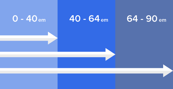
Calculating Pixels From Ems for Mobile-Friendly Design
Lesson #16Foundation

Ems are a unit of measure that can make pixel-oriented designers cringe. Based on typography, an em — so named because its width is the same height of a capital M — scales with the relative size of text. That’s great for making readable content. Not so much for pixel-perfect graphics. But the two can get along. Here’s a quick way to get started with ems in web design.
Common Tech Questions About the Foundation Top Bar
Lesson #14Foundation
The Top Bar is among Foundation’s most popular pre-built components — and certainly its most complicated. We created it to alleviate the trouble of building complex navigation for both mobile and widescreen browsers. The Top Bar is a powerful tool. But with power comes responsibility, or at least confusion about some of its inner workings.
Don’t panic. We’re here to help. This post will answer technical questions we’ve often been asked about the Foundation Top Bar.
Continue Learning with Courses
Learn product design principles from designers who practice them every day.
View CoursesShuffling Columns in Foundation Without Changing its HTML
Lesson #12Foundation

For years, the order in which an HTML document was written directly impacted how it was displayed. Want navigation on the top or left? It had to come before content in HTML. That was an uncomfortable — but necessary — restriction in the past. But with the rise of mobile devices, and some new CSS techniques, designers need greater finesse over their work than restricting “top-left” to always meaning “first.”
How to Keep Your Foundation-based Site From Looking Like Everyone Else
Lesson #8Foundation

We’re sometimes asked in our Intro to Foundation course if using Foundation makes websites look the same. They don’t. Any site that uses Foundation — or any framework — can look like whatever its designer feels is best for the project. We keep Foundation’s default styles to a minimum for that very reason. Don’t worry about looking like someone else. Instead, focus on looking like you. Here are three tips to making your Foundation-based site stand out.
How to Plan a Webpage Design With Progressive Enhancement
Lesson #6Foundation

The allure of new techniques is hard to resist. But there’s a time to revel in “new features” and a time to think “universal.” Progressive enhancement is the idea of designing from a most frequent denominator — what most people can access — and building out. It’s more than mobile-friendly. It’s everyone-friendly with benefits tailored for edge cases.
Here’s a three-minute lesson how to design from the inside out.
How to Choose Among Foundation 4's Visibility Classes
Lesson #5Foundation
Changing layouts to suit different devices is a staple of responsive web design. But sometimes images or other elements only work well at desktop- or mobile-size, but not both. For example, TheNextWeb.com changes elements based on screen size. Navigation is the usual culprit, though this could apply to any element that’s inappropriate to differently-sized browser windows. Here’s how to show and hide elements with Foundation in three minutes.
Using SVG without hacks
Lesson #3Foundation
Scalable, retina-ready, tiny file sizes, and fallback support for IE6. Let's take a progressive enhancement approach to using SVGs.
SVG is a fantastic standard for embedding rich vector graphics into web pages without the usual overhead associated with loading large images. Full-page background graphics like Fairhead Creative's and Foundation's are feasible thanks to the formulaic nature of SVGs.
Continue Learning with Courses
Learn product design principles from designers who practice them every day.
View CoursesHow to bridge rows in Foundation
Lesson #1Foundation
Most CSS grids — Foundation included — organize layout into rows that are, in turn, divided into cells or columns. But what if you want a column to extend over two rows? Officially, you’re stuck. But if we redefine the problem, a solution appears. Here’s a how you can (appear to) extend Foundation columns past one row in three minutes.
