
Product Design Lessons
Intro to Foundation | Lesson #5
How to Choose Among Foundation 4's Visibility Classes
There's a fine line between deliberately hiding and deliberately showing web page elements on different devices. Learn the difference between Foundation's .show-for-x and .hide-for-x classes.
Many elements can resize well mobile- and desktop-optimized layouts. But sometimes a design calls for widgets, images or sets of elements that only work well at one size. For example, TheNextWeb.com changes elements based on screen size. Navigation is the usual culprit, though this could apply to any element that’s inappropriate to differently sized browser windows. Here’s how to show and hide elements with Foundation in three minutes.
1. Create a page with everything.

This sample navigation bar has six links: home (the tappable logo), services, about, contact, blog and testimonials. Unfortunately the design calls for a larger text size than will tablets or smartphones.
To account for all three we start with, well, everything.
<nav>
  <div>
    <a href="/"><img src="logo.png" alt="company logo" /></a>
    <a href="/services">services</a>
    <a href="/about">about</a>
    <a href="/contact">contact</a>
    <a href="/blog">blog</a>
    <a href="/testimonials">testimonials</a>
  </div>
  <a href="#" id="nav-toggle">
    <img src="toggle.png" alt="icon to show/hide mobile nav" />
  </a>
</nav>
The code above includes every link, the logo, and a graphic that, when tapped, would show/hide the mobile navigation. (Again, these are samples — use your own navigation.)
2. Hide parts when appropriate.
The “.hide-for-small” class does exactly what it implies: Elements with this class disappear in narrow viewports (namely, smartphone browsers).

Above: “.hide-for-small” hides elements on when viewed on small screens.
Here’s how it fits the example navigation:
<nav>
  <div>
    <a href="/"><img src="logo.png" alt="company logo" /></a>
    <a href="/services">services</a>
    <a href="/about">about</a>
    <a href="/contact">contact</a>
    <a href="/blog" class="hide-for-small">blog</a>
    <a href="/testimonials" class="hide-for-small">testimonials</a>
  </div>
  <a href="#" id="nav-toggle">
    <img src="toggle.png" alt="icon to show/hide mobile nav" />
  </a>
</nav>
3. Show parts when appropriate.
The opposite are the “hide” classes. For example, “.show-for-small” means “hide this from everything except small.”
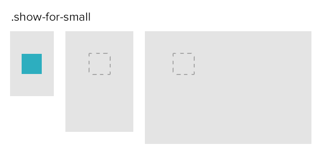
Above: “.hide-for-small” hides elements on when viewed on small screens.
About the instructor

Ben Gremillion is a Design Writer at ZURB. He started his career in newspaper and magazine design, saw a digital future, and learned HTML in short order. He facilitates the ZURB training courses.
Product Design Lessons, Direct to Your Inbox
We're just getting started, so sign up and we'll keep you in the know with our product design lessons. No spam here.