
Product Design Lessons
Intro to Foundation | Lesson #137
Building responsive accessible web forms with Foundation
This week you’ll learn how to build accessible, responsive, web forms.
Designing great forms can be a challenge in itself. Doing it in such a way that anyone, on any device, even with visual impairment is slightly more challenging. Ultimately we need a form that matches our design and is low barrier to entry for all users.
Setting up our form

We’ve set up our form using rows and columns to create our layout. When a person is using a screen reader to access your site, they will be using the keyboard to navigate it. Using the tab key to jump between elements, you can quickly see how the form fields are navigated. We’ll break down the code for this form step by step based on the accessibility techniques used.
Controlling what the screen reader says
When it comes to people who access your site with a screen reader, it’s important to think of your site’s components as if they were a document. Imagine if you closed your eyes and tabbed through the form. An accessible form would have great audio queues to make it obvious where the keyboard is focused on and what an action will do.
Using Aria-describedby
Our form has instructions and contextual information below the submit that a screen reader user would not get to before they submit the form.
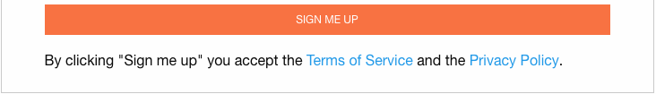
This is a classic accessibility problem with forms. For screen reader users (who cannot see the page) the screen reader default is to read the content from beginning to end sequentially.
We want "By clicking "Sign me up" you accept the Terms of Service and the Privacy Policy." to be read before the button submit happens.
Aria-describedby to the rescue
We'll use aria-describedby to solve this problem: when one element gives a description or instructions about another element. Using the aria-describedby attribute makes any descriptions or instructions read with the control itself. So when a screen reader user tabs to the element the screen reader will announce its description and instructions and the user will know how to use it. It does not matter where it appears on the screen or code.
To use aria-describedby just set the aria-describedby attribute to reference the id of the description or instructions.

Make sure the aria-describedby value matches the ID. Problem solved.
Creating helpful links
In most browsers, the Tab key allows users to jump from link to link, and the Enter key allows users to select a link.
Make your link text explicit. It will help all users know where they are going.
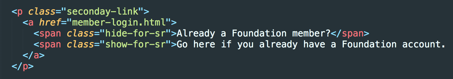
Using Screen Reader visibility classes
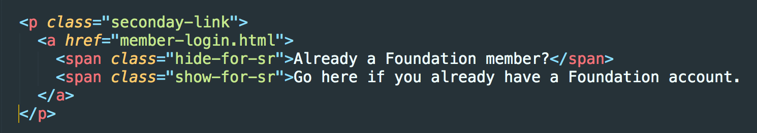
In cases where you need to show link text that may be more contextual for a person using a screen reader, you can use the built in accessibility class in Foundation.
.hide-for-sr- is visible except to a screen reader..show-for-sr- Not visible: to be read by a screen reader only.
Forms without labels
A common misconception is that we have to compromise our design to conform with Accessibility standards. That’s not always the case! Our example form has no visible labels so how can we make this more accessible?
Using labels is the most universal pay to ensure an input field is described to someone with a visual impairment. If your design prohibits the use of a visible label, there are other options.
Don’t rely only on the placeholder attribute. Placeholder text is meant to be short and simple. On top of that, placeholder text might disappear in some browsers when an input receives focus.
Using hidden labels
Once again, Foundation's visibility classes come to the rescue. You can associate a label to a specific input by using the for="" attribute. Adding the show for sr class will ensure only a screen reader calls it out.
Now you can use a label that will give better context to what the input is asking any person to do, and it will not change the design of your form.
Testing accessibility
There are various tools out there to test accessbility. We tested this form with the Chromevox bowser plugin. When you activate the plugin, you can tab through the form. You should be able to tab to all the inputs on the form. Every peice of the form that gets focus should be descriptive enough to know what it is and what to do, even if your eyes were closed. If there is an action to take, like a link or checkbox, either the Enter key or the Space key should make work. Try it yourself on the live demo!
Next Steps
A fully Accessible form is just one component of a your website. There are many other pieces necessary to ensure your site is fully A11y friendly, but hopefully this lesson helps you see that it may not be as hard as you think. For more Accessibility tutorials, tips and principles check out this month’s Responsive Reading.
About the instructor

Rafi Benkual oversees the Foundation Forum. Rafi managed people, stores and small organizations before joining ZURB as our Foundation Advocate.
Product Design Lessons, Direct to Your Inbox
We're just getting started, so sign up and we'll keep you in the know with our product design lessons. No spam here.