
Product Design Lessons
Intro to Foundation | Lesson #149
Foundation 6's Off-canvas
1 off-canvas, 10 possibilities
Learn how to use the Foundation Off-canvas to create more dynamic and modular layouts.
An off-canvas is a great way to make your navigation mobile-friendly, save room in a design and add a bit of wow-factor. While it’s popular as a mobile navigation solution, you’ll see the Foundation off-canvas can be used in many different use cases and screen sizes. The Foundation off-canvas can open from the top, right, bottom, or left, overlap or push your content and so much more. In this lesson, you’ll learn how to add the Foundation off-canvas into your project and how to customize it for your needs.
To get all the features we cover in this lesson, make sure you have Foundation 6.3+
A Quick Review of what an Off-canvas Is
 Image credit: Scott Bolinger
An off-canvas layout is a design pattern, and there happens to be a component in Foundation to accomplish this. This is how an off-canvas works: The user clicks an icon or performs some sort of action (e.g. swiping left to right on a touchscreen device) that results in a vertical container (usually a navigation menu) sliding into the screen from off-canvas (outside of the viewport). Most commonly the off-canvas pushes the page content over as it opens to create focus on the off-canvas but you can also have it overlap you content instead by adding a data attribute in your HTML. The off-canvas can be used as a navigation on mobile, but also on desktop. Increasingly common is the using an off-canvas that is a sidebar visible on medium and larger screens then collapses off-canvas on small screens to be opened with a trigger.
Some Foundation examples of Off-canvas menu's:
Whirlpool's multi-level off-canvas
UTSHC's bottom trigger overlapping off-canvas
Lamborghini's animated multi-level off-canvas
Basic Setup
The off-canvas is really simple to setup with only two elements. You’ll need the off-canvas itself and your page content wrapper.
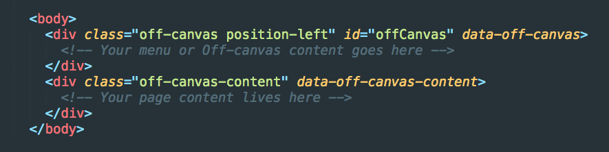
The .off-canvas creates the off-canvas container in which you can add your menu or content. It is an empty container so you can use if more than a navigation. The .off-canvas-content wrapper is where your page content lives. Everything inside the .off-canvas-content will be pushed over when the off-canvas is opened.
The position class can be used to dictate where the off-canvas opens from. You can use any of these classes:
.position-left.position-right.position-top.position-bottom
Adding a Trigger and Close Button
You can trigger an off-canvas to toggle open and closed from a button with your page by adding the data-toggle="offCanvas" attribute. The id of your off-canvas should match the id in this trigger.

By default, the off-canvas will close when the user clicks outside of the off-canvas on the body. You can also add a close button or link by adding an element with a data-close attribute anywhere inside of the off-canvas.

[See Codepen Example]
Also, the off-canvas can also be combined with Title Bar for a mobile menu to contain your hamburger icon.
Multiple Off-canvi
Yes, Off-canvi is plural for off-canvas because Off-canvases is really clunky. Anyways, because each off-canvas you use has a unique id, you can add multiple off-canvi to your site or app.

So let’s break this code down. We have one off-canvas that opens from the left, and another that opens from the right. Notice the data-transition="overlap" attribute we added on the right off-canvas. This changes the default behavior from pushing the page over to overlapping the page.
Creating a Responsive Sidebar to Off-canvas on Mobile
The off-canvas pattern is commonly used on mobile devices, but sometimes you want to use the same menu and have it always be there when have more screen real estate. Foundation's Off-canvas makes this easy! Simply adding an .reveal-for-medium class to the .off-canvas will create a menu that is open on the medium and larger screens, then collapses off-canvas on small. You can alternatively use .reveal-for-large to have the menu collapse off canvas on small and medium screens. When the off-canvas is open, it will shrink the width page by the width of the off-canvas.
You can control the off-canvas width using $offcanvas-size variable in the _settings.scss file. In fact you can adjust any of these settings:

Next Steps
That’s it for this lesson! You can now use the Foundation off-canvas to create all kinds of interesting desktop and mobile patterns for navigation and more. If you’d like a deeper dive into the power of Foundation, be sure to join our next Intro to Foundation training. You’ll learn tons of tips and tricks from the people who built Foundation.
About the instructor

Rafi Benkual oversees the Foundation Forum. Rafi managed people, stores and small organizations before joining ZURB as our Foundation Advocate.
Product Design Lessons, Direct to Your Inbox
We're just getting started, so sign up and we'll keep you in the know with our product design lessons. No spam here.