
Product Design Lessons
Intro to Foundation | Lesson #164
Zero to Website Guide Part 4: Scaffolding Your Portfolio with Foundation’s Grid
Learn how to scaffold a portfolio site with Foundation’s responsive grid and components.
Welcome to part 4 of our 6 part Zero to Website Series! For the past 3 weeks, you’ve been learning all about the basics of Foundation and responsive web design. Now that you have an understanding of Foundation’s file structure and grid, you’re ready to start building your own site! In this lesson, you’ll learn all about scaffolding and how to use this know-how to set yourself up for success in building any website. Let’s get started!
Getting Started
At some point, you’ll benefit from having a portfolio site so we’re going to start you off with creating a portfolio site! You’ve been learning all about how to use Foundation, but by the end of this 6-part series, we want you to be able to walk away with something you’ll need anyways!
What is Scaffolding?
Here at ZURB, all of our coding projects begin with “scaffolding”. In this step, we start by coding up our website purely in HTML and very limited CSS styling. The goal of scaffolding is to get all the pieces of our site into code as quickly as possible. This gives us a skeleton of our entire site so that it’s easier to move into visual styling later.

We try to avoid any styling while scaffolding because that can lead you down a vortex of decision-making based on minute visual details. Remember - all we’re trying to do here is get everything onto the page. It’s okay if it’s not pretty yet! If you do happen to need some styling, try to limit it to padding and margin. Otherwise, try to stay out of your CSS/SCSS files!
The Approach
Just so we can get right into it, we’re going to use our fellow designer Laurel’s portfolio as a template for this lesson! We’re going to scaffold 3 pages: the home page, an about page, and a contact page. She’s already done all the design work for us, so let’s get right into the scaffold.

Visualize the Grid
If you’re just starting out, actually writing code can be daunting. So, before we get started, we’re going to take a minute and study the layout that we’re trying to build. In this quick exercise, we’ll scan the page and think about how we might contain each section of the page in rows and columns. This will help to minimize the task in your head and speed up the coding process.
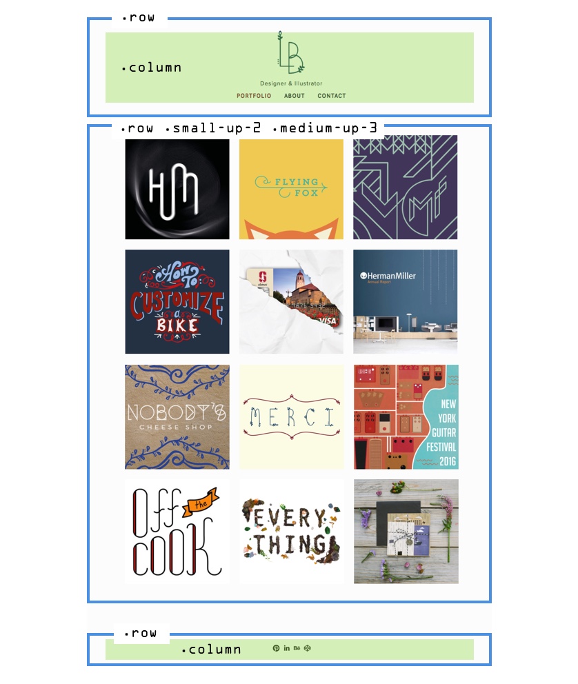
Let’s start with the home page. There are 3 main sections on this page: a header nav area, a gallery, and a footer. Each of theese will be contained in a .row. Inside the header nav row and footer row will be a single .column. This will become .small-12 by default. For the gallery area, we’ll use the Foundation Block Grid component. We’ll simply keep this in mind for now and get into the detailed code later.
This should be enough to get started, but as you build your site you’ll find that you’re constantly going to be doing figuring out how your content will sit in rows and columns in bigger and smaller spaces.
Components We'll Need
Another mental exercise is to think about what components we’ll need in order to build out the rest of the site. Taking a look at our design, we can use the Menu for our header navigation and footer, and the Block Grid for our gallery.

Now that we have a solid mental model of our site, we can move onto our code with confidence!
Coding
Let’s begin by setting up a grid for our header navigation, gallery, and footer inside of our <body> tag. The header and footer will both be contained inside of a .row and .column. Our gallery is a little bit trickier, using a block grid. For now, we’ll set up a .row for this area.

Tip: Use comment tags to label each section of code. This will make it easier to read your code when there's a bunch of markup in it!
Header / Nav
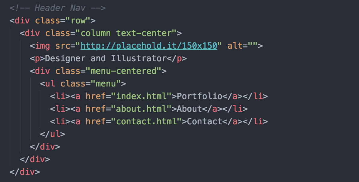
Let’s continue with our header nav. Inside the column, let’s add a placeholder image (we recommend using placehold.it), some text, and our menu. To build our menu, we’ll use a <ul> tag and add the class .menu to it. This class turns the list into an inline-block so that it sits horizontally. Next, we'll add <li> elements containing 3 links: Portfolio (which leads to index.html), About (which leads to a page we'll create called about.html), and Contact (which leads to contact.html).
We want everything to be centered so we’ll use the helper class .text-center to our column. This centers our image and text, but you’ll notice that our menu is not centered. To center it, let’s wrap our menu around a <div> with the class .menu-centered. Our header nav code should look like this:
Gallery
Next, we’re going build our gallery. We’re using the block grid because that’s going to automatically position our images inside even columns. The block grid is built right into the Foundation grid, so we can use the same syntax with some additional block grid classes.
Create a .row with the classes .small-up-2 and .medium-up-3. These are block grid classes that define the number columns we have in each row. The class .small-up-2 is defining 2 columns on a small screen, and the class .medium-up-3 is definine 3 columns on a medium screen. Since we didn’t define a large size, it will automatically show 3 columns on large.

Inside of this row, we’re going to add 9 columns containing placeholder images. Let’s make these images 400px by 400px. If you take a look at the gallery now, you’ll notice that all the images are squished up against each other. To fix that, we’re going to use the helper class .column-block on each column containing an image. This adds margin spacing beneath all our rows. Now our grid is perfectly spaced out! The code should look like this:

Footer
Our footer is quite simple. We’re going to use a ul with the class .menu, and use 20px by 20px images as our links. The code should look like this:

…and we’re done scaffolding the home page of our portfolio! Open up your index.html file in a browser and this is what we have:

Coding the Next Page: About
Now that we have our home page ready, we're going to move on to our About page. To start, we’re going to duplicate our index.html file and rename it about.html. Next, we’re going to remove the entire gallery area so that we can place new content here. Our header and footer will remain the same on each page.
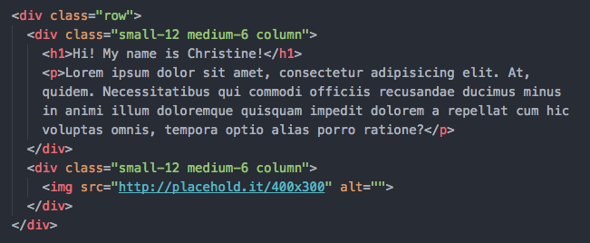
For the content of this page, we’re going to start with a .row. Since we want the content to sit side by side, we'll add two .medium-6 .columns inside the row. The first column will contain a header and paragraph about you. These will be h1 and p tags. The second column will be a photo of you, but for now let's use a placeholder image. Here’s what the code should look like:
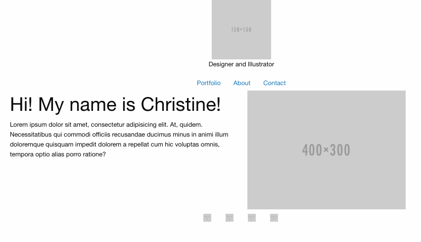
That's it for our About page! Open it up and it should look like this:
Coding the Next Page: Contact
For our contact page, we’re going to duplicate our index.html file again, but this time rename it to contact.html. Remove the gallery area so that we can add new content here.
Again, we'll begin by adding a .row and two .medium-6 .columns. The first column will contain a header and some text to encourage people to contact you.

Our form is a bit more complicated. To build our contact form, we’re going to use a combination of form elements along with rows and columns. We always start forms with a form tag. This will tell the browser that everything inside of it is part of one form.

Next, we’ll set up the rows and columns that define this form. Foundation Forms are super easy to use because inputs will span the width of whatever container they're in. This means we can create flexible forms just by setting up the grid however we want our form to look. Let's check out the form that we're building.

Each of our form fields will sit inside of a .row. In our first row, we'll use two .medium-6.columns. This will make our input fields sit side by side for medium screens. Since we didn't define a small size, it will automatically be small-12 and stack on small screens. Next, we'll add our input type="submit" inside each column.

For the rest of our form fields, we're going to use .row .column and add label and input type="text" elements inside of them. Each label should have the for="input id here" attribute in them that links it to the appropriate input field. This will tell the browser which label belongs to which form field.

For my comment box, I'm actually going to use a textarea tag. Don't forget the label!

Last but not least, we need a submit button! To create a submit button, we're going to use an input type="submit" tag and add the class .button to it.

Voila! Our contact form is ready to go! Here’s what your Contact page should look like:

Conclusion
Next Steps
You just learned how to scaffold your responsive portfolio layout with Foundation’s grid. Next week, we’ll add some sweet styles to make your portfolio stand out. For the fastest way to learn about Foundation and how to build your own responsive sites and apps more efficiently, check out our Intro to Foundation online course. You’ll learn tons of tips and tricks directly from the Foundation Development Team.
About the instructor

Christine Siu is a UC Davis alum with a background in visual design and web development. In edition to creating beautiful designs, Christine enjoys videogames, Japanese cartoons, and Studio Ghibli films.
Product Design Lessons, Direct to Your Inbox
We're just getting started, so sign up and we'll keep you in the know with our product design lessons. No spam here.