
Product Design Lessons
Intro to Foundation | Lesson #146
Raise Your Style's IQ with Foundation’s Sass Settings
Learn how to use the Foundation's Sass Settings File to quickly theme your project.
One of Foundation’s benefits is how fast you can produce amazing sites and apps using it. Styling with CSS can be tricky and time consuming. If you use Foundation’s Sass version this gets a lot easier, faster, and more organized with the included Sass Setting file. In this lesson we’ll dive into Foundation's Sass settings and show you some best practices to get styling faster.
Let’s take it from the beginning.
Sass Variables
Sass variables (technically SCSS) are what makes Foundation’s Sass tick. Think of variables as a way to store information that you want to reuse throughout your stylesheet. You can store things like colors, font stacks, or any CSS value you think you'll want to reuse. Sass uses the $ symbol to make something a variable. Here's an example:

Now that there is a variable available for the modal’s width, the value can be easily changed anytime from one place. This become even more handy when the variable is used in many places.
The _settings.scss File
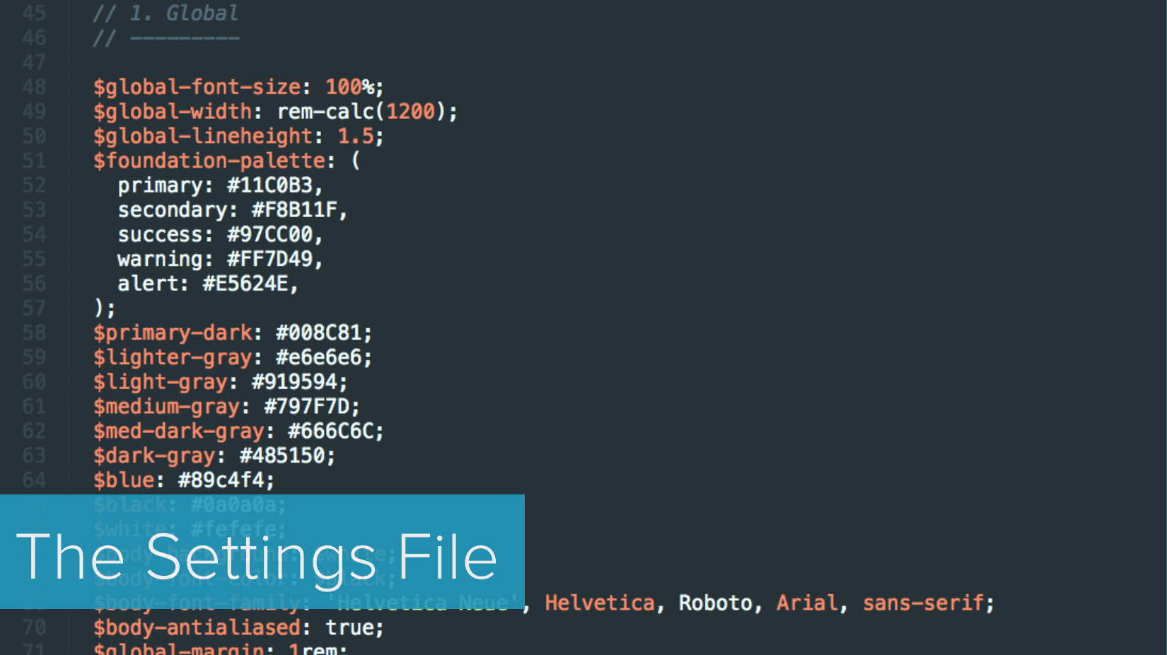
Wouldn’t it be neat if the default styles of Foundation could be easily modified from one simple file in minutes? That what the _settings.scss file is for! The settings file comes with each Sass version of Foundation. You’ll use it for 3 basic things:
- Seeing the default styles of Foundation
- Setting your brand styles quickly in one place
- Adding custom global variables
You’ll find the _settings.scss file here: src/assets/scss/_settings.scss.

The _settings file allows you to change core structural and visual and structural styles of Foundation. You can even control breakpoints, add colors, enable Flexbox for components, and adjust padding and margins of components. Not every possible state and property has a variable and if you don’t find a variable, you can write the CSS yourself. The settings represent the most difficult styles to change, the ones people change most often, and core structural or visual styles.
Best Practice: For global style changes (styles you’d like to apply across the site or app), look for a setting variable first before writing custom CSS. Using settings variables promotes a style consistency across components for things like padding, margin, sizes, and colors.
Make a change to a variable’s value, save, and see your results!
Global Settings
Every component references the global variables in some way. Here are some of the more important ones:
$global-font-size: 100%; // Can be a percentage or px value
$global-width: rem-calc(1200) // Width of rows
$global-margin: 1rem; // margin-bottom of all components
$global-padding: 1rem; // padding inside all components
$global-radius: 0; // border-radius of all components
So for example, buttons have their border-radius set to the $global-radius. So if you change the $global-radius value from 0 to 3px, it will affect the buttons and any other component using this variable. This is a best practice as it helps keep your styles consistent throughout.
You would use the global variables in your CSS like so:

This represents a content wrapper to provide top and bottom spacing.
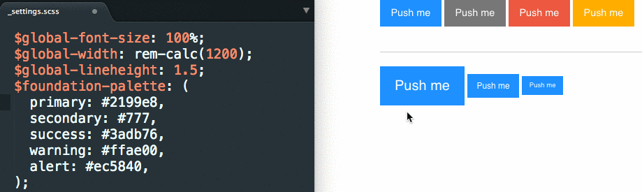
Your core colors are stored in the $foundation-palette variable. You can edit the colors in this palette, or add new ones. They appear as modifier classes used for buttons, labels, etc.
$foundation-palette: (
  primary: #2199e8,
  secondary: #777,
  success: #3adb76,
  warning: #ffae00,
  alert: #ec5840,
);
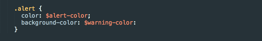
You would use the color variables in your CSS like so:
Helpful Sass Maps in Settings - Breakpoints and Button Sizes
Breakpoints are configured with one Sass variable called $breakpoints. You can have as many or as few as you want, but the first one must be named small.
$breakpoints: (
  small: 0,
  medium: 640,
  large: 1024,
  xlarge: 1200,
  xxlarge: 1440,
);
A subset of your breakpoints can be used as breakpoint classes. These are the classes used in the grid—small-12, medium-6, etc.—and other components.
$breakpoint-classes: (small medium large);Adding Your Own Variables to the Setting File
You can even add your own variables to the _settings.scss file.
Best practice: We are doing this at ZURB when delivering coded pages to our clients. We want to make sure that changes can be made easily and that the custom styles are easy to find.
You can add them anywhere (as long as the variable you are using is defined above it), but it’s better to separate them from the built in variables:

This is great for global variables because everything is one place, allows for quick edits, and creates consistency between pages and components. We wouldn’t suggest placing a variable specific to a custom component here though as the SCSS partial for the component would be the best place for those.
Next Steps
Ok, it’s time to go crazy changing all your site’s settings! Set your brand identity from one place quick and easy. For a deeper dive into Foundation's Sass and how you can can be a Sass Boss, check out our Advanced Foundation online course taking place on Dec 15th. You’ll learn Sass tips and tricks directly from the Foundation development team along with tons more.

Boost your skills in our Introduction to Foundation 6 course
Achieve maximum thrust by learning how to use Foundation 6 to power your projects. The Foundation team will get you up to speed on everything you need to know to get the most out of Foundation 6.
About the instructor

Rafi Benkual oversees the Foundation Forum. Rafi managed people, stores and small organizations before joining ZURB as our Foundation Advocate.
Product Design Lessons, Direct to Your Inbox
We're just getting started, so sign up and we'll keep you in the know with our product design lessons. No spam here.