
Product Design Lessons
Intro to Foundation | Lesson #56
Boost Website Speed with Smart Image Compression
Learn to squeeze the most pixels into the fewest bytes to boost websites’ load times.
The problem isn't a pretty sight. High-resolution or "retina" images use four times as many pixels as normal images —and that's four times as much bandwidth, which is already a problem. Meanwhile, people prefer faster websites but their mobile devices tend to load pages slower than desktop/laptop computers. Compared to ethernet, wifi and 3G are just plain slow.
Here's how to make the most of your bandwidth to create faster websites — and keep end users happy.

1. Use vectors, not pixels, for images
We've found SVGs to be wonderful substitutes for certain kinds of images — namely, flat graphics like our Yeti mascot. And while indexed PNGs compress to smaller file sizes, they lack the full transparency of 24-bit PNG and SVGs.
But good news about lightweight SVGs outweighs the bad.
- SVGs are easy to create. Adobe Illustrator and Sketch 3, for example, save SVGs with little fuss.
- They're (generally) universal. Every major browser today supports SVG. And solutions exist for those that don't.
- They embody "responsive" — as vectors, SVGs scale to any size. They look equally good on any browser or device that supports them.
Sometimes, though, not any ol' SVG will do. Check out Adobe's advice on exporting SVGs from Illustrator.
2. Use strategy in image compression
When trying to make images small, sometimes we have to think big. When people download an entire page with multiple images, we can employ a simple technique: Use more compression in some images to make up for less compression in others.
For example, let's say you have a high-quality hero pick and a smattering of icons.
The JPG 90–20 trick
Artifacts, or the "glitches" that appear in JPGs, are nearly invisible above 90%. But the file size difference is stunning.


Compare the two images above. See a difference? While they look nearly identical, one weighs 212kb. The other, only 86kb.
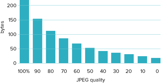
Holy reduction, Batman — JPG 70 compression has less than half the bytes of 100 compression. That means you can send graphics a quarter of the full size without losing significant quality. Below 50%, we don't see such drastic savings compared to the quality loss, but every bit helps.
At the low end of the quality scale, we pay close attention to the difference between 19 and 20 compression. Compared with 20–30 and 0–19, image file size changes suddenly between 19 and 20. Unfortunately, so does quality. That means if you're compressing the heck out of photos, you're not likely to get better savings for the loss below 19. And if you want to preserve any semblance of quality, don't compress JPGs lower than 20%.
Try it today
Got a few minutes? You can check your own products for optimal image use with a few handy tricks.
- Audit your site. Use a browser inspector to figure out how big your pages are. Use Google Page Speed to see which of your pages are slowest. Still, it's best to try your site on a real device.
- Discover what you don't need. Got a website? Rename its images folder (to temporarily "hide" them). Review your project. What do you miss? What glaring problems are there?
- Add alt attributes. Writing good descriptive text isn't hard. But be sure to use keywords in your image alt attributes so people waiting for images to load get some idea of what to expect — and that counts for SEO.
Picture this: A website that doesn't leave users hanging, but still looks great. You can make it happen.
About the instructor

Ben Gremillion is a Design Writer at ZURB. He started his career in newspaper and magazine design, saw a digital future, and learned HTML in short order. He facilitates the ZURB training courses.
Product Design Lessons, Direct to Your Inbox
We're just getting started, so sign up and we'll keep you in the know with our product design lessons. No spam here.