Responsive Tables
Don't let tables break your responsive layout anymore. This simple JS/CSS combo will let your tables adapt to small device screens without everything going to hell.
Why We Built This
When we looked around at the various implementations of responsive tables on the web, we saw lots of interesting ideas but nothing we thought was a really great implementation. Chris Coyier on css-tricks.net did a great round up of responsive data tables and while there's some fascinating ideas in there, nothing seemed to meet the criteria we had for a great implementation:
- Doesn't break responsive layouts
- Doesn't unnecessarily hide data
- Still lets you compare rows
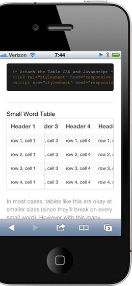
With those existing tricks in mind, we set out to develop this, a CSS/JS combo that takes existing tables and modifies them for small devices so they meet our criteria. It works by taking the first column and "pinning" it to the left of the table, allowing you to scroll the other columns under it. You don't lose the likely key for each row, but you also don't have to break your nice responsive layout.
We built these specifically to work with Foundation, our open source front-end framework for responsive sites, but it would work just fine with any responsive site.
Read more about why we built this on our blog: A New Take on Responsive Tables
How to Make Your Tables Responsive
We wanted this to be incredibly easy to implement. Start by downloading the code pack — this includes a demo file as well as the two key files you need for this: responsive-tables.js and responsive-tables.css.
<link type="text/css" media="screen" rel="stylesheet" href="responsive-tables.css" />
<script type="text/javascript" src="responsive-tables.js"></script>
Attach to Your Markup
On any data table in your markup, you simply need to attach a class of .responsive and the CSS/JS will do the rest. Like so:
<table class="responsive">
  <tr> …
Ready to Rock
From there on your tables will be modified client-side when the window is smaller than a regular tablet (so most any smartphone or very small tablets).
Device Compatibility
This technique was tested on iOS, Android and Windows Phone 7 (as well as Chrome, Safari and Firefox). One caveat is that because Android 2.3 doesn't support scrollable divs on the page, the scrolling won't work on those devices. Android 3 and up does support this, so it's not an issue on newer Android phones.
Score an awesome product engineering or design job
Quick Start
You can download a code pack with a demo file based on Foundation to see this in action. Attach two files to your doc and a class of .responsive to your tables.
Example Page Download the CodeWorks with Foundation
This technique was designed in and for Foundation. Check out Foundation to see what else you can do with a responsive framework.
Visit Foundation »Available on GitHub
Find the latest code on Github, or go there to log / search through any issues. You can pop it open right in GitHub for Mac, here »
Thoughts?
Read our blog post for more background on why we developed this, to see what others are saying, or to let us know what you think.
Check out other Playground experiments

Reactive Animation Listener

Foundation for Apps

Slinky

Tribute.js
