Drop-In Modals
For those using WebKit based browsers (Safari and Chrome), CSS3 effects and properties can help you create fast, simple modals by using transforms, animation, and some subtle design cues.
Note: Demo works best in Safari 4 or Chrome 5. In Firefox, you will not see the animation or gradients, but you will see the transforms.
Simple Modals
The simple modal style we show here is very basic, but effective. The modal itself is set to opacity: 0.0 and when we click the button it changes to opacity: 1.0. A -webkit-transition: opacity 0.25s linear on the shown state causes the fade in effect, so we only need javascript to change the state of the modal — not the animation.
Fancy Modal
This modal is shown and hidden in a similar manner. Instead of using opacity, we've used -webkit-transform: translateY(-570px) to push the modal off the top of the screen. Then a -webkit-transition: -webkit-transform 0.25s ease-in animates the change in translation to pull it down onto the screen.
We use a few properties like transforms, transitions and box shadows. Currently only Safari 4 supports transitions, but Firefox 3.5 supports transforms using the -moz-transform property and also supports -moz-box-shadow.
Copyright ZURB, freely available for distribution under the MIT license.
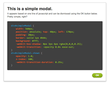
This is a simple modal.
It appears based on one line of javascript and can be dismissed using the OK button below. Pretty simple, right?
.modal {
  position: fixed;
        max-width: 500px;
        top: 25%;
        left: 50%;
        margin-left: -250px;
        padding: 1em;
        background: #fff;
        z-index: 100;
        opacity: 0;
        pointer-events: none;
        -webkit-transition: all 0.25s ease-out;
        -moz-transition: all 0.25s ease-out;
        -ms-transition: all 0.25s ease-out;
        -o-transition: all 0.25s ease-out;
        transition: all 0.25s ease-out;
}
.modal.show {
  opacity: 1;
        pointer-events: auto;
}
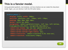
This is a fancier modal.
Using generated gradients, text-shadows, and box-shadows we can create this drop-down modal. You can dismiss it with the OK button below.
.fancy.modal {
  box-shadow: 0 3px 6px rgba(0,0,0,0.25);
  border: 1px solid #bbb;
  background: -webkit-linear-gradient(top, #fff, #ddd);
  background:    -moz-linear-gradient(top, #fff, #ddd);
  background:         linear-gradient(top, #fff, #ddd);

  -webkit-transform: translateY(-100%);
     -moz-transform: translateY(-100%);
      -ms-transform: translateY(-100%);
       -o-transform: translateY(-100%);
          transform: translateY(-100%);
}
.fancy.show {
  -webkit-transform: translateY(0%);
     -moz-transform: translateY(0%);
      -ms-transform: translateY(0%);
       -o-transform: translateY(0%);
          transform: translateY(0%);
}
Check out other Playground experiments
Foundation CSS Grid Examples
Foundation CSS Grid + Container Queries
Foundation Grids within Grids

Reactive Animation Listener
