The Clambake for Emails & Retina Images
Add retina-ready graphics, like your logo, to a responsive email.
DownloadThe Problem
Adaptive layouts thrive on max-width and min-width. Problem is … Outlook doesn't support these features. And creating pure fluid HTML emails is borderline impossible. Outlook isn't the only one. Gmail ignores styles, ruling out high-res media queries.
When it comes to high-res images for retina displays, Campaign Monitor recommends using media queries to shrink down the image for a mobile device. The problem, however, isn't with shrinking down the image, but rather with the media queries. As we just mentioned, Gmail ignores those and strips them out completely.
With the code provided in this playground piece, you'll be able to add retina-ready images, such as logos, into our responsive email templates.
So Let's Get Cooking!
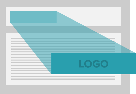
Start with a retina logo, which you can do in your favorite graphics editor. Or grab the one below if you don't have one ready.
Tip: With fixed images, we need to start with the larger size. Vector-images, that aren't resolution-dependent, can easily be scale up. But fixed images will just look blurry if scaled upward.
Later on, we'll be using max-width. Keep in mind, a few Outlook and Louts Notes will display at the full-width and height, possibly pushing your content down below the fold. Be flexible and always remember that your final results will vary.
Get Your Tables for Dual Columns in Order
Back in the day, nesting tables within tables and more tables within tables whilst creating HTML email newsletters. In this, you'll find lots of markup and very little use of paddings and margins. Which has its pros and cons, but for the most part, it works.
Table Structure
Below is an example of the basic structure of a dual-column table. Depending on the width of the logo, you might throw in another TD in the middle of both of them to give additional whitespace. For this recipe, Aaron kept it to two columns:
Additional TD for Whitespaces
As we mentioned, you might need an additional TD for whitespace. It's recommended not to have empty TDs — therefore, add an HTML space. Aaron's advice: stay away from spacer images. It's unnecessary and adds an extra HTTP request.
Grab Your Responsive Email Templates
First, grab our responsive email templates if you haven't already. Open up the Basic template. Look at the basic.html and go to line 23.
Making Your Image Fluid
Set image width to 100% and height to auto. Don't use max-width or max-height at this time while testing. This makes your image 100% fluid.
Welcome to the Clambake, Or Where We Add Our Images
This is where you'll start to understand why Aaron calls this a Clambake (New England Clambake). As he puts it:
"We're going to throw a whole lot of yumminess into the pot and cook up something delicious. Some things will work while others do not. In the end, your recipe might become one of a kind."
That's a statement Aaron made when he first discovered the Clambake. He imagines a scenario where the aspect ratio of the retina logo is tall instead of wide. You might have to adjust your elements or add additional nested tables and markup to accomplish your goal. Let's take a closer look.
Continuously Review Your Progress
We recommend periodically reviewing your progress with each addition made to the recipe. You can hit up Litmus.com and QA on a few good ol' devices, which will help you tinker to get things just right.
Proper Scale
Without height:auto, a few email programs won't scale the image properly. Make sure it's there. After styling the img tag with 100% width, you'll notice a very large placeholder.
Add Your Logo
Replace the placeholder image …
Resize your browser window to test the results. You'll notice your logo will shrink as the browser gets narrower.
Handling Text and Typography
Text and typography play an important part here. Edit the secondary TD in the table by replacing the word "basic" with the phrase: "Add another nested table here. I don't like colspans!"
Change this …
To …
Save and test again by shrinking the browser. Notice how the text wrapped and shrunk the logo. Don't use long words. You can try something like this:
Add Some Spice
Let's start adding the secondary ingredients. Add float:left to the parent TD. It's needed for Apple mail and a few others.
Then add float:left, max-height and max-width to the img tag. Aaron recommends staying away from min-width and min-height. Trust us, Aaron tried it. Didn't work.
Now add min-width and max-width to the parent TD containing the img tag. The min-width prevents the image from getting too small in email apps on mobile devices.
Now test what you've done.
Aaron told us that he doesn't exactly remember the aha moment on the day he discovered the solution. He just threw in a bunch of ingredients here and there, and it worked. He then tested it on a bunch of browsers and email apps all over. If you're interested in more experimentation …
Score an awesome product engineering or design job
Download
You can download the Clambake from its GitHub repository, or get the code from the original jsFiddle.
Supported Clients
| Client | Supported | Notes |
|---|---|---|
| Gmail (Desktop) | Max-width will prevent the logo from being larger than 217px wide. | |
| Gmail (Mobile) | If the same email is sent repeatedly Gmail will clip it, causing the layout to appear slightly wonky. | |
| Gmail (iOS) | ||
| Gmail (Android) | ||
| Yahoo Mail (Desktop) | Max-width will prevent the logo from being larger than 217px wide. | |
| Yahoo Mail (Mobile) | ||
| Mail (iOS) | ||
| Mail (OSX) | Max-width will prevent the logo from being larger than 217px wide. | |
| Email (Android) | ||
| AOL (Web) | Max-width will prevent the logo from being larger than 217px wide. | |
| Outlook (Web) | Max-width will prevent the logo from being larger than 217px wide. | |
| Outlook 2003 | ||
| Outlook 2007, 2010, 2013 | Max-width does not kick in and the logo is very large. | |
| Outlook 2011 for Mac | Max-width will prevent the logo from being larger than 217px wide. | |
| Lotus Notes | Max-width does not kick in and the logo is very large. | |
| Hotmail (Desktop) | Max-width will prevent the logo from being larger than 217px wide. | |
| Hotmail (Mobile) | Body is 15px too wide to the right - might be a padding issue. | |
| Thunderbird | Max-width will prevent the logo from being larger than 217px wide. | |
| Entourage 2004 | ||
| Entourage 2008 | ||
| Windows Mail | ||
| Live Mail |
Dual Column Refresher
If you have been paying attention you might have noticed the Clambake is contained in a dual column. It wasn’t too long ago that email newsletters were designed with two, three, or even four columns. Now with over 40% of email opens occurring on mobile devices, many designs stick to one column layouts. Two-column layouts, with responsive features, are popping up providing hope for those who want to break away from the current trend. This leaves us with three unique and interesting choices at our disposal. And each choice can be used in the same HTML email newsletter — opening up many possibilities! Here they are:
1. Media Queries
Maybe we can’t use media queries to serve retina images, but they still can be used for adjusting layout. There's nothing wrong with them. However, apps and devices that do not provide support could cause you a headache as you figure out a workaround. Some media queries are being used in our responsive email templates. Here, the media query will overwrite the width and float, allowing the tables to be fluid on smaller browsers.
Here's our responsive email template. Here, the media query will overwrite the width and float, allowing the tables to be fluid.
2. Floats
This is where you create two tables and float them left. When the width of the window gets smaller, the right table bumps down.
There is no need to add media queries, but the end result would look more pleasing if you did.
3.Dual Column Tables
Many may have forgotten but tables still hold their weight in email newsletters. With tables, a completely fluid newsletter is possible. And with the introduction of the Clambake, retina images can now be used.
Go Forth and Add Images
With the Clambake and a refresher on multi-column layouts, you can choose to add more than the traditional single or dual columns. Or you can decide if you want them to bump down, or display inline. Now it's your turn to take the Clambake and add retina images to your responsive emails.
Score an awesome product engineering or design job
Check out other Playground experiments

Morse Code for Foundation

Pizza Pie Charts
Prototyping Mobile First
Foundation 4 Stencil Sets
