Most websites have pages with several goals or calls to action, but each Web page needs it's own purpose, an overarching task for users to perform. Those tasks are user goals, and successful websites have several goal-driven pages.
I was recently reminded of this as I was browsing
Flickr. As a Flickr member, when logged in, I have my own
dashboard-like page called Home. It's a great place for me to check out what my contacts are up to, see what I recently uploaded, and more. There's a lot do—just like any other dashboard provides—but what's the goal here? *What am I supposed to do?*
Links, tabs, images, collapsable tabs, hidden sections, oh my! There's a lot to clicked on, so much so that I began to question the ultimate goal the design team at Flickr had in mind when
redesigning this page. Flickr had blogged about the redesign three months ago; it turns out they have no idea what they want users to do most.
While that's not necessarily a bad thing, it's also not a very good one. It means the page is unfocused, alive and there only to get me off the page and somewhere else. A sound strategy I suppose if **the goal is to just explore the site**, to wander aimlessly and find images and videos that looked interesting. Simple enough, but what's the point? Is that really what I come to Flickr for?
Let's consider that Flickr has two primary user types: Viewers and Contributors. As both a Contributer and a Viewer, I'm just like most of the other users. This is where Flickr's problem with redesigning this page lies. As a Viewer, the primary goal is to explore. As a regular Contributor, the primary goal is to upload. Presently, the link to upload is just a heading on the right, a link I constantly overlook. If they wanted me to upload photos and videos more, and as a paid Pro member they should, they're doing a poor job of it. **This is why page goals really matter.**
If Flickr wanted to make uploading photos and videos my primary goal when I revisit the site, they'd make the page look something like this:
Instead, they put my content and that of my contacts first. Images are powerful, catching my eyes nearly as much as a very actionable button. With goals as different as sitting on the sidelines and actually contributing, Flickr faces a unique dilemma: what are they asking users to do?
As not just an interaction designer, but as a Flickr user, the current page design tells me one thing: the primary goal really is to just explore. Although that was not the ultimate goal of the design team, it could still work out well for Flickr.
**Goals help shape more than just messaging and content.** They shape user expectations, telling users just want needs to be done. So, what are your pages telling your users to do?
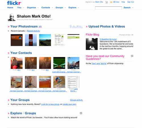 Member Flickr home page with several mismatched pieces and calls to action.
 Realigned Flickr home page that solidifies uploading as the primary goal with a button for uploading instead of a simple hyperlink.