We always look ahead to new ideas, new events, and new ways to help people make great products. But as we close out 2013, we also stop to look back — and what a view it is. This was the year we brought into sharp focus our educational efforts with the launch of ZURB University, a better strong Foundation, new apps and improved ones. So let's take a look at 2013 ...
1. We Acquired Forrst
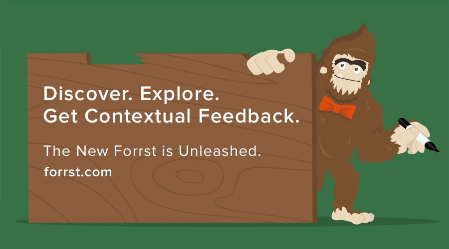
The design and developer community Forrst joined our family in January. We acquired this feedback community because we wanted to help people iterate through their work and learn from helping others. We saw an opportunity to build upon what founder Kyle Bragger started and make Forrst a place of active learning.
2. The Smartest Foundation Yet!
We launched Foundation 4 in February. This was the Foundation that changed everything and helped product designers build responsive websites faster and smartly. We retooled the framework to be Mobile First, made it more semantic and added faster JavaScript plugins.
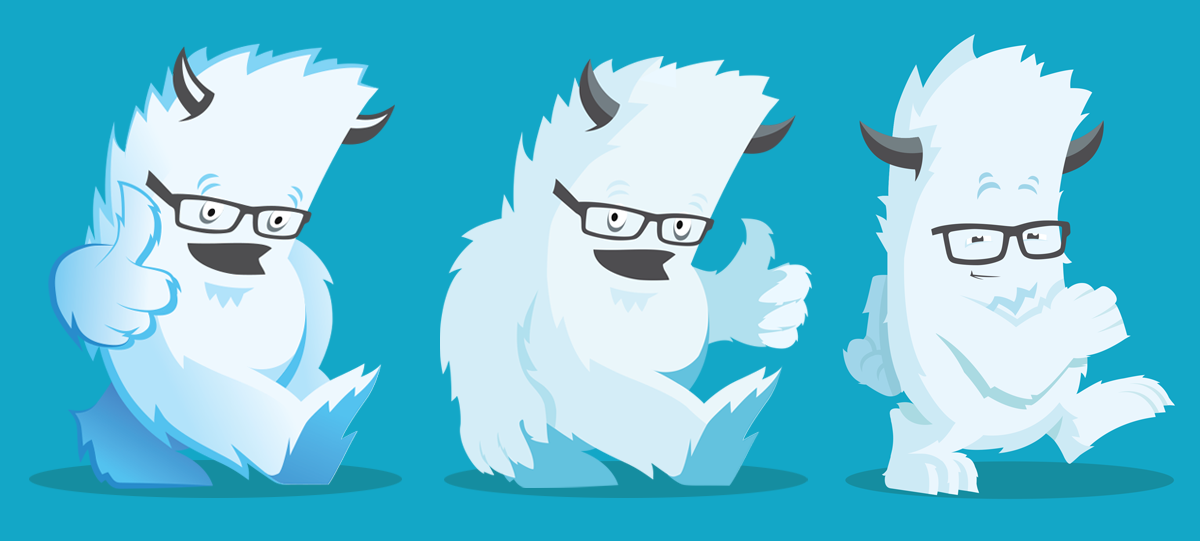
The Yeti also got a makeover this year.
3. Teaching Product Design Through ZURB University
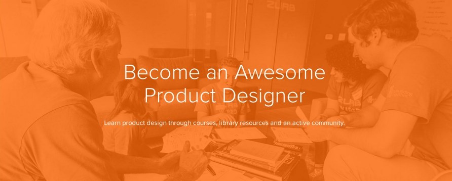
We began holding live, online Product Design training sessions in April. We felt, and still do, that it's crucial for every business to understand product design, especially with the proliferation of mobile devices. We've poured our 15-year experience into each of the ZURB University classes. We've held more than 30 webinars so far, held several in-person workshops and even sent our designers abroad to help hundreds of people learn our approach to better product design.
4. Creating a Library Resource for Product Designers
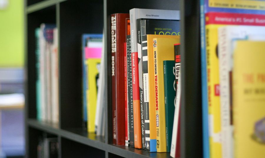
Education as a product designer is ongoing. There are always new things to learn. And we're happy to share our what we've learned, whether it's through a new Playground piece, a new pattern or an interesting factoid. Over the years, we've built several resources for designers, but they'd all been their own separate ventures. With ZURB University, we organized some of our properties — including Playground, ZURB Word, Pattern Tap, Friday 15, Design Quips and Behaviors — into one Library resource. There are also weekly product design lessons. This resource helps product designers learn the many facets of product design under one umbrella.
5. So Long Painful Images Loads on Small Devices
Images in responsive web design have long stymied designers. Many have proposed solutions, but none quite fit every need. In May, we tackled the problem and released Interchange, our solution for sending the right images to the right browsers. This new technique inspired people to design sites that look great across any platform while saving bandwidth and time for end users. So much so that we took this and baked into the next version of Foundation with some additional changes (see number 8).
6. Beating the Clock for ZURBwired
In August, we worked with nonprofit Rebuilding Together Peninsula to create an entire marketing campaign during our sixth ZURB Wired. They learned from our 15 years in a marathon 24-hour sprint. We do this every year to help nonprofits learn the benefits of design thinking and not getting stuck in details. The philosophy behind Wired is that anyone can learn product design to break through barriers and create something wonderful.
7. A Mobile-First Forrst
Eight months after we acquired it, we unveiled the new Forrst site. The focus of the redesign was to make it easier for Forrsters to give contextual feedback and truly make Forrst a place of active learning.
The new mobile-first design makes it easier for designers and developers to give constructive critiques on the go. Notable-style comments help people give contextual feedback on every screenshot. Versions, our most recent feature, helps people see the progress of each post over time. The end result: people can iterate through projects with outside opinions that provide new insight.
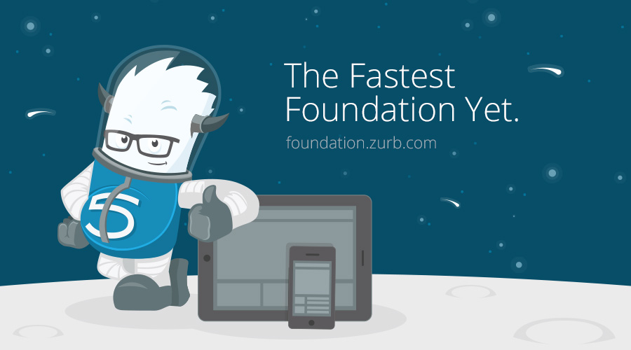
8. The Fastest Foundation Yet!
A new Foundation blasted off in November. The fastest version of our popular framework ever was also the most downloaded at launch. Foundation 5 brought a whole new game with Interchange, which can now work with any type of content, improved speed overall. We also switched from Zepto to jQuery 2 for greater compatibility with the web design world. Designers and developers can now spend more time designing and developing than reinventing grids and UI components, making it even faster for them to use..
9. Strengthening the Foundation Community
We also placed an emphasis on faster learning with Foundation 5. Along with that, we launched a new forum for Foundation users to discuss issues, get help, and swap tips. This gives designers a central venue to learn about the CSS framework from each other. Since launching, we've had more than 550 posts!
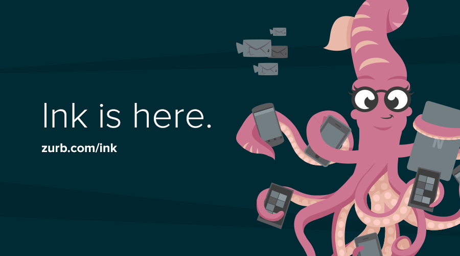
10. Launching Ink, Our Responsive Email Framework
We introduced Ink, a responsive design framework for email, in November. We built upon our previous responsive email templates, but this time we created an entire responsive framework not just another series of templates. Why? Because frameworks give you a consistent code structure and styling that makes it easier to modify layouts in the long run. Better than just a single template, Ink allows designers to build complex layouts tailored to their needs.
It wasn't easy to create a framework that works across any email client, but we found a way to create a mobile-, tablet-, and desktop-friendly framework that makes emails look great, even on Outlook. We learned so much from developing Ink that we started an online course to share our experience with others.
2014 ... and Onward!
This was the year we strengthened our education services. From Foundation 5 (faster product development) to Forrst (smarter iterations) to University (formal design education), we've dedicated ourselves to building a learning organization that helps us and others improve their design skills. But our work doesn't end with the year — you can count on more resources and services to further your design education in 2014!

