Project Leader and fellow ZURBian Alina rallied her wolf pack, banging out the first initial brochure, invitations, posters and thank you cards. Can anyone say Hell Yah!
New Brochures for Unique Homes
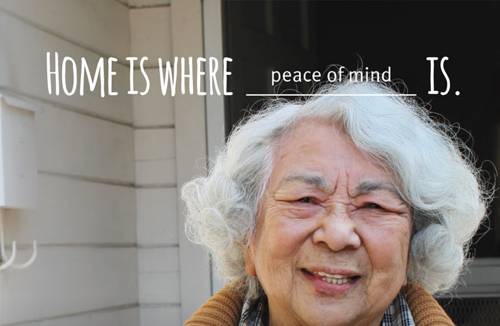
We wanted to give Rebuilding Together Peninsula's previous brochures a much-needed facelift that still focused on the lives of the homeowners. During the process of defining the content we discovered many powerful stories and ideas. With this in mind, we added a simple "Home is where ___ is," because the story is different for everyone.

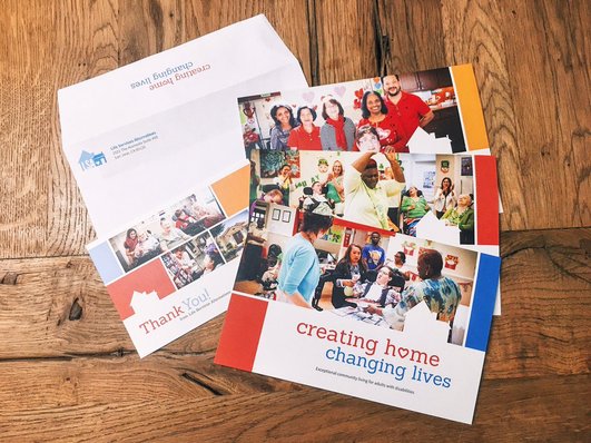
Thank-you Cards With Human Impact
The cards were designed with a backdrop to reach people in a very casual way. Adding a backdrop of the homeowners and volunteers — bridging between two different sides of — allowed us to capture the authentic emotion of the lives of the homeowners and the volunteers this non-profit affects.
Posters Generate Visibility
A message. A photo. We designed the posters to reach a wide range of people in as little time as possible. The posters will spread the campaign’s “home is where _____” message throughout the community.

Formal Invitations to an Important Anniversary
We chose to go a bit more sophisticated with these to reach donors: restrained colors and a more formal serif typeface. To make sure Rebuilding Together Peninsula's new human message came across, we added images of the people they have helped.
What happens when we hit a SNAFU?
We call on Ryan Riddle to superman us to the rescue! During this phase we ran into a snag with the copy on specific dates. Donning his cape, Ryan used his powers of the cell phone to call the printer before it was too late, and with rapid speed the problem was fixed! Whew, that was close.