
Product Design Lessons
Responsive Email Design | Lesson #123
Get Your Responsive Emails in Order
Learn how to source order in responsive HTML emails so your content can work with your design.
You’ve probably heard it before: Content dictates design. Getting your content to fit your design can be challenging. This is especially more challenging in Responsive HTML Emails where many CSS properties just don't work on every email client or device. In responsive email design your content often will stack on smaller screens where space is limited. Being able to control what column stacks on top or bottom can make a big difference in usability and readability. In this lesson, you’ll learn how to source order in responsive HTML emails so your content can work with your design.
We’ve written about this before but now it’s even easier with Foundation for Emails 2 and Inky.
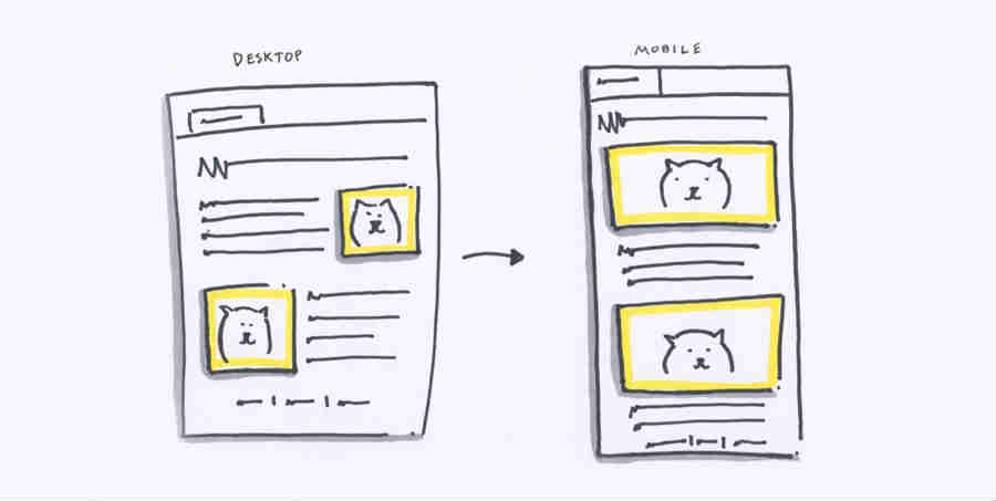
First, Sketch It Up!
It will help to visualize what it is you’re trying to build! Start sketching how your email is laid out on desktop and mobile. These should be quick and dirty and look something like this:
This is a really common pattern you’d see on the web. Surprising it’s easy to execute but confusing to grasp. We’ll break it down step by step.
Layout your Content
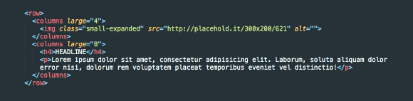
If you look at the sketch from step one, we want to take the image on the right and move it above the text when it's viewed on mobile devices. We’ll first code lay this out into two <columns> in Foundation for Emails. We’ll go ahead and choose large="4" and large="8" for column width on large screens. The meat of the code will look something like this:

Note: the .small-expanded class on the image will stretch it 100% width on the small breakpoint.
Because the text should be in the left column, it comes first in the code. So we get a layout like this:

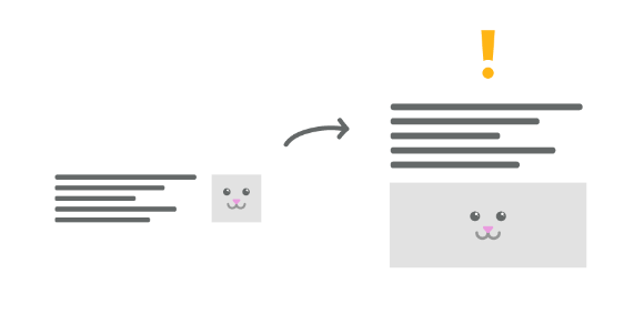
But hold up - we want the image to be on top on small screen. If we leave it as it it looks like this on small:
Reorder That Markup
We’re going to change the order of how the columns are rendered on large screens only. Remember, we want the text on the left, and image on the right on larger screens, and image on top for smaller screens. We’ll go ahead and switch the order of the image and text in the markup like this:
Time To Switch Things Up
Let’s add the dir=”rtl” attribute to the <row>. This causes the email client to shift the columns in opposite order, right to left as it reads through the DOM. Check out the code below:

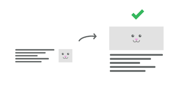
The image should now start off on the right on a large screen and then move on top of the content on the right! Check it out! Pretty cool huh?
Next Steps
That’s it! No longer are you confined to the paradigm of placing left thing over right thing for mobile screens. You can now wield the power of source ordering with just a single attribute inserted into your markup!
We’ve accumulated our experience in sending millions of emails into Foundation for Emails so you can build freely and worry less about cross browser issues. If you want to hone your skills as an email expert, be sure to check out our ZURB Master Course: Responsive Emails.
About the instructor

Rafi Benkual oversees the Foundation Forum. Rafi managed people, stores and small organizations before joining ZURB as our Foundation Advocate.
Product Design Lessons, Direct to Your Inbox
We're just getting started, so sign up and we'll keep you in the know with our product design lessons. No spam here.