
Product Design Lessons
Intro to Foundation | Lesson #121
Get Control of Foundation’s Default Breakpoints
Tailor Foundation 6 to suit your product design’s requirements.
We’ve all been there before. You have a specific design that needs to be coded pixel perfect and the default breakpoints need to be adjusted. Normally you’d have to hunt for media queries through dozens or even hundreds of lines in CSS. You need to account for several different scenarios — smartphones, tablets and desktop browsers, and even different screen orientations. If you had to find and replace every media query things could get messy and time consuming very fast.
But it doesn't have to be this way. We chose default settings to accommodate most scenarios. But most doesn’t cover everyone. Sometimes a project requires different breakpoints. Foundation 6’s Sass makes selecting custom breakpoints a snap with very little setup. In this lesson, you’ll learn how to customize and add breakpoints in Foundation to suit your product’s design requirements.
Learn Foundation from the people who built it. All our lessons are small pieces of what you'd learn into our Foundation 6 webinar course.
First, A Recap on Breakpoints
Breakpoints are the widths at which different grids or CSS styles take effect. These are CSS styles inside a media query that only take effect within the specified range. So for example:

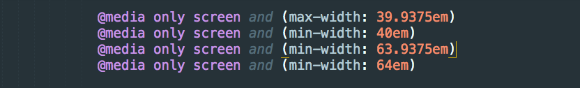
This media query uses a max-width so for any screen 39.9375em and narrower will apply the style within.
If you had to change the media query in CSS, you’d have to search and replace. You’ll find breakpoints on many different lines. For example:
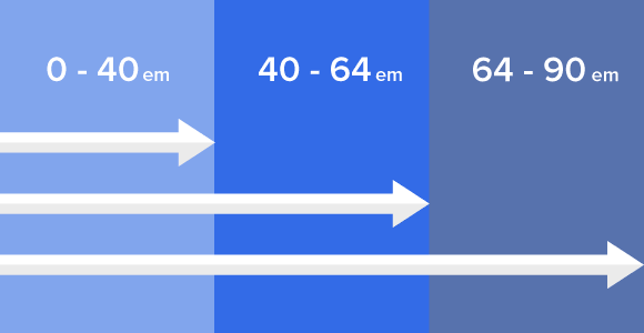
Each represents the point at which browsers apply different rules: Small, medium, large and extra large, respectively.
Sass Maps to the Rescue!
Instead of tedious find and replace, the Foundation 6 Sass version uses a breakpoint variable so you can make a change in one single place. Let’s check it out!
Open your _settings.scss file and you’ll find the section with the breakpoint settings.

Here you’ll see that each breakpoint name is called in this Sass map with a value. You can change the values here to any px value you’d like. When you change the breakpoint values here, every place you use this breakpoint will automatically update to the new value. No more hunting down media queries and manually changing them.
Adding a New Breakpoint
Say we have a special circumstance where we’d need a breakpoint between small and medium. The Sass map makes it really simple to add.
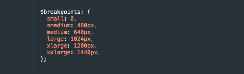
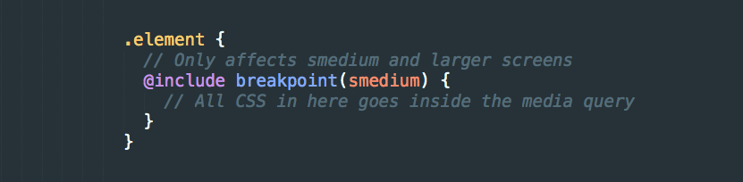
So we’ll add a breakpoint named smedium. We’ll set this breakpoint at 460px. So at any width between 460px and 640px, the smedium styles will apply. Even though the above values are in pixels, they're converted to ems at the end for use in media queries.
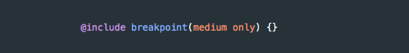
Now you can access this new breakpoint value using the breakpoint mixin:
Using New Grid Classes
To create grid classes for this new breakpoint, we’ll add the new breakpoint into the $breakpoint-classes variable.

Now you can use the new grid classes as you would small, medium, large.

Next Steps
The beauty of Sass and Foundation 6’s breakpoint mixin means you make the change in one place to customize your entire site or app. In our fast paced industry, these kind of conveniences are crucial to meeting deadlines. With this knowledge you can really make Foundation your own. Go out and make something amazing!

Boost your skills in our Introduction to Foundation 6 course
Achieve maximum thrust by learning how to use Foundation 6 to power your projects. The Foundation team will get you up to speed on everything you need to know to get the most out of Foundation 6.
About the instructor

Rafi Benkual oversees the Foundation Forum. Rafi managed people, stores and small organizations before joining ZURB as our Foundation Advocate.
Product Design Lessons, Direct to Your Inbox
We're just getting started, so sign up and we'll keep you in the know with our product design lessons. No spam here.