Today we're opening the huge wooden doors to the new Forrst, like that scene in "Jurassic Park." We've been in Private Release for the past month or so, getting feedback from the community members lucky enough to be part of it. Now we're open for business for every Forrster.
Forrst is a unique place where designers and developers can share their work and get contextual feedback. When we took over earlier this year, we saw an opportunity to build upon what founder Kyle Bragger started and turn Forrst into a place of active learning. And it's become that as part of our educational resource, ZURB Expo.
The big changes are:
- The ability to annotate assets, much like our tool Notable, so that Forrsters can leave contextual feedback.
- A new visual design that allows for better consumption and discovery of posts.
- Finally, a mobile-first design component that let's Forrsters comment from their smartphones or tablets.
The annotations and mobile-first design will make Forrst the destination for actively practicing your product design skills by doing work and getting contextual feedback. You can check it out for yourself.
Eating Our Own Dog Food (or Iterating on New Forrst)
The Private Release allowed us to solicit feedback about the redesign from the community. We wanted to hear what they liked, what they didn't like and what worked for them. They were given access to the redesign so they could use it like they'd normally use Forrst.
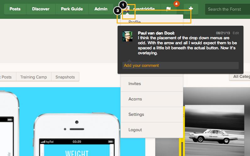
We even used Notable to allow Forrsters to annotate screenshots of the redesign. The tool proved effective in collecting feedback. We got some wonderful insight into what worked and what didn't.
One Forrster was frustrated by the infinite scrolling that we were using on the Post Stream. He noted it in Notable:
I wanted to access the footer on the front page, the infinite scrolling made this impossible ' it'd be good to be able to access it from the front page whilst keeping infinite scrolling.
We got rid of the infinite scrolling in favor of a "load more" button that allowed Forrsters to load posts six at a time. It also allowed for the footer on the Post Stream.
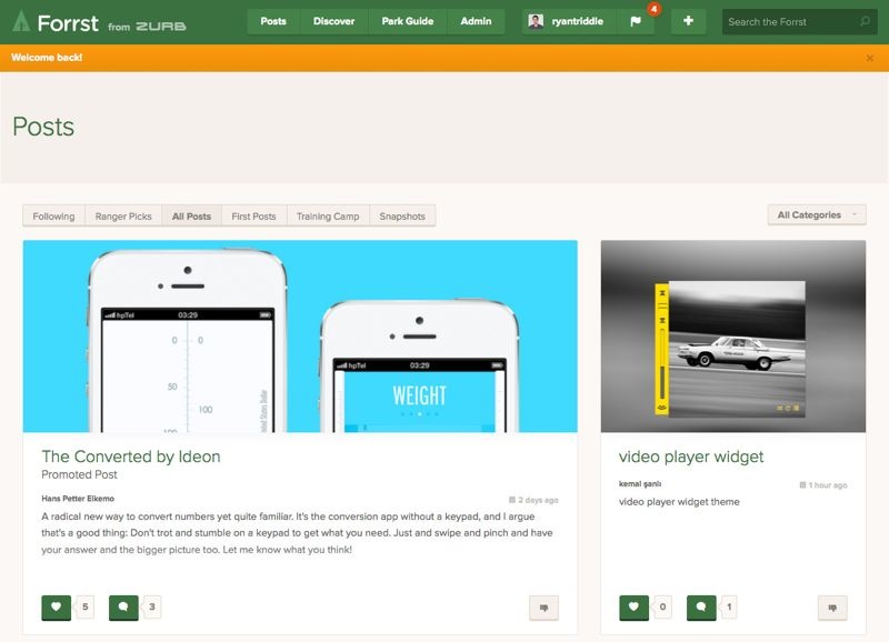
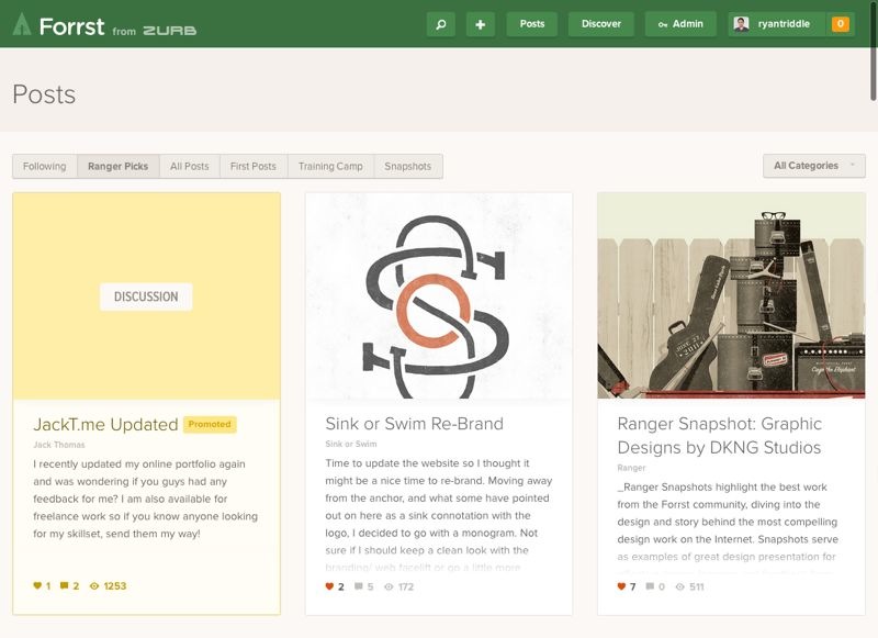
The "before" and "after" of the Post Stream.
That wasn't the only comment we got on the Post Stream. The actions a Forrster could take from the stream came under scrutiny. We originally had buttons for the action of liking or downvoting a post. Samara Dione pointed out that the buttons were too large:
These buttons are taking up way too much focus on both here and in the comments. Is it necessary that they be buttons and not just the icons? If it needs to stay a button, a lighter background would be nice. The tail of the icon speech bubble isn't very clear. The speech bubble of the number of comments & likes has awkward padding. I can't put my finger on it but it feels too narrow.
We made the actions more consistent on both the Post Page and the Post Stream, giving them a similar treatment. But later we iterated, putting a "like" button on the actual Post Page, but allowing Forrster to click the "heart" on the Post Stream.
Iterate. Iterate. Again
The Private Release allowed us to quickly iterate on the redesign and further refine our approach. The best example: the post page.
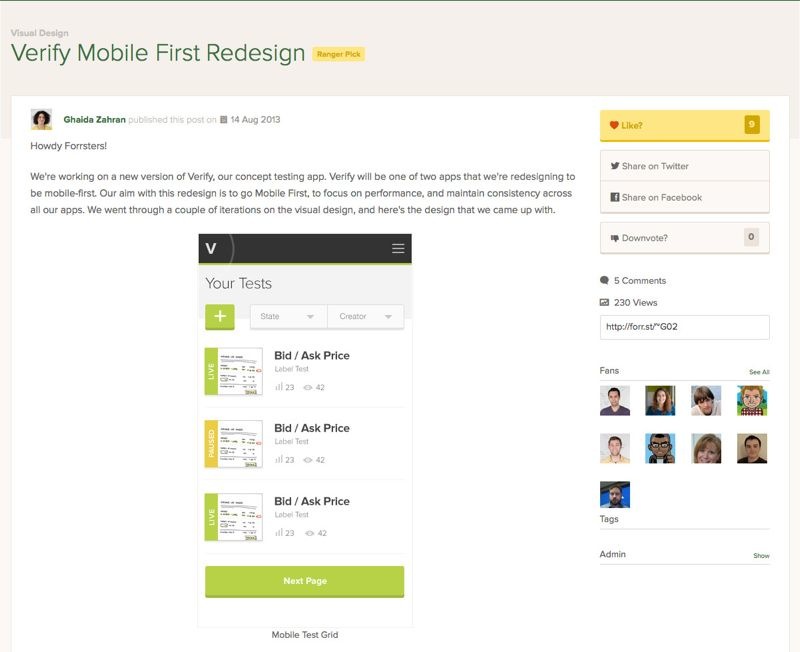
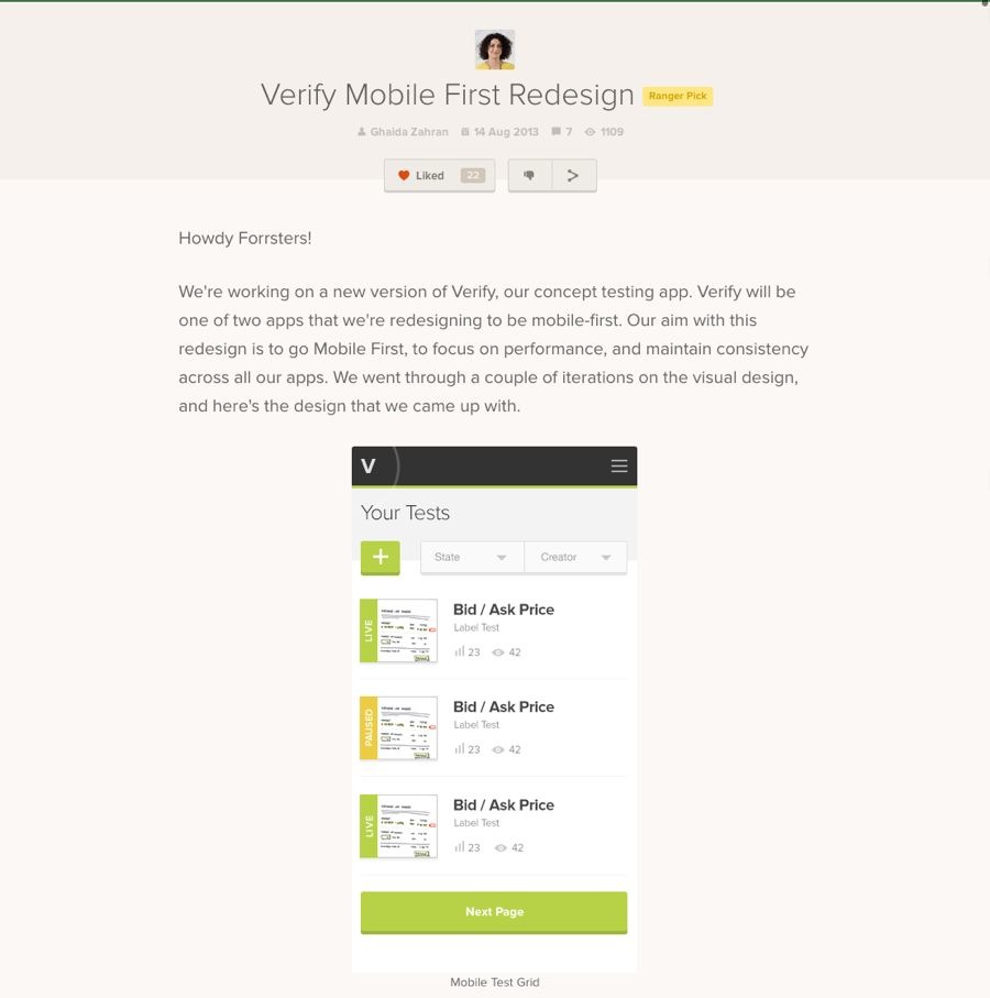
The "before" and "after" of the Post Page.
At first, the post page was a more cleaned-up version with larger images. Then we made it look more like a blog, giving more room for text and images. We placed the "like" button at the bottom, figuring that folks should only like a post once they've read it. The feedback we got was that the action was too buried.
We continued iterating up until last week. We centered all of the content, making the entire page feel more like a presentation of design work than a blog. We also place the actions a Forrster could take — liking, sharing and downvoting — right after the byline so they were no longer buried.
We also got feedback that comments on the mobile overlapped. It didn't quite look pretty, so we refined it even more. Now there's no longer an overlap and it's also easier to follow threaded comments. For a hot minute, we toyed with an off-canvas nav for both desktop and mobile. However, we felt that on desktop off-canvas didn't make as much sense in a desktop context. We cleaned up the nav and reduced the number of actions, yet still making it easy to discover other aspects of the site.
What's on the Horizon
To borrow a phrase, products are never finished, merely iterated on. We're not quite finished with Forrst. We'll continue to iterate. Here's a sneak peek at what's ahead.
Iterations: We're working to bring more Notable functionality into Forrst, including allowing Forrsters to post different iterations without the need to create a separate post.
Leaderboard:We're rethinking the Leaderboard, making it more based on achievements and badges rather than solely on prizes.
Pro features: A major focus for the next round are our Pro supporters, who've helped us get here and continue to help us. We want to make sure they get some nifty perks. Other than directory search, we're giving Pro Forrsters the ability to do other things within the site. Since Forrst is our go-to site for active learning, we want to tie Pro features into our feeder apps and allow supporters to save what they do to a locker.
We're stoked to finally release the new Forrst out into the wild. We're even more excited by the possibilities ahead and to truly make a place of active learning. If you're not a Forrster, don't worry. You can always '.


