We've been in the midst of the Forrst since we took it over in January, pruning the underbrush and working to make it a better place to receive and give design feedback. Today, we're excited to begin our Private Release of the new Forrst redesign. We'll be letting some people in today and a few more each week.
Forrst was (and still is) a unique place where those folks could share their work, learning from one another, no matter what stage they were in their design or development education. We saw an opportunity to build upon what founder Kyle Bragger had created.
Our goal with Forrst has remained clear from day one: to foster a place where designers can get clear, actionable design feedback. And feedback plays an important role in that ongoing education and a person's ability to improve their skills.
We launched into the redesign with that goal clearly in mind. It informed everything we did. We knew that we had to focus on three things:
- Creating a mobile web component so Forrsters could comment from their smartphones or tablets
- Improving the visual design to allow for better consumption of posts
- Adding the ability to annotate assets so that Forrsters could leave contextual feedback
With the mobile component, we knew that Forrst had to be responsive and it had to be Mobile First.
Taking Forrst to Mobile
We've been advocating a mobile-first approach at ZURB, even making our responsive framework, Foundation, Mobile First. We had just released Foundation 4 when we embarked on the Forrst redesign, so we were ready to put our ideas into practice on a larger scale. Forrst had to be responsive and mobile-first.
We thought long and hard about how to foster great feedback on mobile. Would users actually want to post from a mobile device? Or would they want to comment more? How would we encourage Forrsters to really think about how they would construct their post? And we took some of those questions directly to Forrsters.

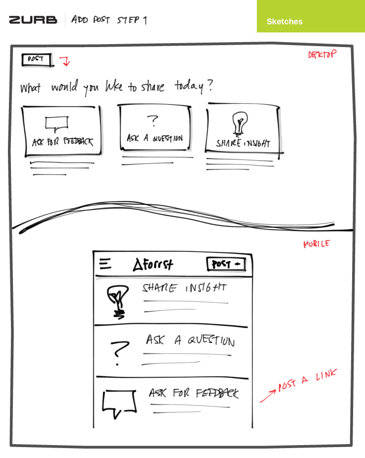
Our earliest sketches centered around improving post quality by bringing back post types. We wanted to frame what Forrsters were sharing by giving them the opportunity to think about what specific feedback they were looking for, whether their posts encouraged insight or were merely posted for vanity's sake. A huge component of this was whether there would be parity on desktop and mobile.
We concluded that most folks wouldn't want to make a full post, with images of their work or code, on a mobile device. At the most, they'd want to start a discussion by posing a question. We turned to Forrsters to validate our idea, asking if they'd post from a mobile device. The majority of those who responded said they'd prefer to only comment. But we also knew that simply making the posting responsive didn't equate to an optimal mobile experience.
Browsing the Post Stream

Another area we focused on was how to consume posts on mobile. We played with an option to collapse the expanded post view. But most folks we surveyed didn't want to toggle views and preferred the expanded view.
As we began to build more detailed wireframes and move into the visual design, we stayed true to our mobile-first approach. We used Live View to make sure the layouts we were crafting in Photoshop were a true 1:1 representation of a mobile experience.
Putting It All Together
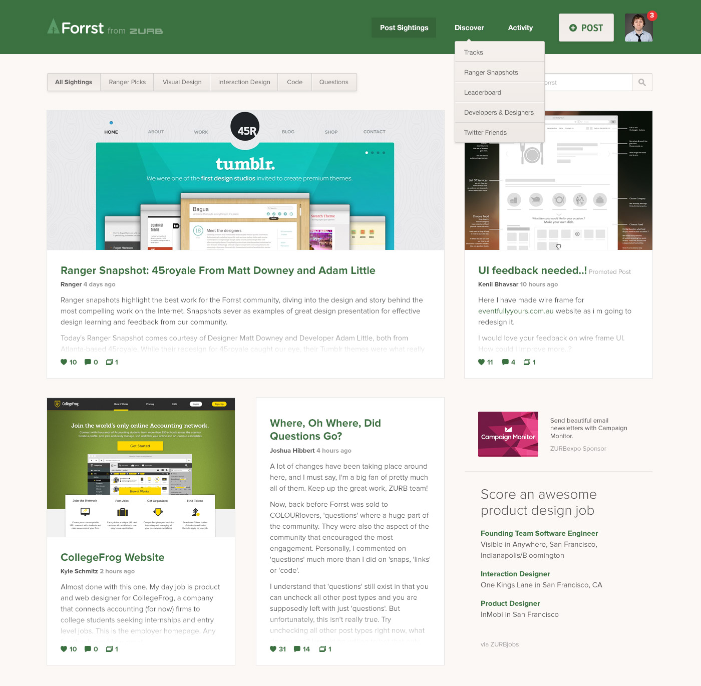
Forrst's new look is a big part of this redesign. We thought it was important to retain a Forrsty feel — keeping the familiar color palette of greens and tans. However, we went easy on the excessive ornamentation. We don't want unnecessary embellishments on our end to interfere overpower the work of Forrsters.
We also took a dramatic redesign of the post stream. Instead of a blog-like layout, we now display posts in compact placards, giving viewers a concise snapshot of each post. This allows viewers to skim through the post stream more efficiently and makes the stream more visually appealing. Posts that don't include images will have a placeholder image applied to them, ensuring that the post stream looks great no matter what.
Giving Contextual Feedback

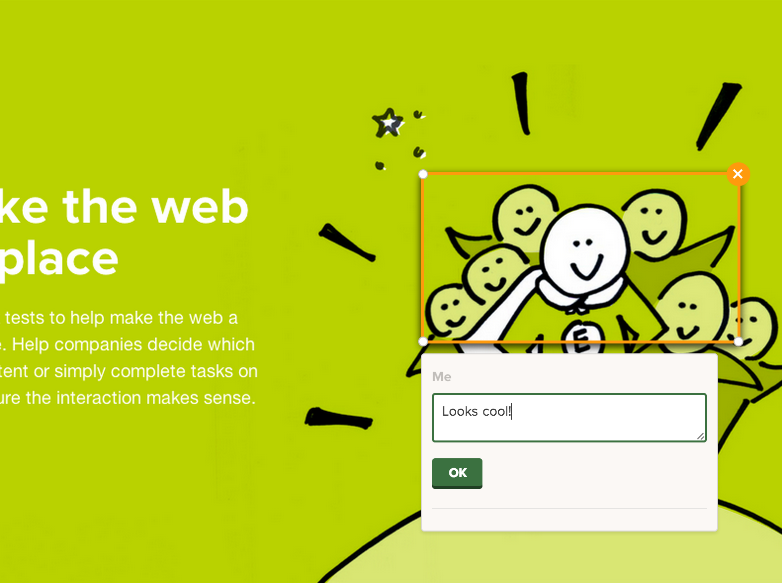
The biggest feature that we're putting into Forrst is annotations. We took the functionality of Notable and baked it into Forrst so that Forrsters could leave contextual feedback on images. Context is everything when it comes to feedback. When you can specifically point to a particular aspect of a design, a nav bar or a button, your feedback will make much more sense than it would in just a list of bullets.
Annotations, on mobile, aren't quite possible … yet. It's hard to get precise annotations on a mobile device because the interactions aren't accurate enough for the size of the screenshot in some cases. Things that are reasonably large on a desktop become unreasonably small on a mobile device. However, we didn't want to just ignore annotation comments on a mobile device. Nor did we want to lose the context. While browsing on a phone or tablet, you'll see those comments in the comment thread along with a small image of where the annotation is approximately on the actual asset.
The annotation page is also responsive. You still won't be able to annotate the asset, but you'll be able to view it along with a comment thread of the annotations. Neat, huh?
Clearing the Woods
We're still clearing the woods and making improvements to Forrst in the Private Release while at the same time eating our own dog food. We're letting folks in weekly so that we can get feedback on what works, what doesn't and how we can make it better for folks to give and receive feedback on Forrst. We want to thank the first group of 10 let in today for being the first to join and those of Forrsters who have continued to give us feedback during the redesign process.
We believe that our mobile-first approach and annotations will help make Forrst the go-to place for design and developer feedback. If you're a Forrster or want to join, now's the time to request an invite. We're ready to part the velvet rope and let others into the Forrst!


