We had a fun time digging into Nathalie’s visit from her dad. It’s really a great story of how people are changing their browsing habits.
He was in town visiting, found something wrong with her rose bushes, and diagnosed it by asking Chat one question at a time. Is it serious. Should I prune it. Will it spread. What should I buy. By the end he understood the plant, and he never once thought about keywords. He just talked until it made sense. (signup for our newsletter if you want more stories like this).
We wrote about what that means for the homepage. This is the follow-up for the people who have to build the thing. If visitors now arrive having already talked their way toward an answer, what do we actually do differently when we design the site they land on?
The short version: for twenty years, we designed the homepage as the start of the journey. AI moved the start upstream. The conversation now happens somewhere else, before anyone reaches you. So the job isn't to begin explaining. It's to rejoin a conversation already in progress.
In many cases, an agent will review your site before a human ever lays eyes on it.
That sounds abstract. It has very concrete consequences. But before the design decisions make sense, it helps to understand what "the conversation" actually is, because the underlying mechanism is the thing that changed.
What's actually happening when they talk to it
I'm a designer, not a machine learning researcher, but the shape of this is clear enough to explain plainly, and the plain version is the part that matters for our work.
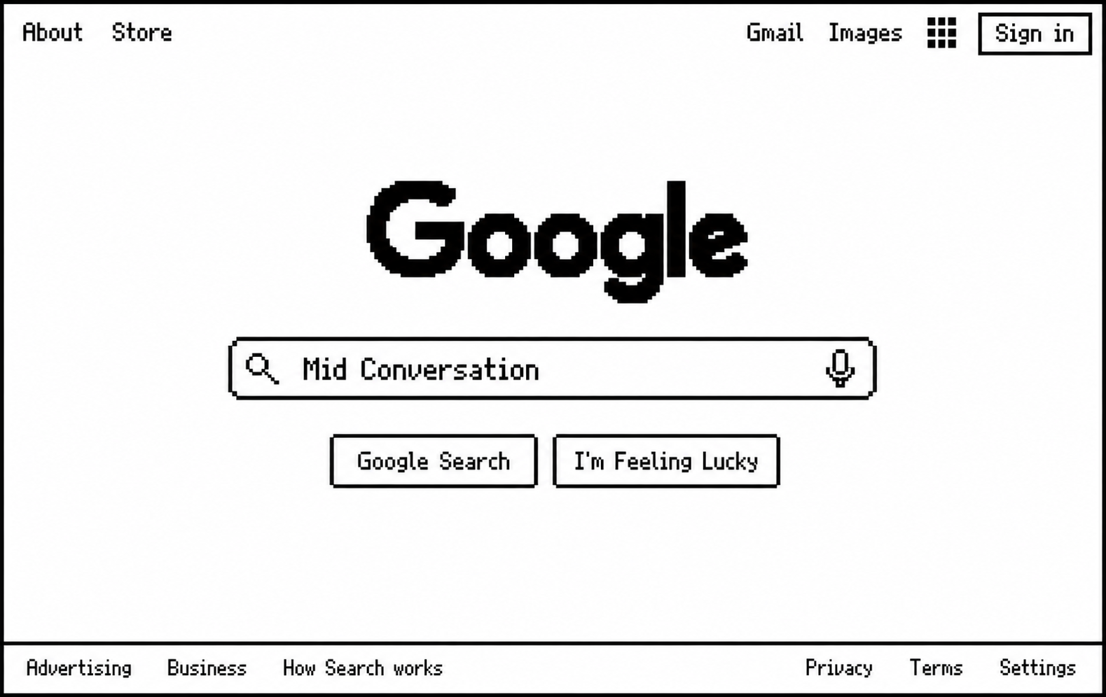
Old-school search retrieves. You hand Google words, it matches them against a giant index, ranks the pages, and hands you a list. The machine finds where the answer might be. You do the rest. That's why searching felt like a scavenger hunt: ten tabs, conflicting advice, and you assembling the answer yourself. Retrieval points inside the door. It doesn't walk you in.
Half of U.S. consumers now intentionally use AI-powered search. Among those users, 44% call AI search their primary source of insight, compared with 31% for traditional search.
What your visitor just came from does something different. It isn't pulling an answer off a shelf. It's generating one, a piece at a time, by predicting what should come next given everything that's been said so far. And that context is the trick. When her dad asked "will it spread," it didn't need him to repeat that he meant black spots on a rose leaf. All of it was still in front of the model. Each answer builds on the whole conversation, not just the last line. That's why it feels like it comes back to you instead of at you.

It helps to know these systems aren't written, they're grown. Nobody typed out rules for diagnosing a rose bush. You start with an enormous tangle of connections, loosely modeled on how neurons connect, and at first they're random and useless. Then you train the thing, first by making it predict text across a huge amount of writing, then by rewarding the responses you want, more like coaching a skill than writing a rulebook. What you get isn't a program you can open and read. It's closer to something cultivated, which is why even the people who build these models study them to figure out what they learned.
Two things fall out of that, and both matter for design.
- First, people now arrive expecting to be answered, not filed into a navigation menu, because that's what the grown thing did for them.
- Second, because it generates rather than retrieves, it produces a confident, fluent answer even when it's wrong.
Search handed you ten conflicting tabs and made you judge.
Conversation hands you one smooth answer and removes the friction of judging. So your visitor may show up already confident about something untrue, shaped by a conversation you weren't part of and can't see.
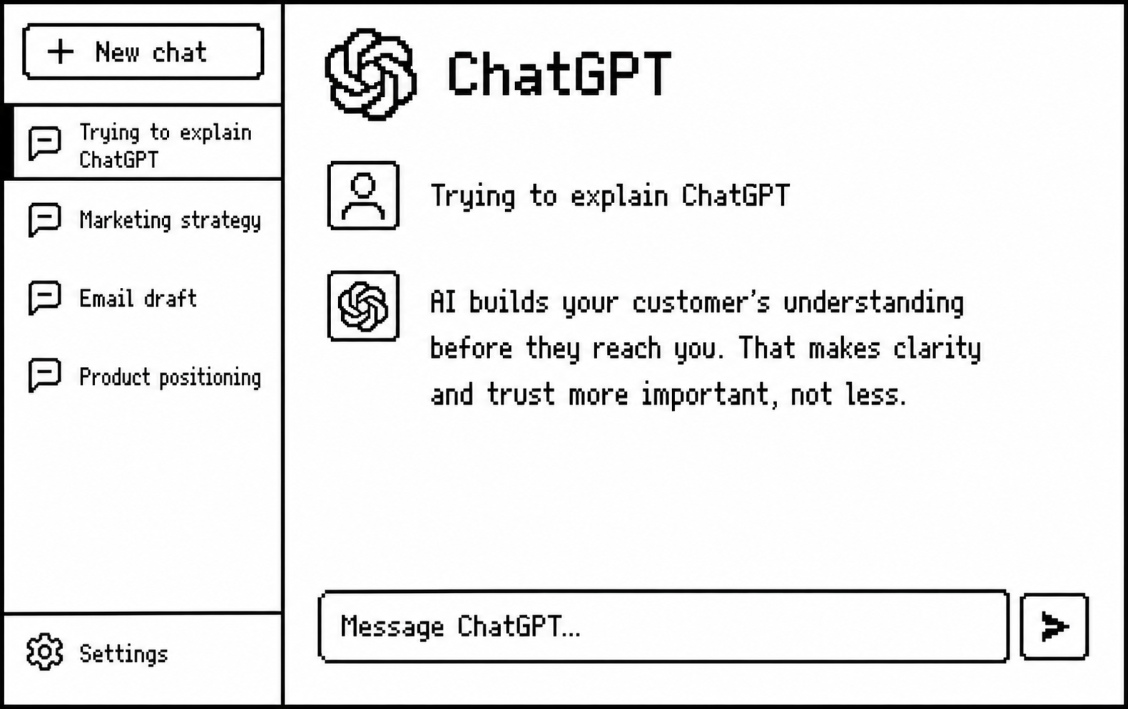
The takeaway isn't "AI explains things, so we can explain less." It's the opposite. When a machine is building your customer's understanding for them, in a way nobody can fully inspect, the burden on your product to be clear and trustworthy goes up.
Now the design side. It only makes sense once you know what the person on the other end is actually doing.
What the visitor is actually doing now
The shift is already visible in the data. Nearly half of ChatGPT messages are people asking for information or advice, and more than 70% of AI-search users use it to learn about categories, brands, products, and services. When those people reach a website, they behave differently: AI-referred shoppers spend 32% longer, view 10% more pages, and bounce 27% less. They aren’t arriving at the beginning. They’re arriving with a model of the problem already forming, looking for evidence that the product matches it.
They arrive with a formed question, not a blank slate. Her dad didn't show up asking what a rose is. He showed up at "is this serious and what do I buy." Your visitors land three or four steps into their own thinking. A page that starts at step one, explaining what category you're in, talks past them.
They arrive with context you didn't give them, and some of it is wrong. They talked to an AI, read a competitor, heard it from a colleague. They have partial understanding, and sometimes confidently wrong understanding. Your page has to meet the accurate version and quietly correct the wrong version, without knowing which one walked in the door.
They expect to be answered, not routed. Conversation reset the baseline. When someone can ask a plain question and get a shaped answer, clicking Products then Solutions then Platform to assemble your meaning by hand feels like labor. Navigation is the visitor doing retrieval themselves, and they can feel the difference.
They judge trust fast and leave faster. They just came from something that explained itself instantly and patiently. Your static page gets compared to that, whether that's fair or not. Comprehension in a few seconds or they're gone, back to the machine that will happily explain you in your absence, using framing you don't control.
That last point is the one that should keep product people up at night. The alternative to your page isn't a competitor's page. It's the visitor asking an AI about you and acting on whatever it says.
What we build to meet it
Here's how those human realities turn into design decisions. None of this is exotic. Most of it is discipline about what goes where.
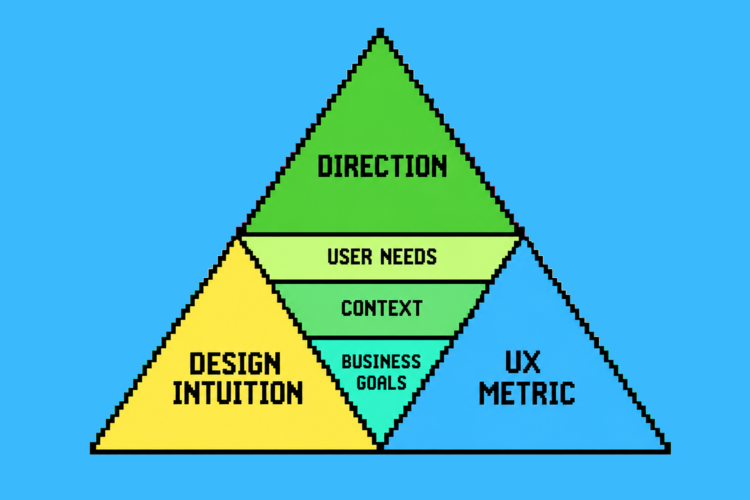
Answer the second question, not the first. The homepage's real job is to answer "what is this and can it help me" fast enough that the visitor can get to the question they actually care about. That's the comprehension work, and it's the entry fee. If people can't understand you in seconds, nothing else on the page gets a chance. On one project we watched comprehension climb past 80 percent once we stopped leading with what the company wanted to say and started answering what the visitor came to ask. Engagement followed. This is step one and everything below assumes you've cleared it.
Structure the page as a branching conversation, not a linear pitch. Her dad's session branched: serious, then prune, then spread, then buy. Real understanding moves in questions, not in a fixed sequence. So anticipate the two or three most common next questions and make them visible paths, rather than forcing everyone down one scripted narrative. A pattern that works well here is the expandable tile: a product tile that opens into a modal giving a quick snapshot, as much or as little as the person wants, with a path to the full page as a second click. Stripe does this. The visitor gets their answer without losing their place, and you learn which questions people actually open. That's the page mirroring a conversation instead of delivering a monologue.
Lead with proof and orientation, hold the architecture. People arriving educated want confidence and evidence, not a system diagram of how all your parts connect. Trust markers, clear capability, "here's what this does for someone like you." The architecture diagram isn't wrong, it's just misplaced. It's a great sales vehicle for someone who already cares about how the machine fits together, which means it belongs on the page they visit once they care, not on the front door. Lead with the diagram and you're asking a stranger to adopt your internal view of the world before they've decided your world overlaps with theirs.
Write copy that answers instead of describes. This is the sharpest shift, and the easiest to get wrong. Most product copy is written for navigation. "Unified Data Integration Platform" is a label. It tells you where to click, not what you get. But every product now competes with an AI that will cheerfully rewrite that label into a plain answer: "move your data between systems without building a team to babysit it."
If your own copy won't do that translation, the visitor will go get it done somewhere else and come back, or not come back, shaped by someone else's words. Write the answer, not the category.
Make the next question cheap. Search made you open ten tabs and do the synthesis yourself. A good page makes the next step nearly free: obvious, low-commitment, and connected to where the visitor's head already is. Scattered attention across a dozen competing calls to action is the enemy. On that same project, focusing a single clear call to action pulled 45 percent of people into the path we wanted, where before their attention had leaked across navigation and noise. One good next step beats five mediocre ones.
Design for being wrong-corrected. This one is genuinely new. Because some visitors arrive with confidently wrong context, the page needs a graceful way to say "you may have heard X, here's the actual shape of it" without sounding defensive. Nobody used to design for this, because the wrong ideas used to form on your page, where you controlled the framing. Now they form upstream, in a conversation you weren't part of. A short, plainspoken "here's what we're often confused with, here's the difference" can do more work than another feature block.
The restraint this all requires
There's a trap sitting inside all of this copywriting.
You cannot out-explain the AI. If you try to make your homepage as thorough and patient as a full conversation, you get a wall of text nobody reads, which fails the very comprehension test you were trying to pass.
The instinct to answer everything is the thing to resist.
The answer is humans! It’s actually the opposite of completeness. Pick the two or three questions that matter most to the people you actually want, answer those cleanly, and make the path to the next question obvious.
Only 6% of Americans who encounter AI search summaries say they trust them “a lot.” Another 46% have little or no trust in them. AI forms the customer’s understanding, but the website still has to prove that understanding is correct.
Let the conversation continue, page by page, click by click, instead of dumping the whole thing on the first screen.
Her dad understood the rose bush because every answer built on the last one, not because any single answer contained everything. That's the model. Your site isn't one big explanation anymore. It's a series of good answers, each one earning the next question. The homepage stopped being where understanding happens. Your job now is to design the place where an understanding already in motion can keep moving, and turn into action.