Designers have an urge, an aching, for creating something unique. Whether we're following current trends or bringing back the well-forgotten past, we're trying to outdo ourselves or each other, to combine elements just so, hoping to make our peers [secretly] wish they'd thought of that design solution. And sometimes, our search for that design epiphany can send us on a goose chase for frivolous, unnecessary visual elements and interactions, which leave our work muddled and confused.
Busy, complex design can be quite brilliant too. Being able to balance a ton of seemingly unrelated elements is an art in itself. And it's really hard to pull off! Although, is it harder to conduct an entire string orchestra or produce a violin solo that breaks someone's heart?
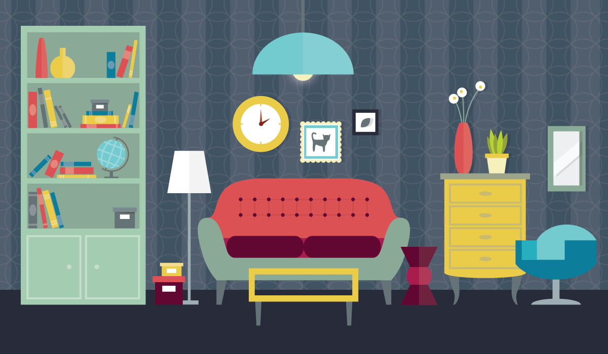
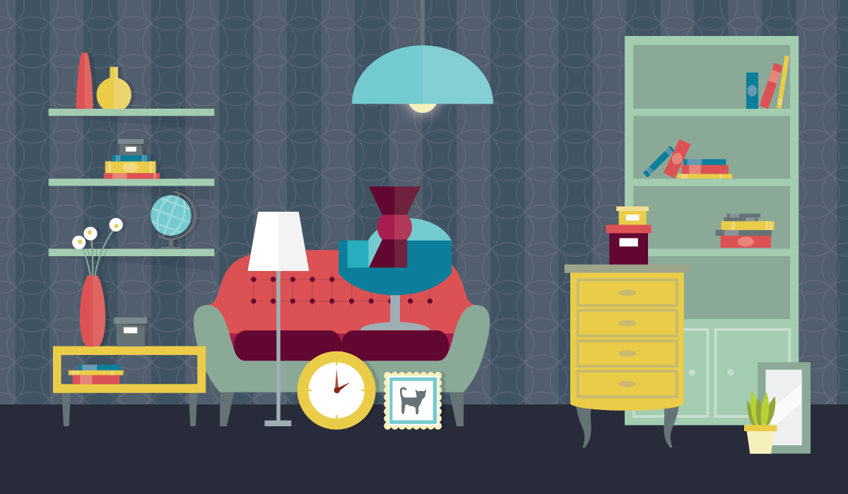
It's the question that designers must have been contemplating since — well ' always. And it appears that in any design medium, the design often starts out quite simple, goes rather overboard, and is then streamlined over time. You can witness this evolution in almost any longstanding brand's logo design, in our favorite devices, even our home furnishings.
When is It Overdesigned?
The mark of a great designer is restraint. It's working within the constraints of goals, technology and time. It's knowing when to stop ''tweaking" that layout or workflow, to have the guts to let work out into the world, to observe and gather ammunition for the next iteration.
Frankly, it often comes from practice. It's the experience of taking design work to the brink of being overwrought a few times, learning to recognize it, and learning to edit away. And it's realizing that by constraining the problem to just a few variables, you're able to create magic — something timeless, so simply obvious.
Early web products were quite busy, compared to the streamlined web of today. And it makes sense — those early web designers were trying to move people from their physical environments to digital ones. The easiest way to do something like that is to give people a sense of familiarity. And it worked. The scrapbook-look got a whole lot of people reading blogs. A bookcase inspired the early iBooks design. And can we forget the countless incarnations of the coffee-cup stain?
It's safe to say that we got past the overly-skeuomorphic design. The design community has been editing. Overdesigning is now considered one of the cardinal sins of design, the top one. And looking at other industries, many beautiful products today are quite minimal — just a handful of design threads that hold an interface, a brand, together.
A Case Study in Editing
Since joining ZURB three years ago, it's been my personal mission to identify unifying branding patterns in our growing business. In 2012 we made our first push at unifying our email newsletters. At the time we didn't have a lot of unity between our various properties, so we weren't sure we could even pull off a unified look for our emails.
It wasn't just a design exercise — it rarely is, nor should it be. We realized that creating unity in our communications, we would give our customers a greater sense of stability and confidence in ZURB. Show them that no matter which property they visit, or whom in the company they talk to, they can expect an equally high regard for their needs and a high level of execution.
That first batch of emails went through many iterations. As we worked through the purpose of each email, we were also looking for repeatable patterns and similarities between them. And we found them. After a few weeks of shuffling, defining, and refining, we ended up with a solid set of templates, email rules to live by:
- Consistent messaging structure
- One core color, tied to its parent site
- Unified typography styles
- Unified image sizes
We weren't able to reconcile differentiating or unifying our corporate communications versus our in-app messages. Our product emails had a slightly different layout, though the above "rules" were still in effect.
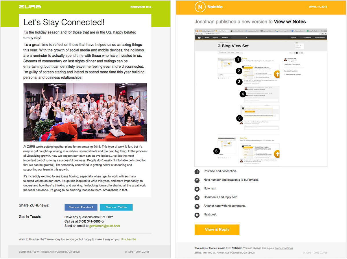
ZURB News (right) was the base for our newsletters, with card-like content blocks, while our product notifications (left) were more utilitarian.
We lived with these templates for about two years. Meanwhile, we continued growing our business and refining our brand. During that time we expanded Foundation, launched University and its Library, and refreshed our corporate site a few times.
We have been editing along the way, too. Instead of taking each property into its own design direction, we keep reeling them back to the core of our brand guidelines — the top three that had survived all the elimination rounds in color, typography and faces. We also used words that echo through our design approach and our work environment: open, positive, candid.
We kicked off 2015 with a new pass at the emails. This time we've reduced them again. The fewer patterns, the fewer variables, the better. We're focusing more on the purpose and the content, aiming to create impact through utility.
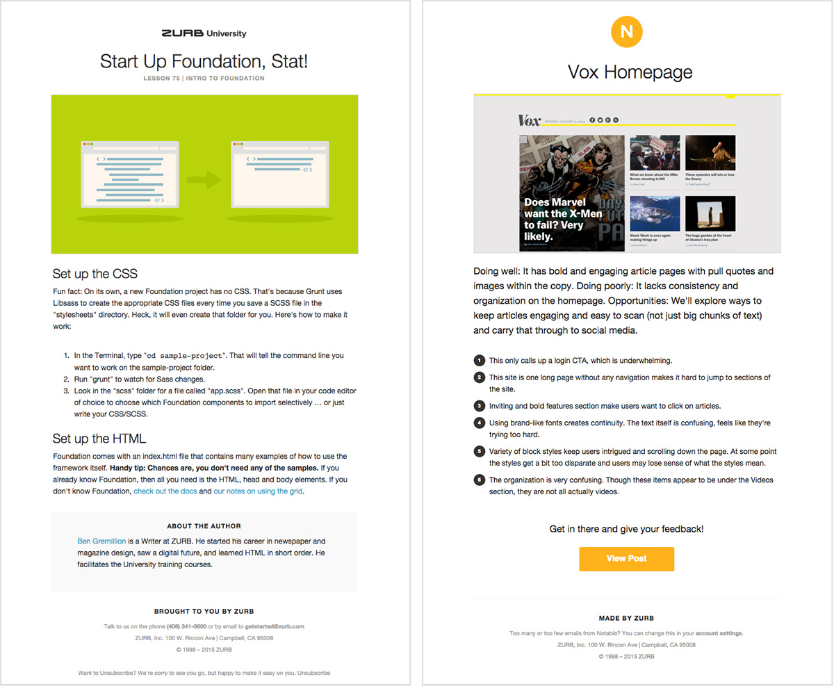
Our new templates are very open and simple.
In reality, we actually stuck to our original set of rules. We just edited. A lot.
Are You Ready to Edit?
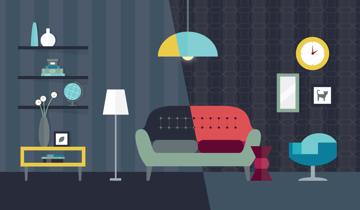
Thinking back to where we were three years ago, I don't believe we could have designed our templates any simpler than we did. We just weren't ready. Our business was still evolving, with four distinct business units emerging and gaining their own footing over time. They didn't have enough definition for us to decipher which brand elements were key.
We were still exploring and finding the confidence to put design guardrails in place. We had combined photography with illustrations with sketches with drop shadows with overlays with whatever else we could think of. We were looking for that unique combination of elements, making decisions that weren't sustainable across all of our sites long term.
Today we have much more clarity in our brand voice and style. It's been carefully edited over time. As we explored new design choices, something really different, we'd step back and realize that it just wasn't us. Every single time. We kept pulling back until we were left with a handful of simple rules — color, typography, faces, graphic illustrations — again. We aim to delight our customers with smart design, to know their intent in their interactions with us and our products, instead of overwhelming their retinas. It's a good foundation to build on, to see how we can continue evolving our design aesthetic without going over the rail.
So What Now?
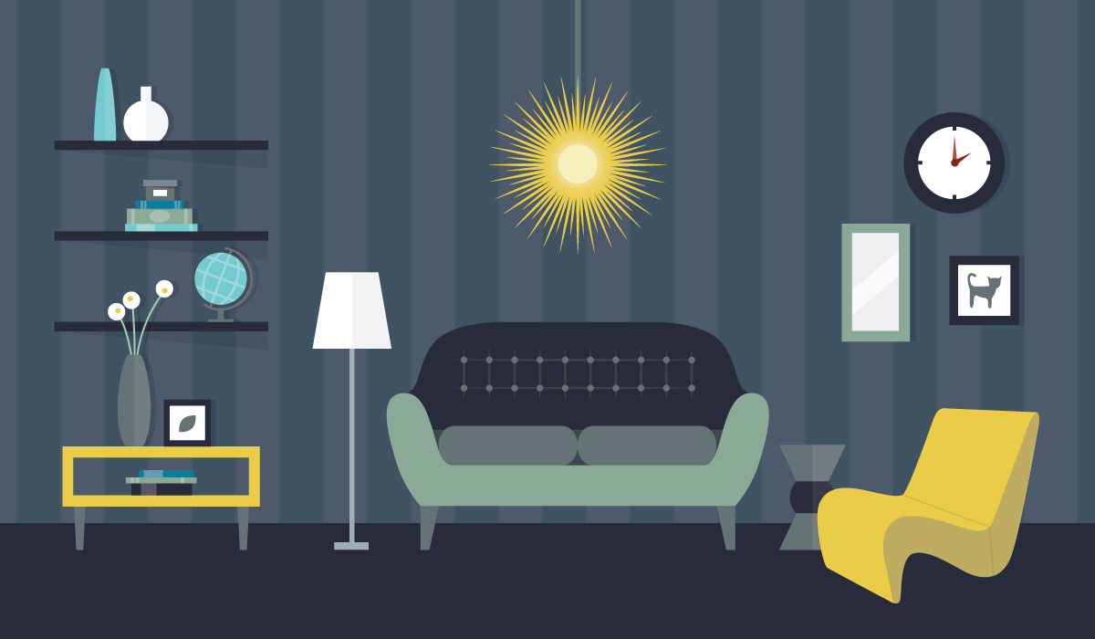
To find balance in something, you can't be timid. You have to go all the way, then pull back. How can you know what's just right without experiencing what's too much? So next time you're laboring over design, ask yourself "Is it overdesigned?" If every element has a purpose and a future, it's a good sign. Then, step back and take one thing away.


