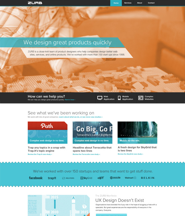
 Our old homepage.
Today we're super stoked to relaunch our ZURB.com homepage. Over the past three years, we've been tinkering and making changes across ZURB.com. We rebooted our blog and launched our ZURBapps page. But our homepage was a bit neglected. The homepage needed to make a bold statement. It had to scream ZURB.
Not just in terms of visual design. It had to scream what we're all about at ZURB — helping people design better for people. We've been working hard at streamlining our message, even going back to our roots with product design. So we had to make sure we communicated that across all our pages. The new homepage also had to better showcase our work and our team.
In so many words, the old site was trapped in the past, stuck in the antiquated 960px grid while the rest of our work was moving more and more toward making sure our designs looked good on any device. We have been moving over a lot of our sites to Foundation and wanted to make sure our new homepage got a piece of that action.
From Sketches to Prototypes
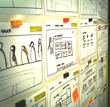 Some of our early sketches.
Like everything else we do, we started with a few sketches to get our opportunities out on paper. From there, we even created some lo-fi sketch wireframes to get a feel for how the site would flow.
Through that exercise, we discovered that longer pages would work much better than splitting up the content into many different pages. The web is moving more and more toward longer pages. That's because people tend to scroll through web pages mimicking how they would view a page on a mobile device. We also didn't want people jumping around the site when accessing it on mobile.
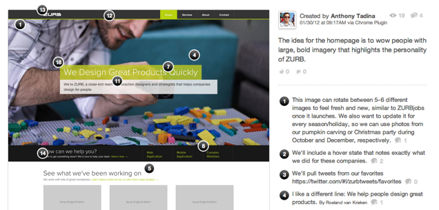
We then moved into a coded prototype using Foundation. The prototype went through a few iterations, with each one exploring ways to consolidate sections and add more of our ZURB personality. On our third iteration (third time's a charm!) we had many rounds of feedback on Notable. Click on the picture below to check out one of our many rounds of feedback:
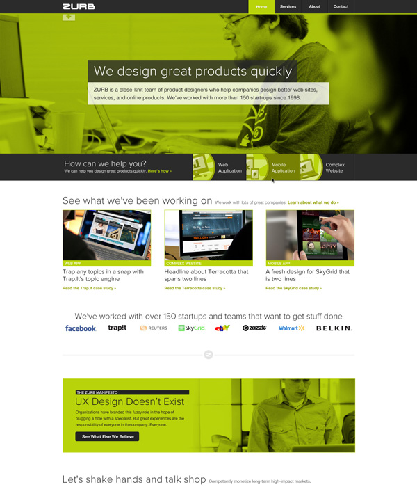
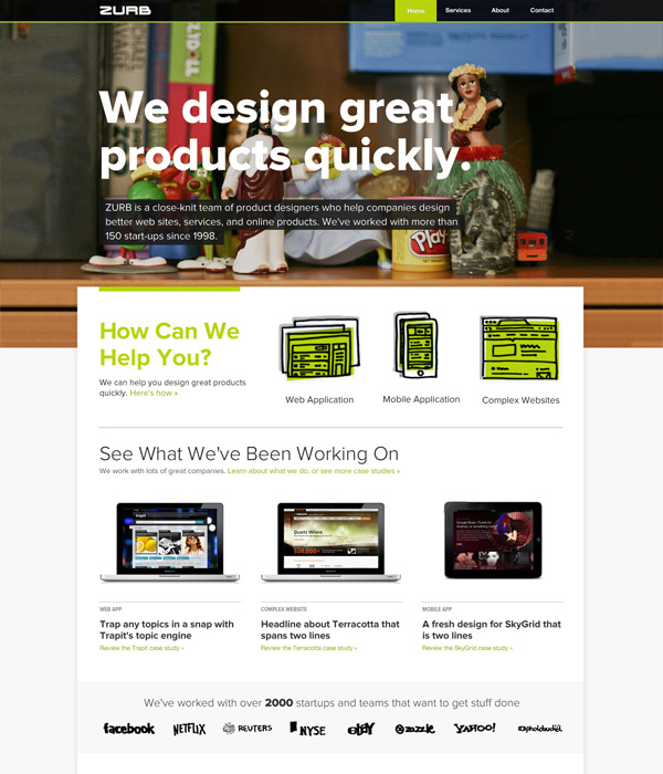
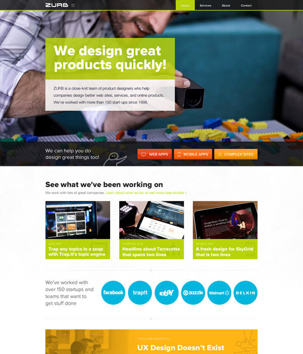
We then created four visual designs from there with each designer taking a shot at how they felt the new ZURB.com should look and feel like. It's fascinating to see how the same content can be transformed in so many ways. Check them out by clicking the images below or on this Influence preso:
We decided to go with Variation Two as it created the nice, big impact we wanted. The design had that wow factor we were looking for with the large photo. Everyone seemed to gravitate more toward this design and presentation.
Containing the content also stood out in this design. It was something we hadn't done on the previous homepage. But putting the content in a container made the picture at the top pop out more. It gave the image a much bigger impact. Adding colors on the page also helped make all the pages seem more cohesive.
Additionally, the design incorporated sketching. This showcased one of our design methods and also put the design more inline with our other pages, like our ZURBapps. We also wanted to create more glyph-like icons to also further connect the page visually with our other properties.
Built ZURB Tough For All Devices
Not only did the visual design add more icons and sketches to showcase how we work and what we believe in, we also busted out the camera and took tons of pictures around the office. That's because we wanted the new page to focus on people and product design.
Our site is also broken up into different sections — such as the homepage, the about page, the team page — with a nav bar that lets you easily navigate between them and our different properties.
We kept the pages as one long running page for one page load. This meant that you didn't have to jump around to see what's new on the page. Bonus: being built on Foundation meant it looked sweet on smartphones, tablets and desktops.
Not Without Its Challenges
The new rebuild wasn't without a few challenges. There were problems using full-width images at the proportions we wanted. It took a few impromptu photo shoots, but we found a few that worked nicely. We plan on rotating the images throughout the year, so be sure to check back often.
But enough of that — poke around the new site and let us know what you think in the comments below!
Visit The New ZURB.com