A recent article by Dan Saffer has shed light on a huge shift in the curriculum design schools are teaching. In many design programs around the world, there is less focus being placed on pixelpushing and more emphasis on strategy and 'big system changes'. After a decade of trying to get designers to think beyond their craft and onto the bigger organizational problems that will truly propel design forward, these ideas are finally making their way into design education' and this is horrible.
Now anyone who's kept up with our thinking over the last two years may be doing a bit of a double take at that last sentence right. We've been exhorting design leaders to stretch themselves, to go beyond just being masters of their craft and start embracing organizational challenges and take ownership of business outcomes. These are the type of design leaders that will advance our industry and bring about real impact, the ones that take on these problems and run with them. But you need to learn how to walk before you can run. The most effective design leaders are the ones that understand the fundamentals of good design, and the best way to learn design is to understand how things are actually constructed. Given the complexities of interactions today, having this comprehension is absolutely vital.
Yes, Craft Matters
Today, pixelpushing has become a dirty word, perhaps because of its association with production. We've poked fun at the Dribbblification of Design, the obsession that many designers have of creating shiny new things that don't actually work or solve problems. We've always felt that while design can be beautiful, design and art are two different things, and we've warned about the shrinking shelf life of the artifacts of design.
In the near future, algorithms and robots might solve the design production complexities of today in the near future, things like creating layouts, interpreting content and presenting relevant content. However, pixelpushing is very much alive, and contrary to some of our writing, we still believe in the near term that it will remain an important aspect of digital product design. The pixel itself may not be relevant, but the concept of pixelpushing as craft is still very relevant. It's in our blood at ZURB- we specifically call this out in our manifesto:
Craft matters- Teams need to be composed of more doers than sayers or planners or documenters. We want people who have great ideas, but also take pride in getting their hands dirty and building something to inspire their teammates and customers. For a designer, craft means knowing when to pick up a pen and how to use it to represent a complex idea in an interface. It's also imagining a person's flow through a series of actions. Craft means caring about every detail that matters to give it purpose- every word, line of code, or pixel- and possessing the skills to do so at a high level.
What is a Pixel?
In pragmatic terms, the pixel is smallest addressable element in design. The word "pixel" was first published in 1965 by Frederic C. Billingsley, to describe the picture elements of video images from space probes to the Moon and Mars. The concept of a picture element, however, dates to the earliest days of television to describe the combination of pix, for picture, and element. It wasn't until the seventies that IBM formally started to use it to describe the technical reference documents for their PCs.

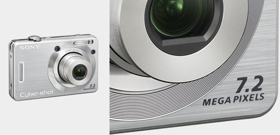
In the early 2000s the concept of a pixel was suddenly thrust into our common zeitgeist as digital cameras pushed their superiority by the number of megapixels they produced. It was a confusing ordeal to purchase a digital camera because manufacturers had convinced us that more pixels was better. However, anyone with some design skills understood that the number of pixels may have created more resolution, but that rasterized images depended on a lot more factors to create a crisp, compelling image.

Megapixels soon fell out of vogue as people began to understand that the number of pixels had less impact on the picture quality than the perceived clarity of how those pixels were presented. Pixels, however, still embody the fundamental building block of sound design.
The Craft of Pixelpushing
In my post last week, I warned of letting beauty get in the way of design. But this isn't to say that understanding how to use pixels isn't important. On the contrary, the craft of design is a critical part of being a great designer and serves as a way to learn the fundamental of good design. I know this through personal experience.

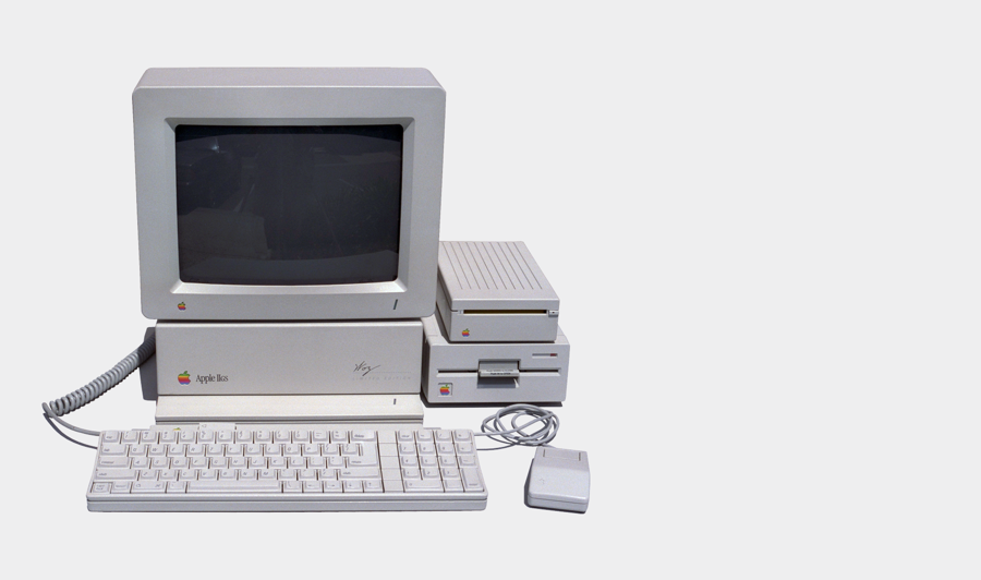
I can remember spending hours in front of my Apple IIGS in middle school, learning how to manipulate images pixel by pixel. It taught me a great deal about presenting design and the power that a computer could provide in capturing a vision. Learning was slow and based on the lessons my photography teacher had taught me (lighting, composition, depth, etc). Resources to learn how to make images were not readily available in the eighties, as the internet was still just starting to take shape. I'm sure those early days of learning my trade had a big impact on how I expect designers at ZURB to learn.
Designers at ZURB learn to work across the entire design spectrum, from product decision making, to coded style guides. Having this perspective in the design process helps us anticipate and see problems from many different perspectives. Understanding how to use pixels gives us insights into the medium we use to produce good design. We've written a lot about the need for designers to spend more time influencing business decisions, and yet effective persuasion requires understanding how to use pixels to present compelling ideas.
Pixelpushing isn't just about crafting production ready design, it's also about understanding how to develop compelling ideas with attention to details to inspire a team within a design process.
The Beauty of the Pixel
Through my college education in the nineties and into my first job, I focused a great deal on the production of ideas, learning to use tools to make creative elements tell a story. Like many designers of my time, I'd spend hours at the computer deconstructing and copying my favorite pixel artists. Something as simple as a donut icon was magical- the subtle shifts in pixels could convince my eye that these icons had depth. I was amazed by the creativity of these pixel pushers.

I'm two decades into my design career and still appreciate a beautiful crafted object. I can only assume most designers still share this appreciation for pixels. And if there isn't a public acknowledgement, I'd argue most design leaders secretly admire the energy and wild abandonment new designers have to just create beautiful things.
Leading with Pixels
Here's the thing about design that makes it so exciting and frustrating for design leaders: it's both a craft and a way to think about building a business. It's an art and a science. A passion for beautiful visuals inspires many to become designers in the first place, but they are soon forced to deal with the parts of the business that can be less fulfilling with the wrong mindset, the people problems, the business problems, etc. Any designer that has made their way up the corporate ladder understands the frustration of this tension. Staying relevant requires balancing so many skills.
A designer that leans too far in either direction only hinders their impact, and the impact of design in their organization. Focusing solely on pixelpushing and not embracing business outcomes results in beautiful artifacts with ever shrinking value, while tackling organizational, system and people problems before having a solid understanding of how things are actually built limits our ability to solve any of these problems.
The impactful designer is the one that learns to balance these struggles. They have a healthy respect and mastery of the craft, but what makes them truly a force to be reckoned with, is that they know how to drive impact with that work through their ability to rally people and organizations around ideas.
For them, pixels are not the culmination of their work. With their fleeting importance and truncated lifespans, viewing them as such actually lessens their value. It cheapens them. No, the impactful design leader views them for what they truly are: tools to inspire, to shape thinking, to transform organizations, to change things. Mighty indeed.

Bryan Zmijewski
Leading the charge at ZURB since 1998
Our fearless leader has been driving progressive design at ZURB since 1998. That makes him quite the instigator around the offices, consistently challenging both the team and our customers to strive to always do better and better.
Learn more '
Follow him at @bryanzmijewski