Ink, our responsive email framework, made a splash recently. Over the past year or so, we've dived deep into responsive emails. And we learned a lot building our framework, such as Outlook matters and flexibility is key. But the framework gave us something else — a process for producing content on a small device.
Marketers shouldn't fret too much about the technical gotchas of sending out emails. Frameworks help them ensure that their content will be easily read on any device, while a process helps get them through a workflow easily. With those two things, marketers are armed to focus on what matters to their audience — the content.
What We've Learned About Content and Emails
We doubled-down on our email newsletters this year. We have some 145,000 subscribers spread across 10 properties. Each property has its own newsletter. Why put out so many newsletters? We can target a specific interest for a specific audience — like with our Responsive Reading or Product Design Lessons. And we've learned a few things since embarking on this journey.
1. Test, Test, Test ... and Test Again
We learned a rough lesson just days after releasing Ink. We sent out this month's Notable newsletter. Looked great on desktop email clients, but not so hot in mobile, especially iOS. And we rightly got called out on it. Check out how it looked on iPhones:
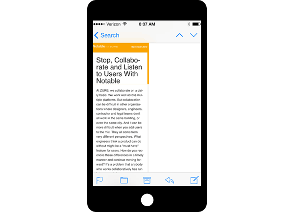
What happened? We tested using Litmus and all looked good. But we could've saved ourselves a bit of a headache if we just looked at an iPhone and not relied solely on Litmus. If we had, we could have scrubbed the code to find the unclosed tag that was caused the issue. The lesson here: you have to test, test and test again. But it's not enough to use a testing service. You have to also look at three or more devices.
And you can't ignore the desktop clients. You have to test in Gmail — which is the number one email client for some of our newsletters — and Outlook, which still has a significant market share.
2. Choose Your Images Wisely
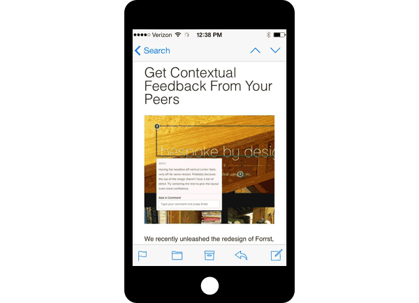
Images are key. They can be small on a desktop, but that won't fly on a mobile device, especially a smartphone. They have to be large enough to still be legible, or else you risk having to make readers pinch and zoom. Using larger images are ideal and most email clients actually have scaling algorithms better than Photoshop. That means it's better to feed in a large image and let the mail client do the work rather than exporting something at 580px.
3. Too Many Links Can Affect Overall Tap-through
Our product design lessons are among our best received newsletters, reaching open rates as high as 51% and tap-through rates up to 25%. But at one point, the tap-through rate tanked to 5% on our lesson, "How to Plan a Webpage Design With Progressive Enhancement". Hardly anyone tapped on our main call to action, which linked over to the course that went with the lesson. What happened? A buttload of links is what, in one case. Check it out:
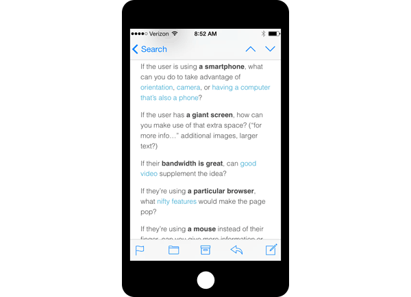
About 61% of the overall taps were spread across the links in the image above.
4. Don't be Too Cryptic, Have Context
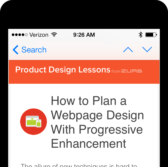
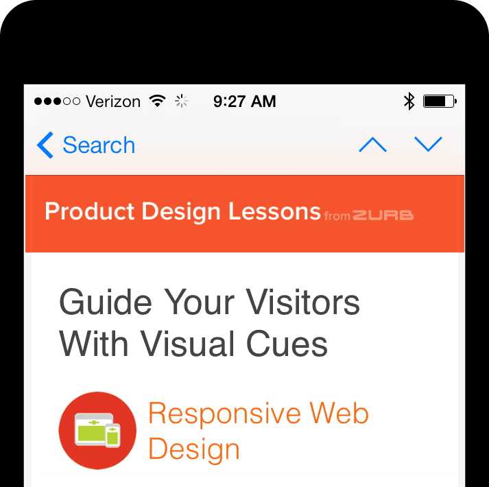
Readers quickly scan an email they open on a mobile device. You can't afford to be vague or coy, especially in the header. We failed to provide context on how our Product Design Lessons tied into a topic or a course. We only had an icon representing the class and nothing to indicate what it meant. To fix that, we added the topic area underneath the title, which was also a link over to the appropriate course. Taps on our Product Design Lessons rose, hitting 18% at one point. Check out the before and after:
5. Shorter Subject Lines Do Better Than Longer Ones
The Return Path found that subject lines that were less than 50 characters generally had a higher read rate. That's not surprising considering that the display limits on an iOS device are between 35 to 40 characters for subject lines.
We've discovered a similar trend with our Product Design Lessons as well. Our lowest open rate, 40.78%, occurred with the highest character count for a subject line: "How to Identify and Deal With Four Personality Archetypes on Your Team." That's 70 characters in total. So all that get displayed would be about:
How to identify and Deal With Four Person
Character counts between 23 to 36 fared better. For instance, "Sketching Form Elements" had a 51.66% open rate. Why? The subject line only had 23 characters and wasn't cut off by any character limit.
6. Finally ... Provide Value to Your Audience
More than 40% of emails are opened on a mobile device, capturing a person's attention is crucial. It's not enough to just get into people's inboxes. You have to provide high-value content, not constantly sell to them. Why? Because you don't get a second chance — only 2 to 3% of emails are opened on another platform.
Continual Iteration and Learning
These are just a few of the lessons we've learned. We're constantly figuring out what makes for better content on mobile devices with each newsletter we send out. And we strive to improve with each one, tailoring our efforts to match the audience of our newsletters. Why? Considering that 79% of smartphone users primarily use their devices to read email over making calls, it would be a waste to spit out nothing but ads to that captive audience.


