We've been through a lot over the past year. We acquired Pattern Tap and Forrst. We released our Product Design Suite. We moved to a brand new building. It was a time of change, but we didn't want to lose ourselves. It was time to regroup and fully understand who we are as a company.
We believe in Design with a capital 'D.' After endless conversations, pages of notes and whiteboards full of sketches, we set down our ideas into the newly evolved ZURB.com.
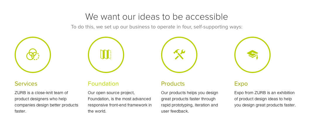
We had to hone our brand so that it told a much larger, more cohesive story about who we had become over the past 15 years. Recently, we told you about how our footer changed to meet the evolving needs of our business, reflecting our four pillars: Services, Foundation, Product and Expo. That had to carry across our sites and into ZURB.com.
Evolving Our Brand and Reaffirming Who We Are
This year, we celebrate our 15th birthday. We're still "design for people" at our very core after all these years. People are at the heart of what we do, how we design. We're not just designing pretty pixels, we're designing products that are meant to be used and solve problems for people. It's a large part of who we are. Our brand had to reflect that.
It had to be:
- Conversational
- Colorful
- And have lots of personality
Because that's also who we are. We're a bit nerdy, quirky, fun and practical. We infused that across the new site. There are bold, bright photos of people, of us. Our voice is conversational, we're always talking with you not at you. No corporate speak here. Of course, we also have personality. Just look at our benefits page — it even has a picture of Britney Spears making it rain.
Streamlining the Visual Style
People who see our website aren't just browsing a collection of pages. They're seeing who we are and what we're about. Part of that was really bringing consistency across our 30-some properties. We'd noticed many styles spread among those properties.

To unify our style, we went with a minimalistic, flat look that would make the different properties unique while belonging to the same family. We even developed our own icons to set the style we were looking for.
Lessons Learned Using Foundation 4
It's no secret that iterating is big in our process. For this iteration of our site, we used Foundation 4 to do more than just build something that worked across all devices. We also wanted to test the waters of the latest version of our framework.
We're about moving forward, and that means leaving IE8 behind. And since it only accounted for 0.8% of our total traffic, we were fine with that. In the next few weeks, we'll revisit IE8 to ensure that we can create overrides to make everything look pretty normal, and then see what we can use for our clients who still have several customers using that browser. We'll share during the next release of Foundation.
Also, helping the site to cater to the iPad's 768px viewport was a lot harder than we anticipated. Forcing ourselves to address the problem lead to an elegant solution: we scaled down the text to just the right size and updated the navigation and footer to scale properly.
More of an Evolution Than a Redesign
We made our last major redesign to ZURB.com about a year ago. With this evolution, the website now serves as an umbrella for our business and helps people figure out where they needed to go. Its goals haven't changed, but the new ZURB.com better suits what we've learned and how we've grown.
We believe in Design with a capital 'D' more than ever. We wanted the new site to show people what we're about. But in updating ZURB.com, we came to understand how we've grown as a company. When you explore the site, you're learning who we are.
The evolved design says what we mean: Hi, we're ZURB. Nice to meet you again. :)
