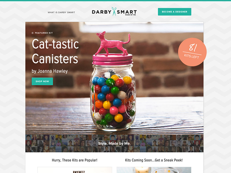
Do-it-yourself crafts aren't a new concept. They've been around. But, in the old days, you'd have to trek down to a craft store and buy the materials, piece by piece, to build your necklace or cat-inspired canister. And that could be a hassle.
We live in the days of internet shopping. We can hit a button and have our goods shipped to us within two business days. So you no longer have to dig through cluttered bins at the craft store. You should be able with a simple click or tap just buy everything you need in some sort of kit.
That's what Darby Smart, which launched recently, is doing. But when they came to us for help in building their site, all they had was a logo. There was something else they also had — a photographer. And that was enough to get started.
Bring in the Creative Types
Nicole Farb left her job at Goldman Sachs to invest in her passion of crafting. She co-founded Darby Smart with Karl Mendes. Their goal was to make it easy for folks to create all those do-it-yourself project on Pinterest by selling kits with everything they'd need to get started.
Without a site already up and running, our work had to focus on three areas:
- How were users going to be compelled to purchase the kits?
- What was the overall look and feel of the site going to be?
- How do we cater to types of users — those buying the kits and those designers who create them?
The lightbulb went off the moment we learned they had a photographer during our kick-off call. That bit of knowledge changed the way we looked at the problem. It gave us a starting point and a special opportunity to use photography as a way of defining the project. We knew what approach to take before we started sketching opportunities.
A Photo Finish
Large images can be unique and personal. They're also a great way to capture the audiences' attention. Focusing on bold, vibrant photos gave the DIY angle a few more creative twists. We knew the photos would be high-quality. So we decided to focus our opportunities heavily on the images.
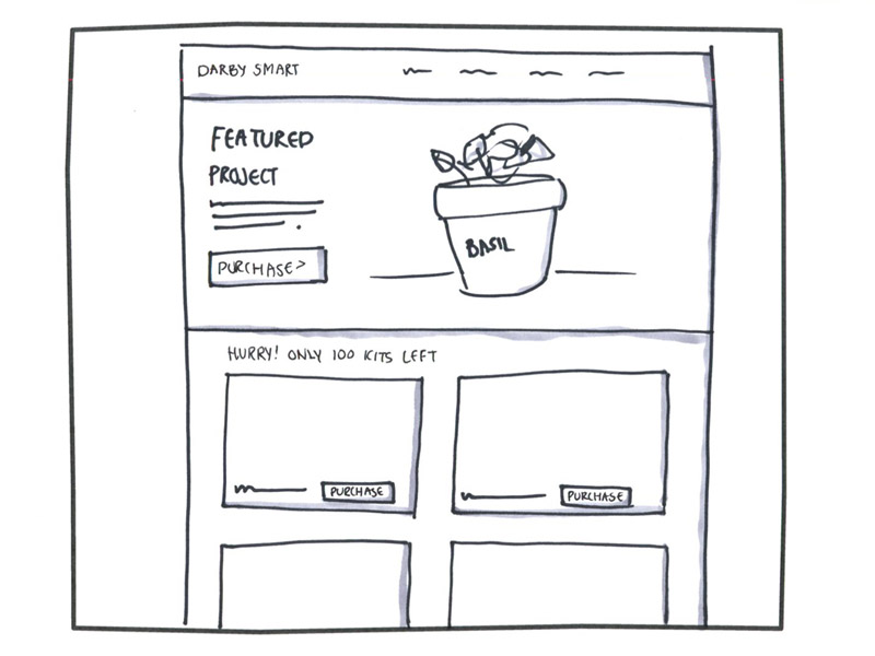
Darby Smart recurited designers who are already popular in the DIY community. We wanted to make sure that each kit's key traits stood out. Our design focused on the products while building a community experience for customers and designers alike. We were able to hit both types of users with this approach.
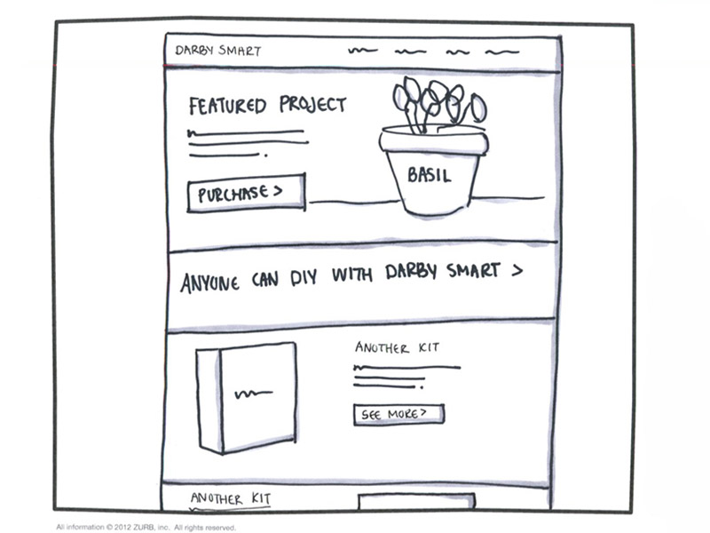
We sold Darby Smart in the first round of sketches on using large images throughout the site. Nicole's creative background made an easy sell. She grokked the large design concepts we were highlighting and was able to make a decisive decision. Karl's developer background also helped us see what was and wasn't possible to build on the backend. Their combined experience helped move things along quickly at this stage, whereas other clients might have asked for more explorations.
Funneling Buyers Into Action
The images did more than just highlight the kits. They solved the main business problem of selling them — by creating an easy conversion funnel. A potential buyer would see the photo of a problem — say for a Catastic Canister — and be captivated. A "shop now" button on the image would be the direct call to action. With a click, a buyer would be taken immediately to the product details page.
Again, images came into play. Photos of the finished product and all the kit pieces would cycle through a slider. In our sketches, we suggested that there also be an element that would countdown how many kits were left. This creates a sense of urgency, motivating buyers to purchase.
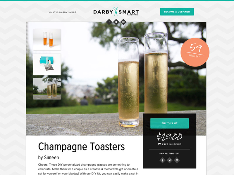
We used a "buy this kit" panel to capture a buyer's attention so that she won't have to hunt for where to purchase.
This funnel also killed two birds with one stone. We were able to further play up the community aspect and cater to the other users of the site — the designers. The designer isn't just mentioned in passing. They're fully credited with the design and have an accompanying bio.
Building the Site
The hi-fi wireframes used hand-drawn elements and big kit images to really capture the overall feel of Darby Smart.
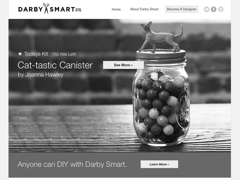
The site's color palette played off the Darby Smart logo and the bright colors we saw in their photos. The photographs and colors inspired the visual design process. We were able to quickly move through the process — we even went through two design variations in one day. You'll see the palette used throughout their site, especially in the vibrant buttons and badges.
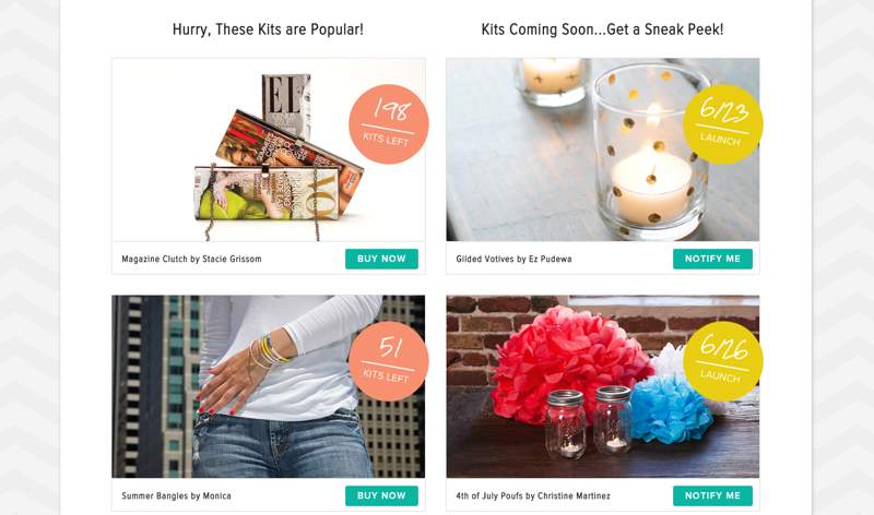
We also used patterns that allow users to quickly navigate the site, reinforcing the easy conversion funnel we'd come up with. We further highlighted the community as well through designer bios and testimonials. Everything fell into place. When we started coding, the process went quickly. We had confidence in what we were building because of the good feedback from Nicole and Karl. We also had confirmation from them that the site would be launched quickly, which made it exciting for us to produce.
The Best Part of the Work
Working side-by-side with the Darby Smart team was a true collaboration. Nicole's creative background allowed her to make swift decisions while Karl's developer background came into play as he built the backend for the final site.
Looking back, Darby Smart remembers some of their favorite moments happened in the beginning of the design process: brainstorming on how to build a community. We absolutely agree — right from the first sketches, exploring all of the possibilities that Darby Smart could become kept us stoked.
Their favorite part? Here's what Nicole said:
Visiting ZURB HQ! The first time we saw the UI elements applied to our prototype. And brainstorming with the ZURB team on how to focus on your first adopters and building community around and for them.
We want to thank the Darby Smart team and congratulate them again on a successful launch. You can check out the live site for yourself:

