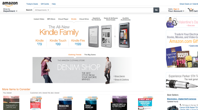
The other day Jeremy and I found we were on the receiving end of two different Amazon.com homepages. We both hated the new one that shoves Kindle front and center. Check it out:

Surely, Amazon must know what they're doing right? They've probably A/B tested the hell out of it, learning that the new one performs better in helping people browse through items.
Yet Jeremy and I were still not convinced that this new homepage really helped customers better navigate around the site. It seemed to us that they were trying to push people to buy more Kindles, but even that effort might be failing with this new homepage. We decided to ask David Heinemeir Hansson, creator of Ruby on Rails and partner at 37signals what he thought. Here's what he said:

I guarantee you that Amazon has done A/B testing and proven that the new design is better. Saying what we think might work better isn't really all that interesting in the face of the fact.
We agreed with David's comment, but deep inside were still not convinced, so we decided to run a little Verify test to see how well the old Amazon homepage works vs. new homepage.
New Amazon Homepage Performs Significantly Worse
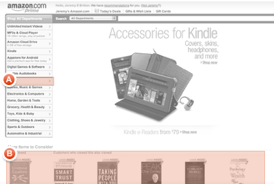
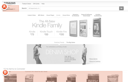
We asked 100 people to click on where they would go to browse through hardcover books on the new homepage vs. the old homepage. On the old homepage, 87% of people clicked on the right spot (defined by the red in the screenshots below), and on the new homepage only 54% of people clicked on the right spot. See full analytics reports below.
87% Found Books (Old Site)
54% Found Books (New Site)
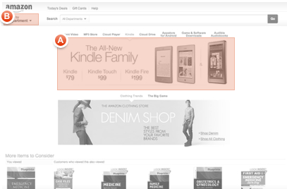
OK, not a huge surprise we thought, after all the new Amazon homepage is trying to get people to buy Kindles so it should do a superb job at having people browse through Kindles. Right? Not really. We asked 100 people to click on where they would browse through available Kindle options. On the old site, 88% clicked on the right spot to find the Kindles, while on the new site (much to our surprise) only 66% clicked on the correct spot to find the Kindles. See full analytics reports below.
88% Found Kindles (Old Site)
66% Found Kindles (New Site)
We should be careful and mention that there may be many different motives Amazon might have for introducing this new homepage. They may be pushing people to use the search functionality more, or may want to have more ad exposure. From our point of view, browsing through available options for Kindles is a very important functionality to have on the site, and from this quick test we ran above it seems like the new site significantly underperforms.
Amazon must know what they're up to here, but what could it be? If it's not selling physical books, but also not selling as many Kindles either, what is the new homepage better at doing?


