The Color iPhone app seemed like a killer idea. Go to a party. Take pictures with the app. See pictures from other people who are in the area. Ah, the joy of all those pictures from multiple lenses! So much joy that Color closed $41 million in funding from Sequoia Captial and others.
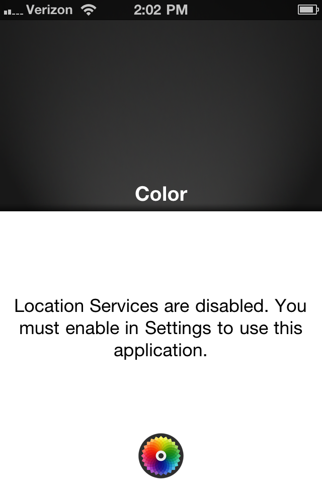
Since launch the app has faced major problems due to a small detail they overlooked. The app doesn't work if there are no other users nearby. Launch the app and you get the message below. Hit OK and this is what you get if nobody else nearby is using this app.


That's it! People got so confused with the first version of Color. The app just does not give you much guidance as to what you should do and leaves people confused and lost. People often forget that successful products make sure that the click before arriving to the intended screen meets the customer's expectations and that the screen fulfills the promise of the click.
The Color team quickly put out an update that fixed some of these issues. The first run experience has a bit more guidance now but is still very shaky:
- The first thing you're asked to do is enter your name.
- You then need to take a photo of yourself (there is an odd line going down the middle of the screen here).
- You are then taken to the dashboard where you're told to start taking pictures. If nobody else nearby is taking pictures you'll quickly feel silly and quit the app.

The key step the user misses here is that if there is nobody else around who is using Color then you literally cannot use it. The app only works if there are already a few users nearby. The first step should be to search for other people who are also using Color.
To sum this up: it's the click that matters most!