Music and design are inherently connected - they are both forms of calculated expression. Musicians use tempo and pitch to set a mood or create a style, while designers use layout, color, typography and hierarchy. While the analogy isn't perfect, we thought it would be fun to find commonalities between specific designs and songs and then analyze why they feel similar. We found some awesome comparisons between designs you may have seen and songs you've almost certainly heard.
In Your Face: Dropkick Murphys & Brewshop
The raw and rowdy sounds of the Dropkick Murphy's "Shipping Up To Boston" felt like a perfect match for the design of Brewshop.co.nz. The parallel between the two stems from a few things. First, the Dropkick Murphys draw a somewhat tough crowd and have been known to start a few mosh pits, and the photo of the crazed beer-fiend fits that bill perfectly. Secondly, the slab serif typeface and black/red color scheme are bold and powerful, just like "Shipping Up To Boston." Finally, this site is all about beer brewing, and the Dropkick Murphy's recorded a drinking anthem for an Essential Irish Drinking Songs Compilation.

Glam Diva: Rihanna & Victoria's Secret
Rihanna is sexy, glamorous and a little bit of a bad girl, which makes her latest hit S&M a perfect match for the Victoria's Secret site. The song, like the site and branding, is risque and naughty. The focus on hi-res photography of beautiful ladies in lingerie paired with the decadent gold backdrop would feel at-home in a Rihanna video.

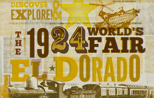
Wild West: Johnny Cash & Lost World's Fair El Dorado
Cash was a rustic, wild country man and his classic song "Ring of Fire" reflects that style, as does the El Dorado Lost World's Fair site. Cash would have felt at home in the earthy, grungy and textured El Dorado site style. Put that together with an antique train to conjure up thoughts of the rugged West and early 20th century letterpress typography, and this site is perfect for "Ring of Fire."

Indie Nostalgia: Moldy Peaches & Eva-Lotta's Sketchnotes
The Moldy Peaches aren't super well known, but their heatfelt Indie tune "Anyone Else But You" made a big splash when Michael Cera and Ellen Page sang it to each other in Juno. The childish, unpolished style of "Anyone Else But You" is a perfect match for the 3rd-grade style sketches and hand-written fonts of Eva-Lotta Lamm's Sketchnotes site. Both strike a beautiful balance between nostalgic childhood memories and an Indie-inspired, hipster vibe.

Bohemian Beauty: Florence + The Machine & Anthropologie
Florence + The Machine's recent hit "Dog Days Are Over" has a shabby chic and bohemian spirit that also finds a home in Anthropologie's site. Both the site and the song feel a lot like being in an Instragram photo - trendy, dreamy and a little bit vintage. The typewriter fonts and torn paper accents throughout the site feel like a hipster DIY love letter, a mood-match made in heaven with "Dogs Days Are Over."
 We had fun finding matches between some great designs and our favorite songs, so maybe you will too. **Hit us up in the comments if you have a site and song match that you think is worthy!**