When are we NOT in the mood to go view a viral video? Whenever we get the urge, we typically head over to YouTube to see the best videos surfacing up all around the Internet.
In an effort to transition YouTube's design to reflect Google+'s a bit closer, we were excited to dig into the newest channel design. As The Next Web's Harrison Weber points out, it isn't much of an aesthetic improvement. But do the new pages actually get in the way of someone wanting to perform some basic YouTube actions?
We captured a few screens and set up a few tests with Verify. Though they are only in limited beta at the moment, we still wanted to know: Do the new YouTube channel designs actually work? You're about to find out.
Does a user know where to go to subscribe to a channel via the YouTube homepage?
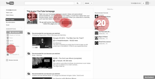
First, we wanted to see where user's click tendencies ended up when presented with the current YouTube homepage. We asked testers to click to subscribe to Kevin Rose's channel.
As you can see, there were quite a few potential options here — Kevin Rose's channel appears in the left-hand nav, center body and right-hand nav.

The majority of testers (76.92%) selected the Subscribe button next to Kevin Rose's thumbnail in the right-hand nav, which is a successful action. Two users selected Kevin Rose's name in the left-hand nav — this is also a successful action, but on mouseover, users would be presented with an overlay to browse channels to subscribe.
One user incorrectly selected the image box next to the text in the body — while Kevin Rose's thumbnail is present here, it does not allow you to subscribe to his channel.
Does a user know where to go to Subscribe to a channel with the new design?
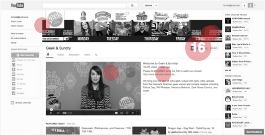
When you come across a channel that you want to save for later, YouTube allows you to subscribe. In the new channel design, do people know where to go to successfully subscribe to a channel?

It turns out that most people found the "Subscribe" button successfully in the new design. 76.19% of testers (16/21) successfully selected the "Subscribe" button.
There seemed to be a few areas on this page that tripped people up: "Subscribe" text in the new cover photo, the "Please SUBSCRIBE to be the first to watch our shows" call-to-action text, as well as the button. We dug even further into the data to see how long it took for the tester to make a selection.
The median user took approximately 4.8 seconds to click on their selection — not great, but also not particularly slow, either. We see room for improvement here: Though most users eventually found the button, it'd be a good decision to make the Subscribe button more prominent. In the midst of a lot of potential actions on this page, being able to Subscribe is a key action that will hook channel viewers into returning to the site.
Does a user know where to go to view discussion for a featured video?
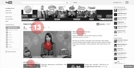
Finally, we wanted to see if people knew where to go to view (and potentially) hop into the discussion for the featured video on the new page layout. Our final test examined if users were able to find the discussion area:

The featured video takes up a significant part of the center part of the design, so it's natural that if a user is watching it directly from the profile page, they may want to read the comments or discussion. There's a "Discussion" tab directly above the video, but to our surprise (and the surprise of the majority of our testers), the discussion tab there leads to a comment section for the channel, NOT the featured video.
76.47% (13/17) testers incorrectly selected this, which if we're being perfectly honest, we wouldn't blame them. It is misleading, and people may interpret the navigation bar as related directly to the video underneath it.
The correct answer here, selected by only one of our testers, was the link to the video page, titled "Welcome to Geek & Sundry!"
There is significant room for improvement in this part of the design.
Our Conclusion
Whenever we see a site with the clout of a YouTube redesign, we can't help but get excited. This particular iteration of the YouTube redesign — in general — did not perform very well in our tests. There is plenty of room for iteration and clarification on a lot of the core functionalities that make YouTube a great place to broadcast and consume great video content.
We're looking forward to seeing how the YouTube design team spearheads their future efforts. It will be interesting to see how the YouTube design evolves over time, and how Google+'s design may or may not continue to impact the video sharing site's design.
