Stop me if this has happened to you. You're standing in a long checkout line, bored to tears. So you pull out your smartphone to what's going on in the world. But when you open your browser to your favorite news source, you've hit a block. An app block, to be precise.
You're told that to enjoy a carefully crafted mobile news experience that you have to download the native app version. The few minutes you had to actually read the news has now become time spent downloading and familiarizing yourself with a new app.
An expletive may or may not leave your lips.
This has probably happened more than once to programmer Tom Morris. He recently outlined his reasons for why he won't download a ... well, he used an expletive... app.
As he put it in the days of just the desktop web, reading news was as easy as 1,2,3 — go to site, click on the link and read. Now, as he outlined, there are 14, frustrating steps to get to the news you want. He used quite a bit of colorful metaphors.
All those steps end with:
Give up, go to newsagent, buy paper edition, throw smartphone off a (expletive) cliff.
Don't Block Your Site From Users
Think it's pretty obvious that Tom's not on the side of native apps. We've already made our stake in the ground, saying that the responsive web will outlast native.
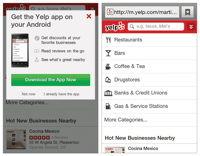
But think about it for a sec. Tom does make an interesting point. The perfect illustration of this problem is Yelp. They've got three different versions of their site: mobile, desktop and app. Yet when you pull up their mobile site on an Android phone browser, you get a pop-up add for the mobile app (see the image below on the left). Even though their mobile site is fully-functional (see the image on the right below). 
Surprisingly, most of Yelp's traffic came from desktop in 2012 — 78 million visitors per month. Only 7 million monthly vistors use the mobile apps. We can't be sure, however, if the dip in numbers is directly related to forcing users to the mobile app or not. Nevertheless, the numbers are quite telling that something is happening.
Device-Specific Strategy
There may, of course, be business reasoning behind Yelp's decision to funnel folks to the native app. But if you must, really must, have three different versions, it must make sense for users and your business.
Take One Kings Lane, for instance. When CEO Doug Mack got on his soapbox, he told us how the company has a mobile strategy that's layered like a cake. Or a device-specific strategy, as he put it.
A majority of the site's sales were from iPhone users, but the experience sucked on mobile Safari. So they came up with an iPhone app. But on iPad, customers got a good shopping experience using Safari. So they waited on an iPad app, which they are now finishing up. Android sales weren't as high but they didn't want to marginalize their customers. So instead of an Android app, they're whipping up a responsive site.
You could say that having this device-specific strategy, One Kings Lane is covering their (user) bases.
Don't App Block
Whatever the strategy, users shouldn't have to jump through hoops to use a product. One Kings Lane is on the golden path with having both a native app and a responsive site. They're not risking app blocking their customers.
Having three different versions of a site — mobile, desktop and app — can be very alienating for users. It's frustrating that you need to switch between them. Whatever you choose, be absolutely sure that it makes sense. And that you won't be hemorrhaging more users than you get.


