Last week, we dove into the redesign of a technology news outlet, the re-branded ReadWrite. Despite minor confusion around the mobile site's navigation, the redesigned, responsive site did very well in our tests.
So this week, we shifted our attention to another popular technology blog, The Next Web. The latest version of their site went live on Wednesday morning, to the delight of tech news readers everywhere.
We set up a series of Verify tests that mirrored similar questions to those asked of the ReadWrite redesign. Does the new redesign work well for readers?
Where would a user click to read stories under a specific vertical/topic?
Most visitors to The Next Web probably go to the site with the intention to read or consume content. We asked our testers to click on where'd they go to read Apple stories. Visually, the results here were very interesting.
As you can see from this click test, there are multiple correct answers here. Most testers selected the "All Categories" dropdown on the left-hand nav. Two other targets stood out on the page: The "News" link in the top navigation gathered three clicks, and the search magnifying glass in the top nav also gathered attention.
It's a great sign that users are able to easily access news: The categories or search functionality would get a user to Apple news. The "News" link simply reloads the news page, so in the context of this question, Apple news may not always be present. Despite no consensus location to read stories, we believe TNW is on the right track when it comes to content discoverability in their new site.
Does a user know where to go to contact the publication?
The Next Web boasts amazing content across a variety of verticals in tech — so people will want to get in touch to share news or announcements for coverage. Does a user know where to go to contact TNW?

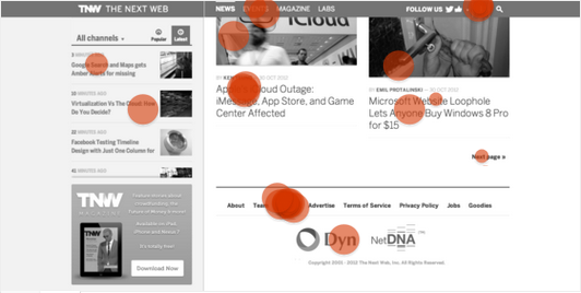
For the purposes of this test, we scrolled to the bottom of the main TNW homepage. The good news — it isn't awfully hard to find the "Contact Us" link on the bottom nav. Three testers selected the 'i' logo in the top right-hand nav, which was also a correct action — a user can contact the publication on that dropdown on mouseover.
Interestingly enough, two testers selected "Events" in the top nav — leading us to believe that some testers may be interested in contacting the events team at the publication. The results of this test make it pretty clear — If people want to get in touch with TNW, they don't seem to have a hard time doing so.
Does a user know where to click to follow The Next Web on social networks?
We wanted to also test to see if mobile readers knew where to go to find The Next Web on social networks. We captured the mobile homepage for the purposes of this test.

Ten testers (31%) ended up selecting the downward-pointing arrow, meaning that they were on the right track to finding the blog's social networking presences.
We clicked around the mobile version of TNW's site, and we found that it was very hard to find the links to their social channels. Even though some users were on the right track, they would have to click through to the Contact page and scroll to the 'Engage' header to find the links.
If the publication is interested in acquiring new fans and followers through mobile devices, we recommend they make their presences more prominent on the mobile version of their site.
Conclusion
Visually, it's hard to deny it — The Next Web's new design is indeed beautiful, and very well done. All things considered, the new design does work for readers. The main design empowers a reader to identify content they want to read easily (via channels or search) and get in touch with TNW, should they choose to do so.
Our one suggested area for improvement — make the social media channels more visual to a mobile reader. A reader should be able to find the Facebook and Twitter links with the fewest number of touches and swipes possible — all this assuming that their design strategy incorporates social media fan acquisition.
Do you like The Next Web's redesign?
