More and more people are pulling out their phones to check their emails. According to some figures, at least 20% of people are reading emails on their phones. For us, it was over 34%, a number we couldn't ignore any longer. A whole lot of our readers weren't getting a spectacular mobile experience with our Chief Instigator's monthly newsletter or other email campaigns, and it was beginning to feel a little like cobbler's kids have no shoes. It was time to bring ZURBnews up to the standards we hold our work to. It took us some research, finessing and going back to the basics.
Think in Tables
Yes, newsletters still need to be coded in tables because some of the most popular mail clients will not render div-based HTML correctly. Working in tables isn't any designer's favorite pastime. But if you start feeling limited by the table grid, just remember that before CSS came on the scene in a big way, all websites were built using tables and designers found creative ways to utilize them. You can create pretty complex layouts using nested tables as well — that is, if you can keep track of them. That's what we kept in mind as we started the newsletter redesign — keeping it simple, structured and flexible.
The Mighty Sketch
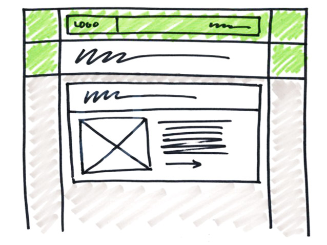
Once we had the design figured out, believe it or not, we went back to pen and paper to do some quick sketches of how the framework could be created. We sketched out the newsletter, dicing up the design into simple rows and columns. That short exercise saved us a lot of valuable time when it came to coding up the template, because we knew where each design element would live within the table structure.

Hurray For Media Queries
At long last, media queries are accepted by email marketing tools. Adding some simple style tweaks allowed us to refine the newsletter for the phone viewer. We also learned some tricks along the way. We found out that using attribute selectors to assign styles will make sure browsers don't pick up mobile styles they're not supposed to. Adding '!important' is truly important for mobile styles, since inline styles trump mobile styles. Here's how it comes together:
Smart Images
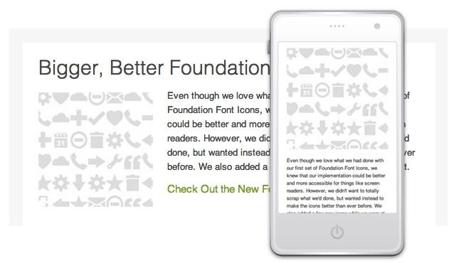
We know that relying on images in a newsletter is not best practice, but no images = no fun. We wanted our supporting images to really draw readers in on small devices. Here's how we did that. We opted for floating the images instead of setting them into separate table cells. So when it came time to make the newsletter scale, we simply give the image a width of 100% and it scaled perfectly to full-screen width of a phone and sat on top of the paragraph, which gave us the effect we wanted. If the image was set within a table cell, we'd be able to scale the cell sizes, but not reconfigure the structure.

Tweaking font sizes
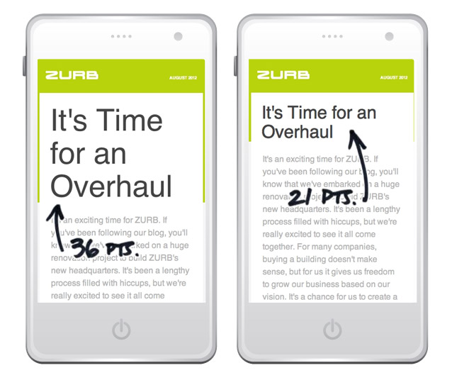
After the big strokes were finalized, we wanted to make sure to optimize every bit possible for our phone readers. One simple thing we looked at was adjusting font sizes for the mobile screen. What looks nice and prominent on a computer screen can look loud and obnoxious on a phone. Reducing header sizes for small devices was a very simple change that made a big difference.

The overhaul was long overdue, and we're glad to have taken the time to make it so. It was a little roundtrip from the past to the future — we used some technologies of the past and utilized the capabilities of the new ones, and as always, we learned something along the way and how to make the next one even better.


