Not everyone who works at ZURB is a designer, but working here teaches you the importance of design thinking. You know, the type of thinking you need to do when you actually want to get something done.
Like many, I was hung up on the word design. To me, it meant something strictly visual, instead of the process of creating prototypes and rapidly iterating to create an amazing product.
You may have noticed that we updated our marketing pages for our ZURBapps, including new sites for Notable, Influence and Solidify with a new page for Verify on the way. Each page includes a tour of our apps, new examples and a product video.
Our team worked on different pieces of these pages in order to position the messaging of our products, provide useful information and show our ZURBian personality.
Leading the creation of our product video, we faced many challenges. Our biggest challenges were with Influence, as some of the features of the privately-released app do not exist yet. By using design thinking, the challenge to create a product video lessened and it became more like an amusement park ride. It was always fun, but you never knew quite what was around the corner.
Our product videos need to be many things. They needs to be informative, but not too feature-heavy or boring, and fun, but not so fun that it renders their purpose useless. Our product videos need to peak your interest about the apps and hopefully inspire you to dive deeper into our tour page and examples for more information.
Making the Video
As I mentioned earlier, I'm not a designer. I can barely draw a stick figure. Sketching was a hurdle that I was a little nervous about tackling - especially when you are surrounded by lots of talented people whose sketches blow you away on a daily basis. But I quickly learned that sketching can convey ideas far better and faster than most other methods. Take a look at my first round of sketching for Influence's product video, clicking on them for the full size images: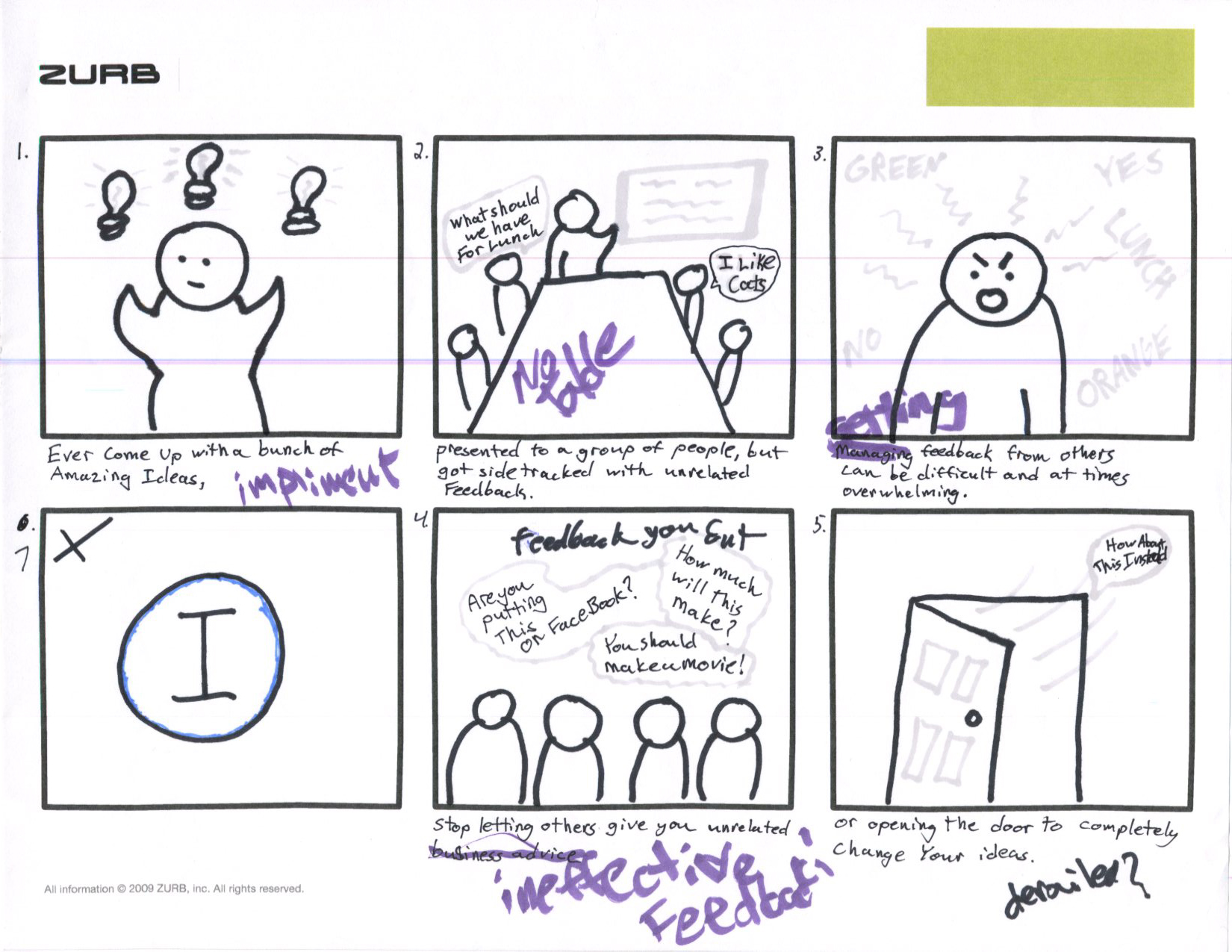
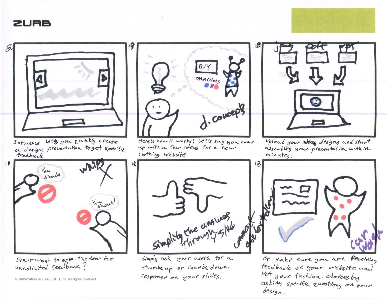
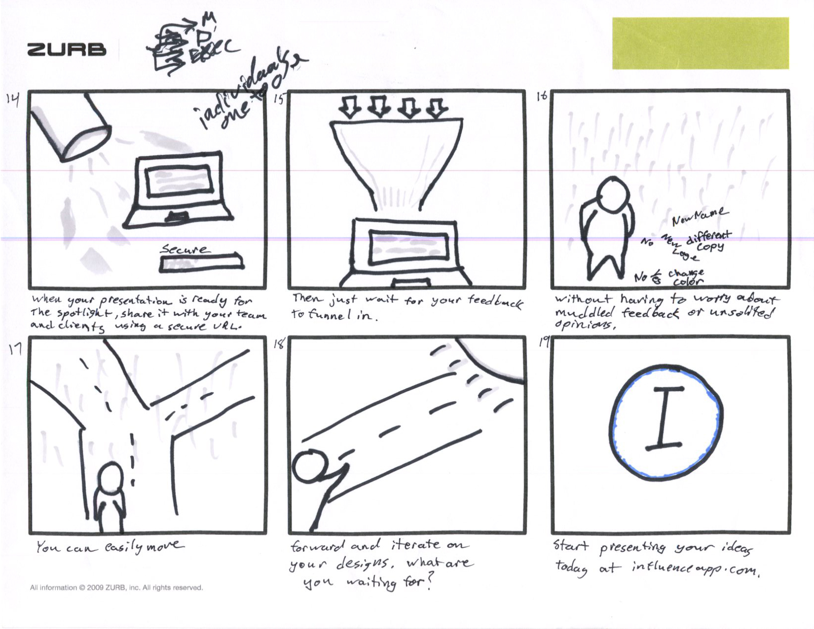
By quickly getting ideas out with the above storyboard, it showed where the holes in our story for Influence were, and even opened up the conversation about our app as a whole. To no surprise, many of the elements from this first round of storyboards didn't make the final cut, including a hollywood-esque ending with our Influence user walking into the sunset (This, of course, erupted quite a few laughs at my expense in the office).
After another iteration or so, it seemed the best way to approach the storyboards was to set up a controlled presentation so I could display these ideas in a linear timeline. Just like our character in the final video, we found ourselves getting sidetracked with unrelated feedback or focusing on minor details best to discuss at a point further along in the project.
Using Influence, I set up a design presentation with another iteration of the storyboards. Quickly cutting the the storyboards into individual frames and uploading the images to a Influence presentation helped to focus the feedback directly on the story that needed to be told in just those couple of sections. Even with the team in the same room, using Influence let us stay on a single storyboard frame without our eyes wondering to another piece of the proposed video. It also let the team revisit the storyboards after our scrum to provide any additional feedback.
Click on the image to view the Influence presentation, which also includes basic animation notes:
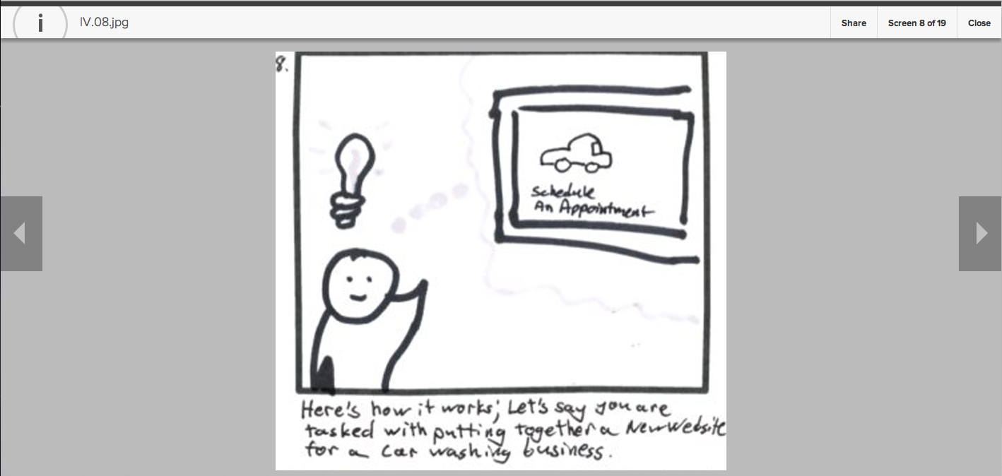
With focused feedback, the Influence positioning became a lot clearer. We also realized a few elements didn't quite work out. After our first round of storyboarding, we iterated to create a funnel of sorts which would show an Influence user sorting through feedback. After quickly prototyping this idea, we realized that we may not have described Influence in the best way and the storyboard may be a misleading representation of the app's features. Once more, we made quick adjustments to the storyboards and moved forward.
The next step was to create a basic animation from the storyboards using basic animation and really simple program, iMovie, to connect the storyboard panels.
The above video worked as a starting point for our friends at Revolution Productions, who created the animation for our product video.
Working with an external team proved to have it's own set of challenges, as it tests the positioning for our apps as well as the effectiveness of our apps' stories. Luckily, the team at Revolutions was able to deliver great quality work and work with us as needed to make adjustments to the story. Iteration must always be a part of creating a great product.
Revolutions provided us with their own storyboard versions based on our low-fidelity sketches.
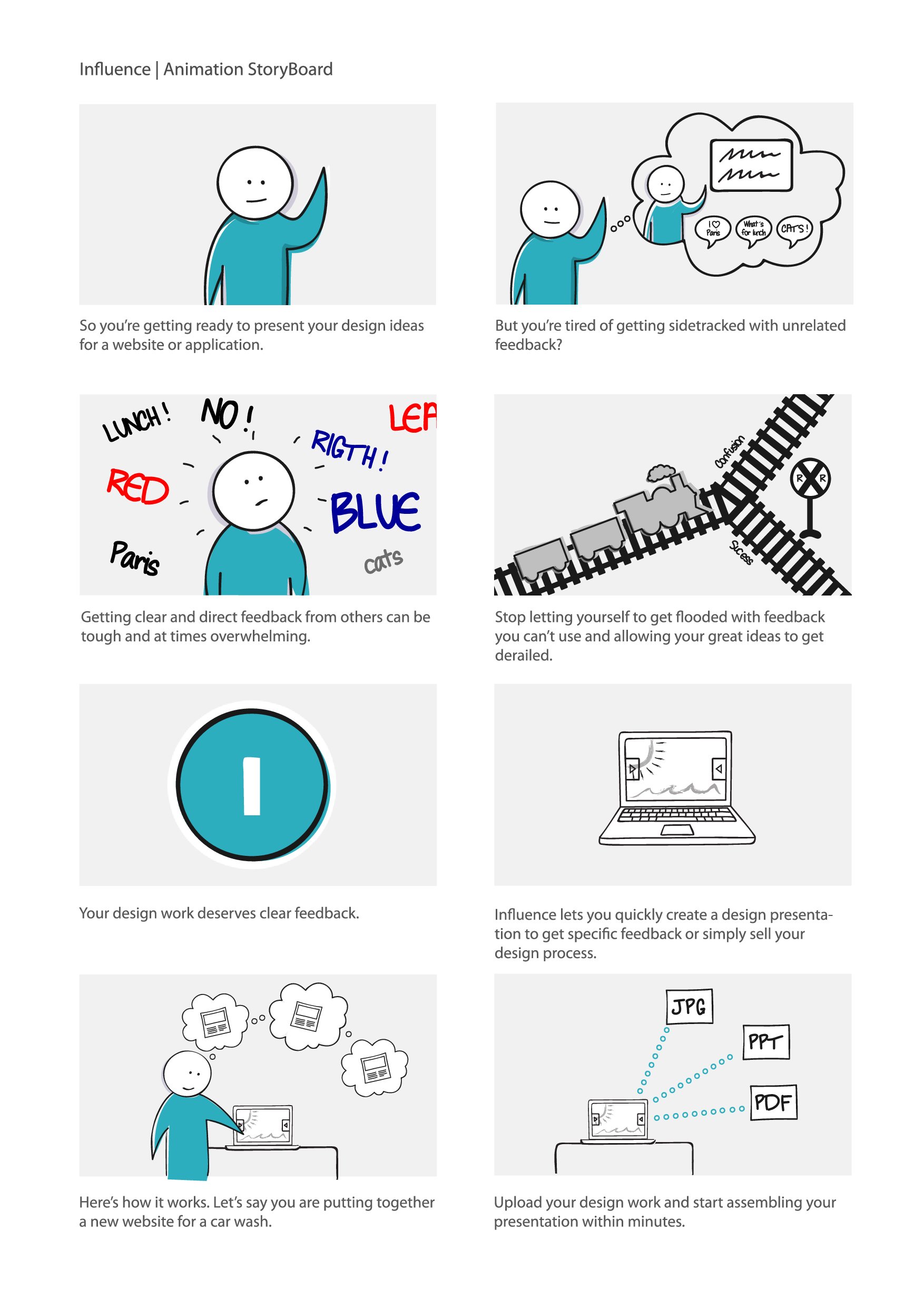
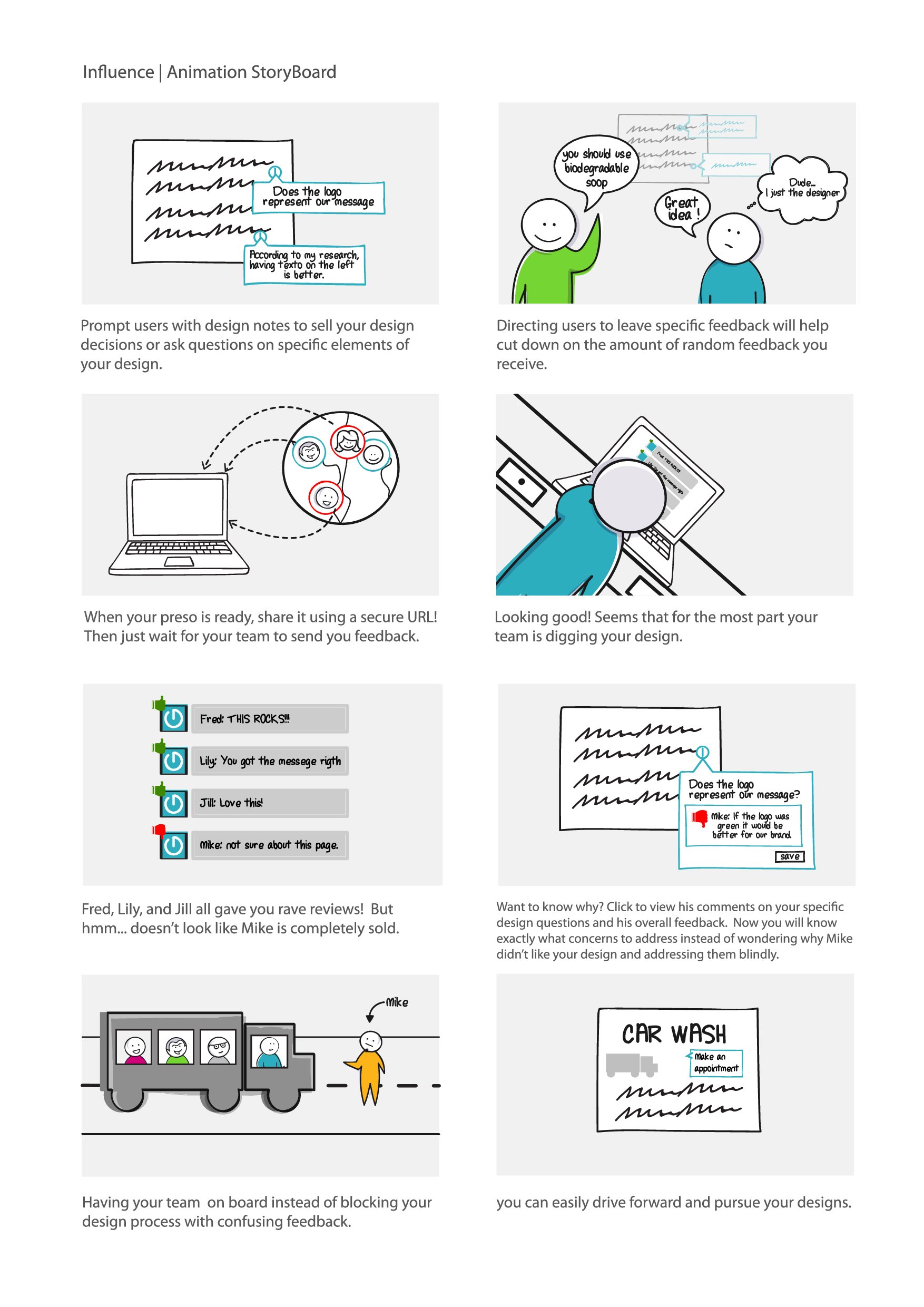
After seeing the high-fidelity storyboards, we realized that a few of our ideas weren't going to be conveyed quite as we imaged them. After all, it is fairly complex to create a simple product. With two rounds of storyboards and seeing our concepts animated, we saw that getting from point A to point B needed a bit more work to make the video feel like a fluid piece of work. Working with Revolutions, we were able to create a product video that was both fluid and told the story of our app.
Check out the final version of the Influence product video that can also be found on our marketing site below:

