Typography has been around for a long time, but over the past couple of years, it's become a very hot topic on the web. With the use of @font-face widely spread across browsers, we're able to fine-tune our web typography and make our designs shine. We no longer need to rely on typefaces that are standards across browsers and operating systems. With this push for better typography on the web comes the need for better tools and knowledge about how to work with type in a way that mimics traditional typographers of the past. We're taking a step in the right direction with Foundation 3.0 by revamping our type based on a modular scale.
What the Heck is Modular Scale Exactly?
Many different scales exist in the world, from the golden to the musical fifth. Throughout history, these scales have been used for architecture, music, writing and design. In his article, 'More Meaningful Typography', Tim Brown quotes Canadian typographer Robert Bringhurst, who says:
A modular scale, like a musical scale, is a prearranged set of harmonious proportions. Robert Bringhurst
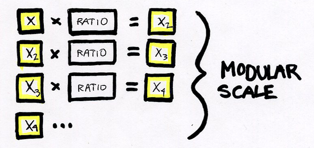
So a modular scale gives us a set of numbers to use for elements, such as typography, in our web designs. These numbers relate to each other in a meaningful way because of the manner in which they are created. This takes away the need to come up with arbitrary values for key pieces of your designs and creates a visual harmony and rhythm to the page. You simply start with a ratio and a number, then continue to multiply or divide to create the set.
 An example of the equation used to make a modular scale.
Building a Scale
As you saw above, most single scales don't give us a great range of numbers to work with on the web. We need a bit more of those in-between numbers, but we still want them to relate in a meaningful way. Tim Brown suggests adding a second important number that means something to the project or the first number. We used his nifty modular scale tool to test out a few ratios and numbers.
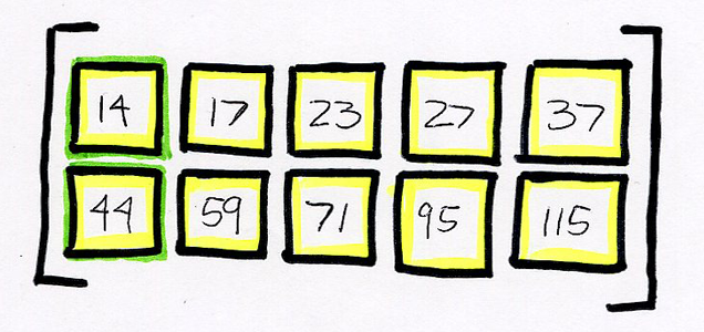
We chose 14px as our first number because it's a good base font-size for body copy on the web and it's what we'll use in Foundation 3.0. For our second important number, we decided on 44px because it's become the standard for the smallest, easily tappable area for UI elements on small devices. Since Foundation is responsive, this number made sense. After trying out a few ratios, we settled on the golden ratio. This gave us our set of numbers to use as the base for a typography sizes.
 The actual numbers rounded from our scale for use in Foundation.
How We're Using It
One big shift we're making in the new version of Foundation is writing it in SCSS. You read that right, we SASSyfied it! This gives us lots of firepower when it comes to building a really flexible framework. To help us easily use our scale and keep it flexible enough to easily change on the fly, we relied on an open source gem, aptly named, modular-scale. We found this gem through an article on the Sass Way, which also helped us implement it in SCSS. After requiring the right files for Compass and importing the gem properly, we were able to use a really simple mixin that gives us the flexibility we need. Here's an example of the modular-scale SCSS mixin and the type sizes it compiled into:
// Variables
$ratio: $golden;
$base-size: 14px 44px;

// Modular Scale SCSS Function Syntax
h6 { font-size: ms(0); } // First Number in Scale
h5 { font-size: ms(1); } // Second Number in Scale
h4 { font-size: ms(2); } // Third Number in Scale
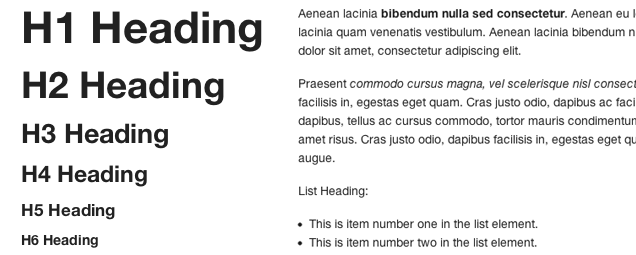
 Font sizes based on our modular scale.
Why is this Necessary Again?
By using tools like modular scale, we're able to keep a consistent vertical rhythm down the page. This creates visual harmony and paces the page as users view your site and read your content. This also lets people who eventually download Foundation 3.0 create really nice typography for their project and easily change the values by updating the SCSS variables in the project. People will be able to give meaning to their typography for each project to ensure that it makes sense and looks good each time.
As with everything in design, it's best to use this with a slight grain of salt. If something looks better by tweaking the scale slightly, then do it. Sometimes our eyes can do a better job of fine-tuning elements on the page, but modular scale gets us what we need in most cases. We have one iteration on our typography done, but we'll be perfecting it over the coming weeks. Check out the progress on our 3.0-scss brand on Github. As the web progresses, we need to continue to expand our knowledge as web designers and find tools that help us create better things on the web. Next time you start a project, add some meaning to your type by exploring a modular scale.


