Here at ZURB, the Sharpie is our best friend. Before we write a single line of code, we sketch out our layouts to ensure our flows make sense. The reason? There’s no faster or cheaper way to weed out bad ideas than good ol’ sketching! Through quick iterations on paper, we’re able to get to solutions quicker, edit on the fly and crank out tons of ideas.
In this case, we made most of these opportunity sketches on our whiteboards so that the whole team could give feedback on the ideas. We even did a quick audit of the existing Downtown Streets Team website, writing down each page on individual sticky notes so we could rearrange and consolidate their sitemap. Once we felt good about the sketches and our layouts, we brought our creations to life via these sketch wireframes.
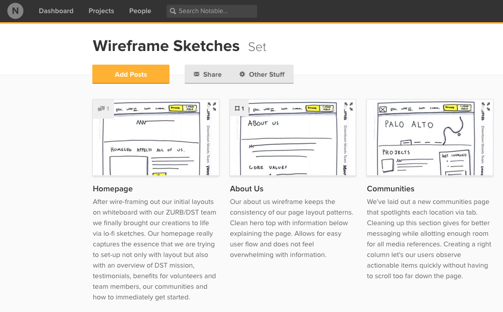
Homepage is Home Base
The Downtown Streets Team homepage has to convey a lot of information to several different groups of people, so it was essential that we come up with a layout that makes it easy to get to the most important pages of the site. Our new design consists of an overview of the Downtown Streets Team mission, testimonials, benefits for volunteers and team members, our communities and how to immediately get started. That’s a lot of important information and messaging on a single page.
Purposeful Design Patterns
One of the new pages on the site is a Communities page that highlights the different areas within which the Downtown Streets Team operates for each location.
As with any non-profit, keeping donation options clear and easily accessible is a major priority. In addition to some prime real estate as a button in the header, Donate gets its own page that educates users on all of the different ways they can donate to Downtown Streets Team! Psychological triggers play an important factor in this regard.
Using tried and true, reusable patterns in the new layout helps keep our code clean and easy for third parties to edit if needed. An example of this can be seen in our Success Stories layout, a 4x8 column structure that makes it really easy to show information.
Work Smart AND Hard
Going through our pages, you can see that we are re-using the page layout patterns and elements that we have set-up in earlier wireframes. By working smart, we’re creating a clean layout with clearly defined hierarchy, the perfect blueprint for us to start building on and adding extra polish!