Spur's FAQ
A little app from ZURB that helps you critique your web designs, giving you that kick you need to make them better.
Why?
Classic design principles still prove true today, but there are no good tools out there to help you apply them on the web.
Spur helps you apply those principles to your design and share what you’ve learned with others.
What is Spur?
Spur is a fun and easy way to critique web designs in ways you’ve never done before. Just paste a URL (or upload an image) and you’ll be able to use seven different tools to help you find what’s working (and what isn’t!).
Great! What now?
Share what you’ve learned, of course! Spur generates a unique URL you can use to share your design with any of the tools applied to it. Get feedback from your team by uploading the altered image to Notable; they’ll be more than happy to dig their Spurs into your design.
Why would I do that?
Looking at your web design through Spur’s seven tools will give you new perspective to see things you might have missed. You might think twice about that bright green Buddha after you look at in high contrast! Or maybe not...
How do I use it?
Just type in a URL and press Enter. If your design isn’t live yet, use our image uploader to add a mockup to Spur. You can share your altered image using a unique URL or upload it directly to Notable as a new post.
Not sure where to start? Here are some tips about how to use the seven tools:
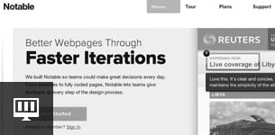
Grayscale
What are you left with when the color is taken out of your design? Do the areas of focus still hold up, or does contrast between elements? Make sure your original hierarchical decisions still hold up when you take out the color. Learn how →
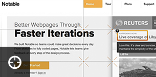
Intersections
Take a look at where the major lines of the page force the eye to focus. Draw your grid lines to show these focal points. A good design will ensure the spurs are on a spot where people can read the maximum amount of information in the minimum amount of time, typically seconds. Learn how →
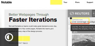
Contrast
Every design has intentional areas of focus, but are these areas too overpowering? Bumping up the contrast of a design can help show what areas are really jumping off the page when someone initially views the page. Learn how →
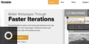
Blur
What does your design look like at a glance, without details? Make sure you have solid hierarchy and weight, and that if someone glances for a few seconds they get something valuable. Learn how →
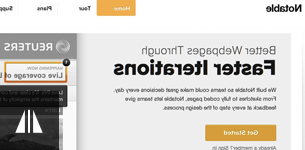
Mirror
Get a sense of how your page feels without readable copy. Areas you might not expect can jump out at you, and misalignments become more obvious. Learn how →
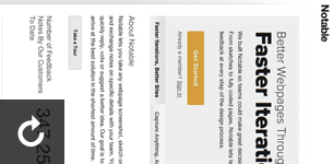
Rotate
In an age of different devices and screens, it's valuable to see how your page holds up on its side, or upside down. Could someone get a sense of your site if they saw it on someone's iPad? Learn how →
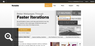
50% Zoom
Take a look at your site as a smaller thumbnail; does the layout hold up? The best websites still get the story across at a small size. Elements should look balanced and people should still be able to get the gist of what they're seeing. You want them to click through don't you? Learn how →
Press
Spur has been all over the place and we're loving it.
Thanks for the love:
I want more!
Here at ZURB, we have several apps to help you design better products.
ZURBapps Pro Suite
More free apps
I love Spur!
Awesome! We love you for trying it out. Since you like what Spur does, why not share it with some friends?
Who Made It?
Spur is made by ZURB, an interaction design and design strategy company located in Campbell, California. We've put over 13 years of experience building web products, services and websites into this product. Learn more »
For some other fun ideas by ZURB, check out the ZURB Playground.
Support
We'd like to hear about issues you might be having, or just how we can make Spur even better. Drop us a line at support@spurapp.com!
Want to know what we're up to on the ZURB products? Follow us on Twitter and stay up to date!