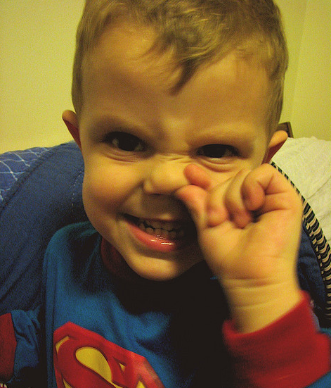
 Image credit: Jesse Gardner
A typical visitor who lands on your page will at most click three times before deciding whether to stay or leave your site. So the question becomes — does your site have the personality to catch a visitor's interest in three clicks or less? Does it stand out from the rest?
Fred Wilson published a great guest post mentioning that personality is the second most important thing when building a product (after actually building it!):
MOST IMPORTANT STEP FOR BUILD PRODUCT IS BUILD PRODUCT. SECOND MOST IMPORTANT IS BUILD PERSONALITY FOR PRODUCT. NO HAVE PERSONALITY? PRODUCT BORING, NO ONE WANT.
WHEN CHOOSE PRODUCT, HUMANS ONLY CARE ABOUT DOES WORK, AND IS INTERESTING. WORLD ALREADY FULL OF THINGS DO WORK. MOST BORING. PERSONALITY = INTERESTING. INTERESTING = CARE. CARE = TALK. EVERYONE CARE AND TALK ABOUT PRODUCT? YOU WIN.
Are You Picking Your Nose?
A great example of a product that nails its personality is Wufoo, which was recently acquired by SurveyMonkey. Wufoo is a forms engine, which sounds like a generic and boring product. So how were they able to make it fun and engaging? Wufoo's founder Kevin Hale, who spoke at our ZURBsoapbox a while back, said that they thought a new visitor to Wufoo as a first date with its potential customer:
So if you're on a first date and you see that your date starts picking their nose in the beginning of dinner, there will be no second date.
The Wufoo team looks at all the tiny moments as opportunities for a visitor to catch you picking your nose. The very first email you send them, the account creation process, the first advertisement they'll ever see, the first support request; these are all places you can fall flat and miss out on that second date.
Our login link is a tiny little dinosaur, and right next to the login link, when you hover near it it goes "RARRR!" This experience is very memorable. Some of my favorite login pages are those like Wufoo, which have a beautiful login page where they have very pretty vector illustrations. The old Flickr login text said "Get in There!" When you contrast that with Google or Yahoo sign up pages, there is a big personality difference, you don't start off your journey with a smile.
Think about what your first date is like with your website visitor. Are you picking your nose? You have just three clicks to capture their heart.


