Imagine for a sec that you've just given feedback to the designer on your team. Afterwards, you find that the designer hadn't incorporated your suggestions or addressed any of the problems you saw. There was no followthrough. What could have gone wrong? What could you have done differently? Provide contextual feedback.

Follow-through on solid product design work is tough. The problem we've seen on projects is that it comes down to lousy feedback that's vague and directionless. Cryptic feedback can result in a bad product. So where do things fall apart? Where do things go wrong? They fail to put things into context.
Put Things Into Context
Research has shown that our brains are "wired to recognize and organize coherent connections, not arbitrary ones," according to Anthony Greene in a 2010 Scientific American Mind article. He uses the example of a girl who likes cars learning multiplication by relating it to how many wheels she'd need for three race cars. Easy peasy, three times four, or 12. The association with the cars made a connection in the girl's mind.
Connections help us anchor an ever more complicated body of knowledge about how the world works and negotiate the complex structures all around us.
Translation: We learn better when the subject is put into a context we understand, not something abstract. If our feedback isn't put into context then it can be abstract. Meaningless. And our brains won't make the necessary connections.
How to Give Contextual Feedback
Feedback must be contextual. That's why it's important to get feedback on actual design work. And the designer on your team can't treat design work as abstract art. She also has a part to play when it comes to contextual feedback. She can't just throw something up without clear explanation of the goals — Or else the rest of the team will flounder on how best to give feedback.
But once a designer provides that clarity, then you're in a better position to put things in context. Let's take a look at four ways you can provide contextual feedback.
1. Showing Designs in Person

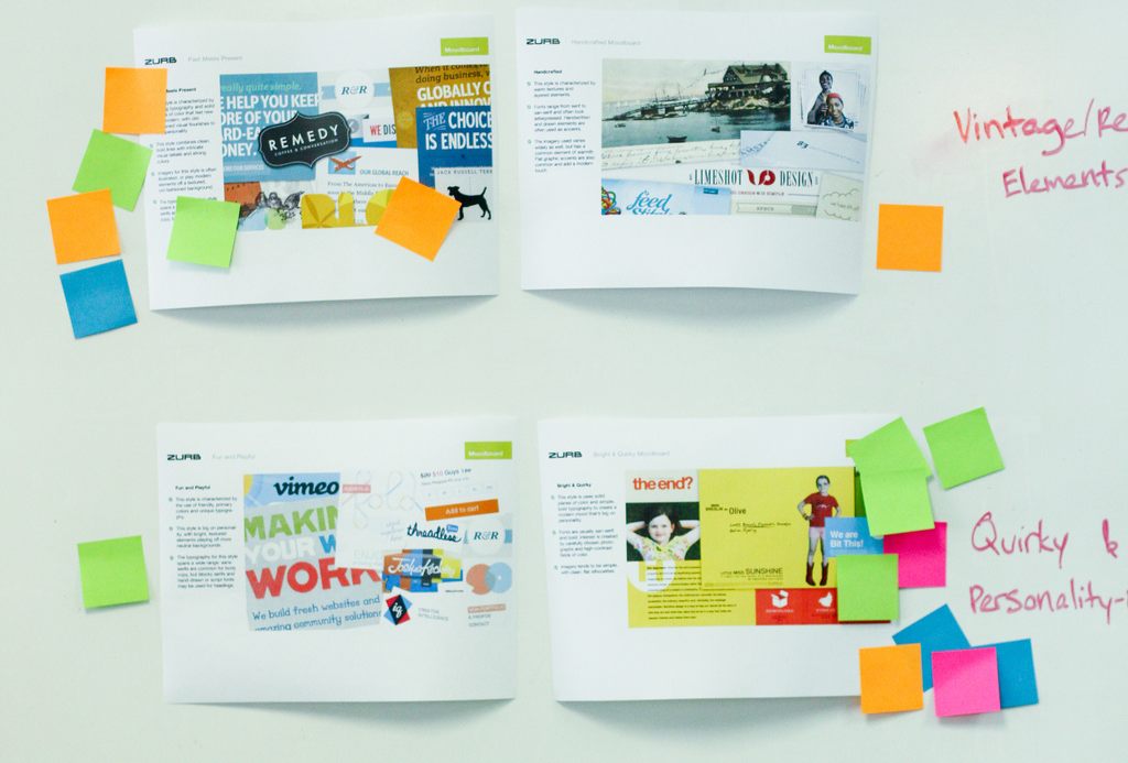
Voting with Post-its on designs lets a designer know which are working for the team and which aren't.
The designer on your team can show designs in-person. We do this often with both internal and customer projects, where we place our design work up on a whiteboard. Team members can vote on designs they like with Post-its or they could leave specific feedback by writing them directly on the whiteboard.
2. Online Feedback
Email is a horrid place to get feedback. It's a good place to ignite a feedback loop, but you can't get contextual feedback in a bulleted list of items.
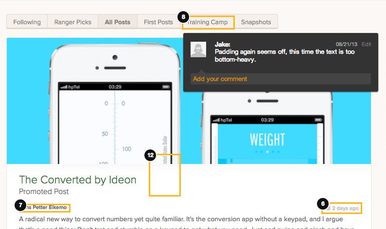
We often use Notable to upload screenshots, sketches or wireframes so that we can annotate directly. We used Notable a lot during our redesign of Forrst, our designer and developer community. Check out some of our notes:

An annotated comment on our Forrst redesign.
To get really meta, we've taken the functionality of Notable and put into into the Forrst redesign so that those in the community can get feedback directly on their designs.
3. Over the Phone Feedback
It's not always possible to get in-person feedback. Occasionally, we have to get feedback over the phone — the next best thing. Before we hop on a call, we post our work on an intranet, or what we call the extranet, and shoot that off to our customers. In our emails we outline the three big ideas of what we did and a link to the work, like this:
When we get on the phone, we usually use GoToMeeting, which lets us share our screens and go through our designs. This allows stakeholders to leave specific feedback on the work rather than talk aimlessly. Without this context, the customer wouldn't see any follow through on their feedback. We wouldn't know what are next steps would be.
4. Outside Research or Show an Example
Outside research can further help with contextual feedback. It puts things into perspective. You can argue why something does or doesn't make sense armed with a statistic or two in hand.
Say you're giving feedback on a skeumorphic design, but want to convince the designer on your team that they should go in a flat direction. You could pull out this stat:
68% (of web designers) think web design will still be around five years from now.
The other way you can give context and be persuasive is to use an example. We have a feedback mantra at ZURB: tell me, show me, tell me what you showed me. Tell someone your feedback, show them an example then tell them again what you just showed them.
Make it Memorable
Contextual feedback is more memorable. You'll help connect the dots for the designer on your team. More than that, you'll also prompt them to follow through on that feedback rather than leaving them scratching their heads.


