In the hustle and bustle to get a product to market, a lot of assumptions can get made. One of those assumptions may be that customers want simpler and simpler features. However, trying to make things more simple, might end up making things more complicated.
We recently encountered this very situation ourselves with our app, Influence, which is currently in private release.
Don't Always Assume, Test Your Assumptions
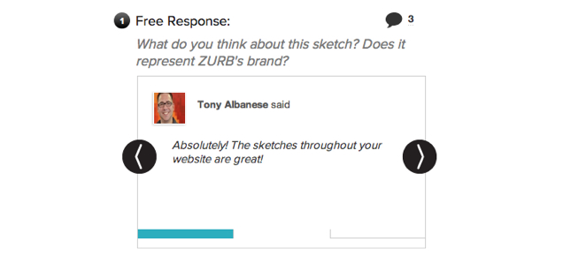
Recently, we used our Orbit plugin for Foundation to create a nifty visual slider so folks could simply scroll through the comments. We assumed most users would prefer this simple feature, which we tested out on our users. While the feature is visually appealing and a great way to collect data, our users found the upload a little troublesome. Immediately, we received feedback from our users who would prefer having a place they could easily see a list of comments, especially when receiving 30 or so responses.
 The comment slider in Influence.
It was only up for two days before we got feedback from a couple of demos. Not wasting any time, we quickly iterated on it. Had we not iterated shortly after we pushed out huge updates to Influence, we might have had a lot of frustrated users. But that feedback helped us realize an overarching problem with the orbit slider — we assumed our summary page was easy to use. But, instead, it caused an unnecessary amount of clicking.
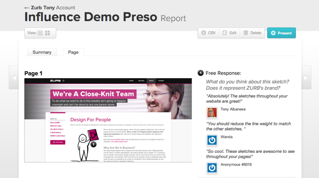
Sure the slider was a great way to visualize data, but it could be frustrating if you're just looking to analyze the data you collect. What was needed was to find a way to balance the reports summary so it didn't become cluttered and still made the feedback easily accessible to users. To cut the difference, we created individual page reports. That way we were able to have it both ways.
 The individual page report with the comments on the side.
In other words, we had overgeneralized the problem and ended up making things much more complex. What Influence users really needed was layered complexity.
Layer it Like a Cake
What the feedback was telling us was that we could keep the simplicity of the slider, but there needed to be a place where users could go to get more depth. Hence, the individual page reports. In other words, we had to layer the complexity like a cake, something we'd done before with our other app Notable and its pricing tiers.
With Notable, we layered in complexity with tiered features. Just one month after we launched the new pricing model, we saw a 22% increase in our customer lifetime value.
When it comes to building a product, simple isn't always the end-all-be-all. Sure it may seem that users would want a product to become more and more simple. But don't assume that's what they are looking for. And you may also find that the more you try to make things too simple, you are in turn making it more complicated.


