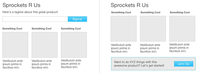
Every time we give our Design Drives Action talk, we ask the following question:
If you remove the sign up button from the homepage on the following site, will signups increase or decrease?

The site in question is one of our clients actually. It's funny to see how often people get the question wrong. Most people look at the two screenshots above and assume that signups will decrease since visitors won't be able to find the sign up button on the homepage. The reality is that signups increased 350% after our client removed the sign up call to action from the top of the homepage.
Joshua Porter recently wrote a great post where he describes a similar phenomenon — they added a three bullet description of their product with a giant red sign up button and had no relevant uptick in conversion. Why is that?
Why Bury Your Sign Up Button
In our client's case, its content got users invested. People were much more likely to sign up only after they clicked on "Something Cool" and were able to engage with the site and see how it worked. Joshua Porter also found that his customers needed better content to get invested in his product:
So in hindsight the answer is obvious'people weren't clicking 'Sign Up' because they were not ready to. They saw the button and did not care enough to click it. I could have made it flashing big-ass and red, but still nobody would have clicked on it.
The hard fact is that they just don't care. Or more precisely, they don't care yet. They're interested, but they do not know enough to care. We have not given them enough of a reason to care. They are not ready to take that step.
The right answer is to remove the button altogether and replace it with something that people do want to click. Something they do want to do'the appropriate next step in their lifecycle as a customer.
Both of the examples above do a great job of illustrating how big calls to action alone are not enough to grab a viewer's attention. Content is what helps them understand your product a little better and to potentially take the next step. We wrote a great post a little while back where we thought through the mental model of the customer that is trying to engage with a product. It's important to think through these questions when designing your homepage.
Next time you're upset at the fact that your large sign up button isn't driving conversion, try to think of the questions that are going through your customer's mind while they're on your homepage and whether the content on the page does a great job of answering them.


