On Friday, Alina highlighted the importance of using visual design to help craft and tell a story well. Which brings to mind the age old question about the role of content in design. Over the years, there's been a call for content-driven design and the death of lorem ipsum. Sure, content should drive design and it's better to use actually copy rather than dummy text, but is it necessary to have all your content written before you design?
Think of it this way. You might be left with a designer with idle hands — or worse, designing in the dark waiting for copy. Or you might end up with copy that's either too long or too short to fit the space the designer allocated for it.
Design and writing don't have to be siloed efforts. They don't have to happen exclusively of one another. In fact, designers and writers should strive to work together, hand-in-hand, to achieve a result.
Designers and writers worked closely together during our recent ZURBwired event, where we helped the nonprofit Family Giving Tree redesign their website and come up with several print materials for their "One Millionth Child" campaign. This year, we had tight deadlines to get the print materials completed.
Seeing if the Content Will Fit
Under a 24-hour time constraint, we really didn't have time to silo our efforts. The content team of writers had to work in tandem with the visual design team to meet the deadline. The brochure, Thank You cards and invitations had to be in no later than 4 PM. We had some breathing room for the posters and stickers, which had to be the printers by 5 PM. The visual design team got to work sketching out the earliest designs for those elements while the content team hashed out content, such as taglines and mission statements.
While our efforts began separately, we quickly came together to see whether our ideas would work harmoniously together. We soon realized that we were both going in the same direction, highlighting the fact that Family Giving Tree was going to celebrate the millionth child they've helped.
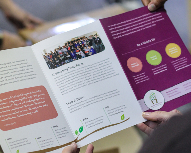
We based the brochure on their previous brochure, but made the language more playful and brought the tree metaphor to the forefront. The visual design also highlighted the tree metaphor by having an actual tree branch run along the bottom, showcasing a timeline of Family Giving Tree's history. However, we didn't wait for the final copy for the brochure. The designers worked from an early draft of the copy so they could layout the pages. Not only did this cut down on the time spent designing the brochure, it also gave the designers a better sense of how the content would actually fit within the design.
 The final brochure.
Working hand-in-hand also allowed us to meet our tight deadlines for the print material.
Seeing Where the Content Will Go
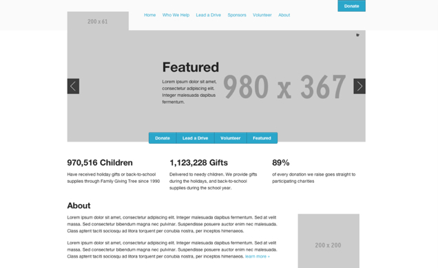
The writing doesn't necessarily have to dictate the design. A writer can also work with the designers to see how the copy can best fit what's being designed. Which is what we did when we worked on redesigning Family Giving Tree's website. The content team looked at the early sketches and wireframes of all the pages to get a better sense of what needed to be written and how long. It also helped the content team write more concise copy.
 Early scaffolding for the homepage, which helped the writers visualize what they were writing.
Once the design was being coded up, the design team consulted with the content team to better hone the message and story of Family Giving Tree. You can view the final website with the final copy here.
A Parting Thought
Sometimes using lorem ipsum is unavoidable, but design is much richer when there is actual content to work from. Knowing the content allows the design not only to be richer, but better communicate a story. It's the difference between pixel pushing and great design. More than that, writers can also learn how to write better, more concise copy that fits within a design by working with a designer. And that's the difference between writing filler and writing content that matters.


