You can tell a lot about the health of a business from its footer. Sounds crazy? But it isn't. Our footer has and continues to evolve along with our business.
Think about it. Your footer is the last stop on your page, where you can snare the attention of visitors before they bounce somewhere else. What goes into it says a lot about how you want to connect with your viewers, or how you want them to connect with you. And as you grow and change, so must your footer. Here's how we've changed our footer over the years to meet the needs of our evolving business.
Reflecting Changes
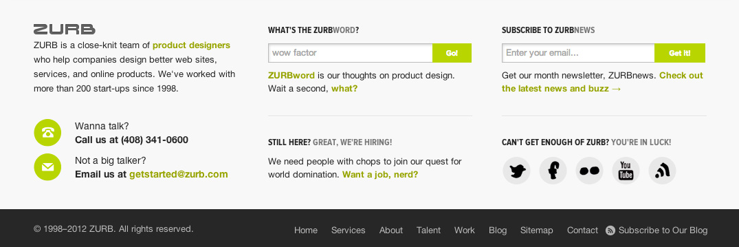
Our footer didn't change too much from 2008 to 2012. We were in a good place and we felt comfortable about who we were at the time. Check out our footer from 2008:

It's very basic. We emphasized our contact information: phone, email and signup for the newsletter. At the time, we were focused on perfecting our design process, and this footer was all about brining in business. But we were also poised to expand our reach.
We charted a course into product in 2009 with Notable, our first app. It was early days and we were going through the expected growing pains of launching a first product. However, our longevity helping other companies and startups put us in a good place to overcome them.
Evolution came as we launched other products, such as Solidify and Verify. We were now putting together a product suite. Our footer had to reflect that, because we weren't just trying to validate our product — we were really putting an emphasis on marketing them. Below is a footer from Notable where we first talked about a suite of apps:

Telling A Story
Footers must also match your business goals. Early 2012, we relaunched ZURB.com with a brand new look and a splashy footer. Content-wise it was mostly the same — still largely geared toward generating leads for our services — but with more emphasis on personality. After the success of proving ourselves with our own products, we wanted the world to know what it was like to work with us.

But by that time we were so much more than that. Foundation was gaining speed as were the improvements to our product suite. Our educational and training channel, Expo, was growing with new materials. We thought about our ever-growing property tally and our future. How was this all tying together? What was the story being told?
Tying It All Together
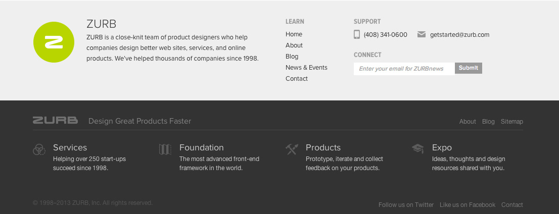
We spent many months last year figuring out who we've grown to be and how we can clearly tell the story that had emerged. Here's what we came up with:

We've pared down the top of the footer to the essentials about the properties and the most vital links. Plus a means to get help. It really covers the gamut of what users need without being too verbose, too heavy footed. The bottom is devoted to ZURB, who we are as a whole, and lets visitors into the rest of our awesomeness. And it's something you'll start seeing live on the site really soon.
With our snazzy new footer, we've developed a pattern that tells our story and works across our property spectrum. We've come a long way and we're doing big things. We were taking a stand, marking the four pillars of ZURB: Services, Foundation, Products and Expo.
Footloose and Fancy Free
A footer says a lot about your business. It says much more than the health of your company. It says who you are. And it must evolve as you do.


