While music and design are typically thought of as inherently connected, typography and food are not. It's easy to see that music and design are both forms of calculated expression, but what about food? or typography? Aren't these calculated forms of expression as well? Neither of these analogies are perfect, but I still thought it would be fun to riff off of Dave's post about music and design to find a correlation between our favorite foods and typefaces.
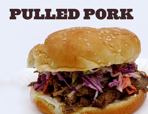
Pulled Pork & Ziggurat
Most of us can remember a time when we've had amazing pulled pork that tantilized our taste buds. Ziggurat in all caps felt like the perfect match for a messy pulled pork sandwich. The round, boldly shaped letters have a porcine quality that match the intense porky flavor of some slow cooked pig shoulder.
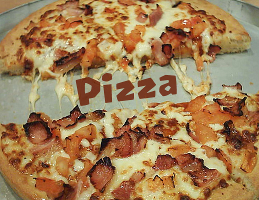
Pizza & Oetztype
Growing up, the amount of pizza consumed for classroom events was ridiculous. Any exuse the teachers had, they'd order a pizza. Oetztype fits well with pizza because of its handmade features. The haphazard angles and bold lines are like the toppings on a pizza; thrown-on chunks of goodness that add to the overall flavor.
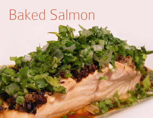
Baked Salmon & Colaborate Thin
Salmon is a hard fish to cook right. Most people char it to oblivion, leaving a dry, hard to swallow plank of fish-wood. When cooked right salmon is moist and flakey, almost melting in your mouth. Colaborate Thin pairs well with properly cooked salmon because of its thin strokes. The airy quality of each character lends itself to the delicate flavors of baked salmon.
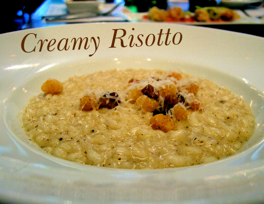
Creamy Risotto & New Baskerville BT
Risotto is rice simmered on low heat, which causes starch to thicken the stock and become creamy excellence. New Baskerville BT is created from soft, smooth lines that incite feelings of warmth and comfort. This fits wondefully with the full, rich flavor of risotto. The varied thickness of each line adds to the overall effect by inspiring thoughts of melting cheese.
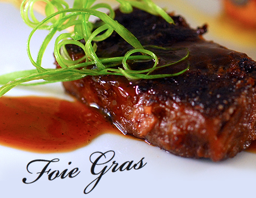
Foie Gras & Bickham Script Pro
Those who have eaten foie gras regard it as one of the best foods in the world. The fanciness that foie gras tends to be associated with fits well next to Bickham Script Pro. This specimin of script typography has letters with varying width and elegant curves. The rich flavor of seared foie gras belongs in a quality restaurant, just as the grandeur of Bickham lives on a prestigious event invitation.
We had fun trying to find foods that match the qualities of each typeface. Its great to stretch our imagination and create new association between uncommon things; it helps us learn to find unique ideas in any situation. Let us know what typeface goes with your favorite food in the comments below.


