The buyer journey is not a straight path.
People do not buy things by following a process, and nobody walks around with a five-step buying model in their head. More often than not, someone gets an itch to make that purchase, pokes around, compares a few things, buys one, and figures out how they feel about it later.
But here’s the deal.
Messy behavior gives a team nothing to point at. Breaking a purchase into stages does.
Splitting the consumer decision-making process into five steps is a way to make that problem smaller. It is built for the team more than the buyer, and it gives us something to orient around when the thing we are supporting is not linear.
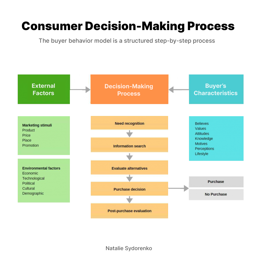
Those stages are:
- Need recognition
- Information search
- Evaluating alternatives
- The purchase itself
- What happens after
Once a team can define the stage they think the visitor is in, the back and forth gets more productive. You end up with a defined problem to go tackle instead of two opinions in a room with no direction.
Here's what we can take away from each stage, based on our experience testing and learning in every one of them.
Thinking in Commerce Steps
We do a lot of ecommerce work, most of it data informed with UX metrics. The same thing comes up on almost every project, usually before anyone opens the analytics.
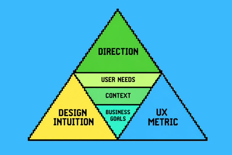
Companies often rely on intuition to understand the needs of their buyers. They are working off hunches, and in many cases those hunches can be grounded in patterns someone has seen. Someone on the team has spent years close to the customer and built real instinct for it. That founder instinct holds while the offering is small, especially when the founder is making most of the decisions. One product line and one story to tell fits inside a single person's head.
As the catalog expands, that typically stops scaling.
Teams move into a production mindset, spread across more groups, pushing things out. A product line manager can no longer see how buyer intent connects across everything they own. There are almost no leading indicators to check against, so you lose track of how it all comes together. The guessing continues at a size where being wrong costs a great deal more.
A framework gives the team something to work toward. It also makes the problems smaller to evaluate, and gives room for feedback to come in.
Most of the arguments we see about product pages come down to what the user actually needs from the product. Naming the stage answers that. It tells you what the visitor is trying to accomplish, which tells you what the page has to do.
Two things change how you evaluate the effectiveness of your offering.
The Decision Starts Before Your Site Loads
The hardest problem in ecommerce right now is driving intent. Customers are not searching the way they used to, so teams are trying to figure out how to get traffic to their pages at all.
People are running their comparisons in ChatGPT and other AI tools before they ever land on a page. Google has folded AI into longtail search, and a lot of those search terms are getting absorbed into questions people ask an assistant. I do it myself. I will type a long question into the address bar because it is easier than opening ChatGPT.
So visitors arrive having already formed an opinion about your product. Whether the information behind that opinion is correct or not, it is shaping how they buy from here. They are coming in with partial answers from a conversation that happened somewhere else.
Two practical consequences:
- Your page has to answer specific questions. The general ones got handled before anyone got to you.
- Your content has to be legible to the system doing the summarizing. Clarity is what gets a customer to come over to your site in the first place.
What we see in testing: Participants regularly describe a product in terms nobody at the company wrote. Those words came out of a summary that compartmentalized the information you provided. Your brand value is getting compressed somewhere else, and your pages now have to bring clarity back to it.
An Interface Alone Will Not Move Buying Behavior
When we do UI work, people often expect the interface to do the heavy lifting. What the interface actually does is clarify a decision the customer already wants to make. You can add desirability to a page. You can make it feel good. Put roadblocks in front of someone and none of that matters. This is where we see a lot of paper cuts.
If the price is wrong, or the economy is tight, or a competitor already owns the category in someone's head, a better hero image will not fix it. Optimize the page, and know what the page can carry.
Here is what is pressing on the buyer before they reach you.
- Marketing stimuli. Product, price, place, promotion. People have built bigger models with more Ps, but these four still cover the ground. They set expectations before the page loads.
- Environmental factors. Economic conditions and purchasing power. If the economy is bad, people are not buying in droves. They get more specific about what they are willing to buy. Technology and what it surfaces. Political factors, including which sites can even be reached in a given country. Cultural norms. Demographics.
You do not have to answer all of this. The job is to create clarity in the purchase and to think about how your information gets used outside your site. You are filling in the missing pieces for someone moving through a category, whether that is shoes or anything else, and closing the gaps on why your brand is the better product.
Buyer Behavior Sits On a Grid
This is the part that ends arguments. Teams fight about how much content a product page needs. The fight is really about buyer involvement, and the grid settles it.
- Complex. High involvement, big differences between options. Buying a car. Buying a wedding set. A lot of research happens before anyone talks to you.
- Dissonance-reducing. High involvement, few real differences. Buying a dishwasher. The buyer worries about making the wrong call more than they compare features.
- Habitual. Low involvement, few differences. Toothpaste.
- Variety-seeking. Low involvement, real differences. Snacks.
A complex purchase needs comparison, specs, and proof. A habitual purchase needs speed and availability. Naming the quadrant turns a content debate into an evidence question.
1. Need Recognition
Needs are vague, because customers do not always know exactly what they are looking for.
Someone thinks "I need a cute pair of pants."
They are not thinking "I need acid wash jeans in a 32 inseam for $59."
That level of specificity comes out of an evaluation process, and very few people run one. In our findings, fewer than 20% of people approach a purchase that analytically. Most people want to be sold to in some way, or they want to try the thing. They are not working through a spec sheet in their heads.
You still need the specific version on the page. Just know you can over-index on it. The exception is a highly technical product where the requirements are the product. Then the detail is the reason someone is there.
Triggers come from two directions.
- Internal ones come from the person. Hunger. Worn out shoes. A phone that stopped holding a charge.
- External ones come from outside. A billboard. An ad. A friend who will not stop talking about a restaurant.
Marketing creates exposure to a solution someone did not know existed. It also fails here more than anywhere else. When the message is not aligned to an internal trigger, you are paying to convince someone that a value exists. That is a much harder job than meeting a need someone already feels.
How Much The Buyer is Carrying
Once someone recognizes a need, the next thing shaping their behavior is what the purchase costs them, in money and in consequence. Buyer behavior sorts into four types on that basis.
- Complex. High involvement, big differences between options. Buying a car. Buying a wedding set. A lot of research happens before anyone talks to you.
- Dissonance-reducing. High involvement, few real differences. Buying a dishwasher. The buyer worries about making the wrong call more than they compare features.
- Habitual. Low involvement, few differences. Toothpaste.
- Variety-seeking. Low involvement, real differences. Snacks.
Teams fight about how much content a product page needs. That fight is really about buyer involvement. A complex purchase needs comparison, specs, and proof. A habitual purchase needs speed and availability. Naming the quadrant turns a content debate into an evidence question.
What we see in testing: Quick surveys will not always identify a need cleanly. More often they tell you whether an existing need is being met on the page, which is still directional and still enough to act on.
Helio Example: Banko
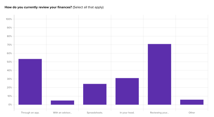
We ran a needfinding survey with 200 US banking consumers for a theoretical platform called Banko. The goal was to understand what people are doing with their finances now and where the gaps are.
The responses showed people approaching their finances in noticeably different ways, which pushed the team away from a one-size-fits-all product story before a single screen was designed.
Things to test:
- Which behaviors people currently use to solve the problem, before any product is shown
- Whether the need shows up general or specific in their own words, using an open question before any list
- What gaps exist in their current workaround, which tells you what the page has to displace
- Whether your positioning statement maps to an internal trigger or asks them to accept a new value
- Which trigger got them here, internal or external, since that changes the first thing the page should say
Measuring with UX Metrics
The metric that matters most in needfinding is usefulness. People are looking for something that solves a problem in front of them.
You could call this jobs to be done. I am careful with that framing, because most people have not fully worked out what their job is. They have a general idea of the activity they are trying to complete. Someone shopping for pants is solving a job in the loosest sense, and there is a stylistic pull sitting next to it. They have an impression they want to create. There is a brand vibe they are after. Calling that a job gets overly specific. Usefulness covers more of it.
Comprehension is the second one. Can people understand what you have put in front of them, and does it actually help them make a purchase.
Bounce rate on entry pages is the slower version of the same read. High bounce usually means the page is not meeting the need, because someone did not find anything important on it.
This is the earliest point where a signal exists. A signal is a behavioral read that gives direction to a design decision. Watching how people react to something is the fastest way to understand what comes next. A lot of teams move past this and go straight to traffic and analytics. That data takes a while to arrive, and they lose the chance to clarify anything up front.
2. Information search
Most people prefer a comfortable experience over a new one.
Internal search runs first, and internal search is memory. Past experiences carry enormous weight because people gravitate toward what they already know. This is the real reason switching is hard. The known option requires no evaluation. Recommendation from a person or a system someone trusts is the most reliable way past it.
External search is where the last two years changed everything.
- AI tools. People hand off to AI when they need specifics. Search engines are still a starting point, and increasingly the handoff point.
- Friends, family, and colleagues. Still the highest-trust source.
- Reviews and ratings. Yelp and Amazon have twenty years of accumulated trust behind them.
- Social. Instagram, Facebook, and X are now vertically aligned around interests more than around social connection. That changes what a channel is worth to you. You are buying access to an interest graph.
- Commercial sources. Ads and brochures still work, but sites have to be more specific about the information they provide, because the general version is already handled.
Helio example: SkinSavvy Action Maps
For a skincare brand we tested where consumers actually go across a website, mobile app, and social channels. The team needed to know which platform to treat as the testing ground for patterns that would flow into the others.
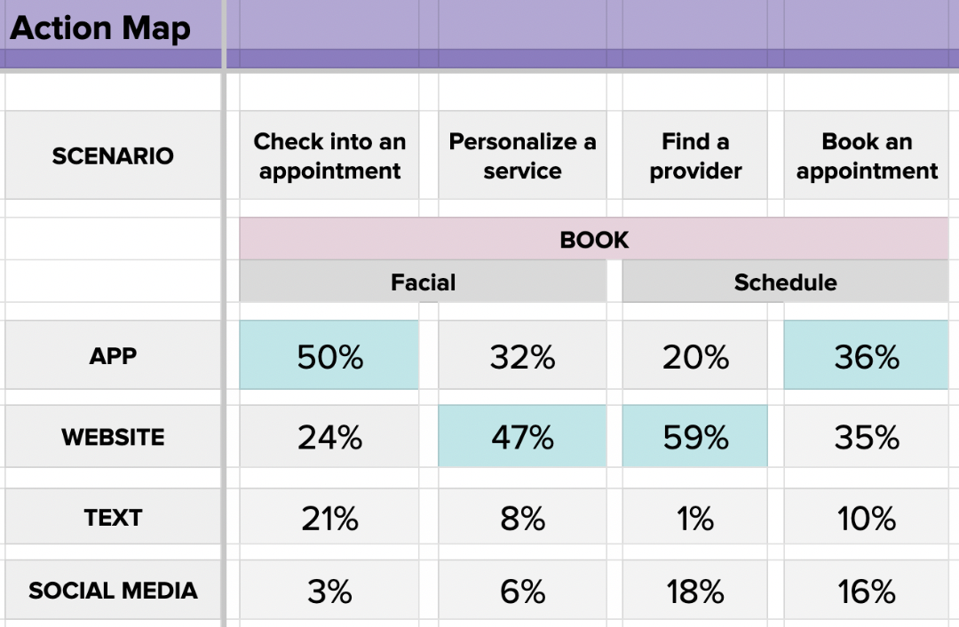
The method is a two-part approach. First we ask open questions about what people might do in a scenario. Then we stack the most common answers into a list and ask what they are most likely to do next. That gives a percent likelihood for each channel at each step.
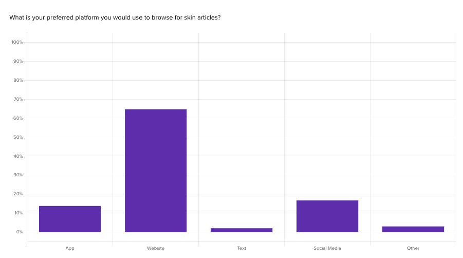
Across booking and appointment scenarios, the website came out on top, with an average of 41% of consumers choosing it. The app was close behind.
What we see in testing Is an Action Map perfect? No. It gives you a starting place and a quick read on how people are thinking about a problem, which is usually enough to make the next decision.
Things to test:
- Which channel people choose for each key scenario, using an Action Map
- What they already believe about your product before seeing your page, which surfaces the AI-formed opinion
- Which source they name as most trusted for this category
- Whether a first-time visitor and a returning one describe the product the same way
- What question they would ask an AI tool about this purchase, in their words
Measuring with UX Metrics
Trust is the attitudinal read at this stage. Which source carries weight in your category, and does your own content register as one of them.
The behavioral metric is intent, meaning which action someone takes next in a specific scenario. That is exactly what an Action Map captures, and the 41% website preference we found for SkinSavvy is an intent number you can run again next quarter and compare.
Pages per session and click-back rate fill in the performance picture. Both tell you whether someone found what they came for or kept hunting.
3. Evaluation of Alternatives
The top item on the cons list outweighs the entire pros list.
That is the most useful thing we know about this stage. Almost nobody builds a decision matrix. People carry a rough pros and cons list in their heads, and aversion is a stronger force than attraction. If you know the single objection that stops people, you have found the highest-leverage element on the page.
Three forces bend the evaluation.
- Psychological. Preferences, biases, perceptions. We see these constantly in Helio responses. People carry aversions into a comparison and rarely explain them.
- Social. Recommendations and visible use by others.
- Situational. Urgency. Most people do not have time to evaluate every option properly.
That last one is an opportunity. Become the sorter and the filter for someone and they build trust with you faster. Doing the comparison work for a buyer reads as a service.
There is a limit to how hard you can push. When a company oversells a single idea, consumers push back. They are looking for something that feels unbiased, and they know a brand page will not give them that. What works instead is being clear about what makes the product different and letting people judge. Testimonials still matter, and they matter far more sitting next to the specific decision someone is making. A general five-star quote at the bottom of the page does almost nothing.
Helio example: CRM Competitive Review
We ran a comparative analysis across five CRM providers: HubSpot, Zoho, Zendesk, Salesforce, and Monday.com. Five independent tests, roughly 100 participants each, focused on motivation, ability, and clarity of prompts.
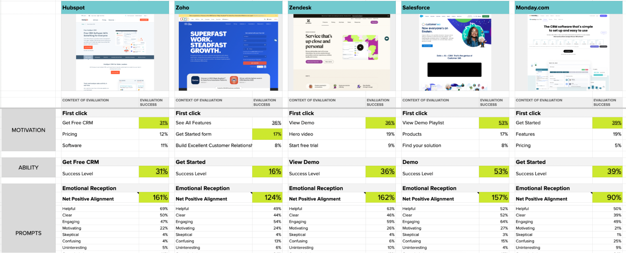
HubSpot produced the highest satisfaction and landing page engagement. Monday.com's use of white space confused participants and produced the lowest impressions of the group.
What we see in testing: Comparative testing is the fastest way we know to help a customer get a read on their pages. People usually make a definitive call right away once they see the spread.
View the Competitive Review Case Study
Things to test:
- The single biggest hesitation, asked as an open question, then stacked and ranked
- Your page against three competitors on motivation, ability, and clarity
- Which differentiator people can recall unprompted after viewing the page
- Whether the comparison content reads as helpful or as overselling
- Which testimonial performs next to the actual decision point, tested against a generic one
- First click on the page, to see whether people go to proof or to price
Measuring with UX Metrics
Brand score and desirability are worth capturing here, and only in comparison. A single score on your own page means very little. The spread across four or five competitors is what settles an internal argument, which is what the CRM study produced when HubSpot came out ahead and Monday.com came out last.
Comprehension shows up again, this time pointed at your differentiator. Can people repeat back what makes you different after they leave the page. Exit rate on comparison pages is the lagging version of the same question.
4. Purchase Decision
Credibility is risk management. On a large purchase, part of what a buyer is managing is the fear of making a bad decision and being stuck with it afterward. Anything that reduces that fear moves the sale, which is why trust signals often outperform feature lists at this stage.
Discounts, promotions, and offers still push on the decision. So does emotion. There is a rational layer solving a problem, and underneath it there is affinity for a brand and the social pressure around the choice.
Product pages carry the load here. Amazon puts an enormous amount of effort into product content for a reason.
The common barriers are price, risk aversion, and missing information. It used to be that you left those trade-offs to the buyer. AI tools have made it possible to shape the options for people, which means you can frame the trade-offs around your actual strengths instead of hoping the buyer finds them.
On the follow-up side, personalized marketing, email, and loyalty programs work when they match real behavior. If someone buys once a year, marketing to them weekly is not useful to anyone.
Helio example: SkinSavvy price elasticity
We tested six combinations of pricing and treatment options, presenting one price point each to a different group of beauty consumers, with four questions per test covering satisfaction and purchase likelihood for both the package and an added option.
The lowest price points produced the highest satisfaction, which was expected. The result worth sitting with was at the top of the range. The highest-priced treatment had the lowest satisfaction and one of the highest likelihoods of adding an extra option.
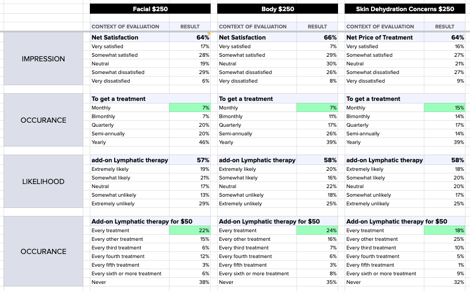
One participant explained it plainly: "It doesn't happen often so I would make the most of it."
What we see in testing: Rarity changed the math. Satisfaction scores alone would have sent this team in the wrong direction.
Things to test:
- Price elasticity across separate groups, one price point each
- Satisfaction and purchase likelihood asked separately, since they can move in opposite directions
- Which risk reducer carries the most weight: guarantee, return policy, trial, or reviews
- What people expect to happen after they click the primary CTA
- Whether the offer framing lands as urgency or as pressure
- Which missing information stops them, asked as "what would you need to know before buying"
Measuring with UX Metrics
Trust and expectations carry the attitudinal load, because this stage is about managing risk. Intent to purchase is the behavioral number, and it is available long before you have conversion data. Abandonment rate is where you find out the risk won.
Ask satisfaction and intent as separate questions. They can move in opposite directions, and the gap is the finding. In the SkinSavvy price testing, the highest-priced treatment produced the lowest satisfaction and one of the highest likelihoods of adding an extra option. A satisfaction score alone would have sent that team the wrong way.
5. Post-Purchase Evaluation
Go through the experience yourself before you scale a survey. The experiential points give you the frame for reading everything that comes back later. You know what the numbers are describing.
Feedback, reviews, and direct conversation all work after the fact. Thank you notes, requests for feedback, usage tips, loyalty programs, and responsive support build on it. Guarantees, clear pricing, and return policies belong up front rather than after the fact. In our custom product work, return policy is a real driver, because customization introduces variability and buyers know it.
Speed matters here more than it used to. With AI in the loop you can collect post-purchase feedback, test against it, and refine the thinking much faster than the old survey cycle allowed. A short follow-up survey is often enough to keep an MVP moving.
Helio example: SkinSavvy Secret Shopping
We dogfooded this one. SkinSavvy did a limited app launch to providers already carrying their products. We sent five advocates in as secret shoppers to book appointments, complete treatments, and observe how providers and customers actually used the app.
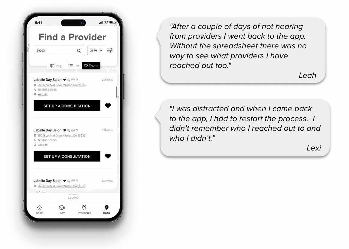
After reaching out to 30 beauty providers through the app, the hard number was the insight: only 25% responded at all. Interviews turned up a second problem. Four out of five providers handled loyalty discounts outside the platform after treatment.
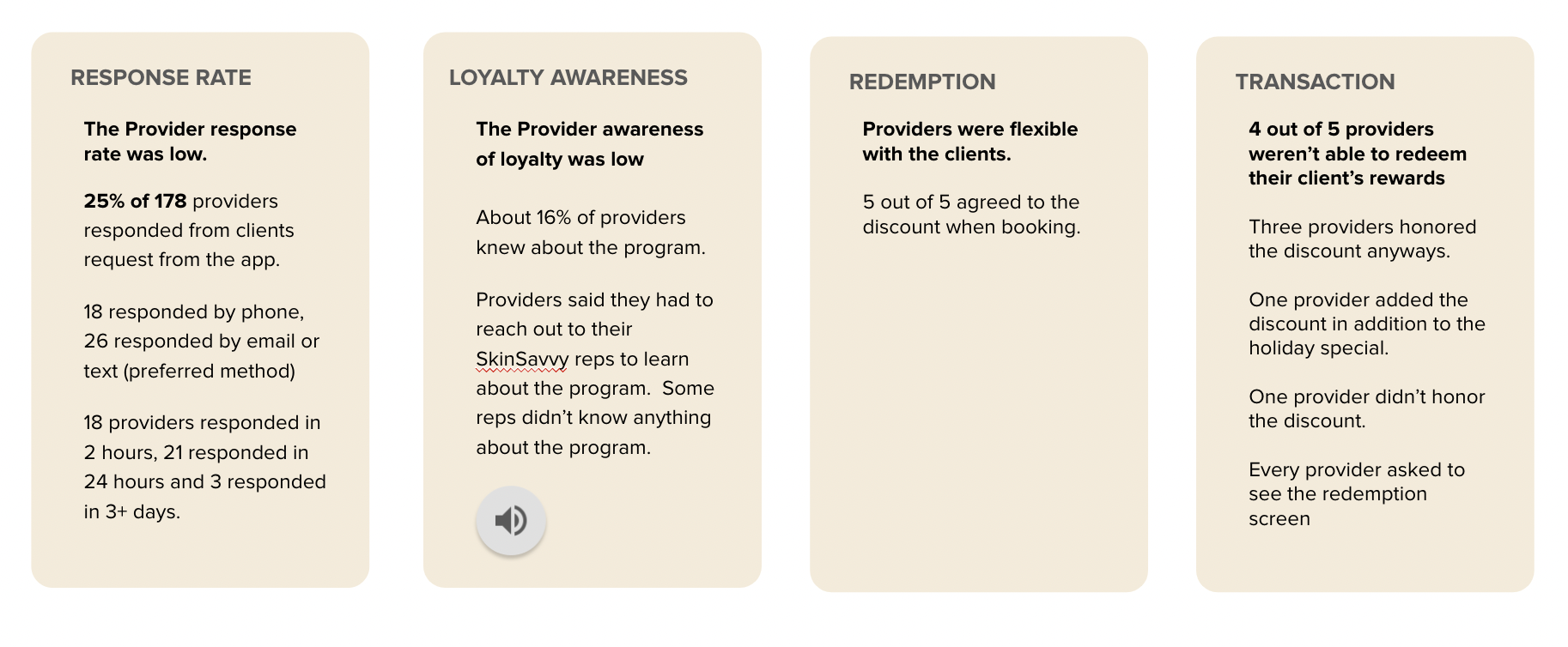
What we see in testing: Neither finding would have surfaced in a satisfaction survey. Somebody had to book the appointment.
Things to test:
- Whether the product matched what they expected at purchase, asked as a direct gap question
- Where the experience broke, found by going through it yourself first
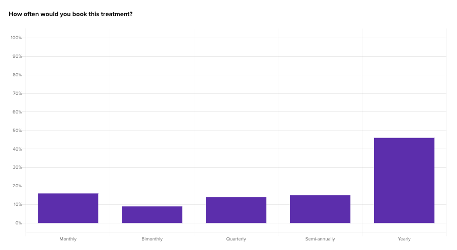
- Which follow-up communication people want and at what interval, matched to actual purchase frequency
- Whether they would recommend it and to whom specifically, which is more useful than a score
- What they did outside your platform to complete the job, since workarounds reveal the real gaps
- Whether the return or support experience changed their view of the brand
Measuring with UX Metrics
Satisfaction and loyalty tell you whether the product matched what the buyer thought they were getting.
Frequency tells you whether they came back and how often, which is the number that should shape your follow-up cadence. Retention and repeat purchase rate confirm whether the relationship held.
These are lagging indicators. They only mean something next to the leading ones from the first stage. That pairing is the whole point. Predictive signal at need recognition, proxy testing through the middle, analytics at the end, and the analytics feed the next predictive test.
Buyer Characteristics, and How Much to Use
Demographics are labels, not drivers.
Beliefs, values, attitudes, knowledge, motives, perceptions, lifestyle. These attributes show up in every version of this model, and they explain why a group behaves a certain way rather than causing the behavior. The labels are also getting less reliable. TikTok started with Gen Z early adopters and is now broad enough that the demographic signal is thin.
You can overanalyze this. Segmenting on all of these at once requires an audience larger than most teams will ever have. Pick one or two behavioral attributes as a starting place and you will learn most of what you need.
In the Banko work, filtering by income surfaced that participants earning over $100k are much more likely to use an app to track finances right now. One filter, one clear direction to pull on.
So which behavior do you segment on? The gaps in your own numbers will tell you. Three patterns show up often enough to watch for.
- High satisfaction with low completion. People like the idea and cannot finish. The problem is in the flow, not the offer.
- High completion with low satisfaction. People are grinding through. They will finish once and leave, which makes this a churn warning rather than a success metric.
- The system works and nobody cares. Usually a need problem, which sends you back to the first stage.
Each of these points at a specific behavior, and that behavior is the one worth segmenting on. A mismatch is more useful than a clean result, because it names the thing to go look at.
Start broad. Segment on behavior once you know which behavior matters.
Where This Leaves You
A lot goes into a commerce page. In our experience, breaking it down into a decision-making process with the consumer is how you learn quite a bit about what is actually happening on it.
Each stage asks a different question. Need recognition asks whether people know they have a problem. Information search asks whether you are present where they look. Evaluation asks what objection is stopping them. Purchase asks what risk they are managing. Post-purchase asks whether you told the truth.
You do not have to run all five.
Pick the stage where the guessing is loudest right now and test that one. One or two levers will teach you most of what you need, and you do not have to sit and grind out the whole model to get there.
In my experience, none of this is perfect.
It gives you a starting place, and a starting place is usually what the team is missing. The product line manager who could not see how buyer intent connects across the catalog now has one stage, one question, and one number to bring to the argument. That is enough to stop guessing on that piece.
Then go do the next one.