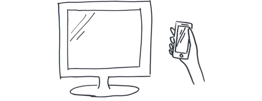
LukeW shared some the astonishing metrics outlining the growth of mobile and urging us to design for mobile first. If we omit designing for mobile, he says, we're missing 1 million people every day. The question still stands: Is the small screen the answer for all of our activities? Is the large screen becoming obsolete?
Andy Budd doesn't think so. He recently shared a number of tasks he favors the large screen for:
There are just certain things I don't enjoy doing on a small screen like booking a flight or filling in my taxes. Basically anything which requires lots of data being presented at the same time, complex navigational structures and multi-step processes. There are obviously ways of breaking this information down to satisfy fat fingers and a small screen size, but that makes it difficult to reconcile with a single URL pointing to a single resource or piece of data.
Budd points out a study in which researchers asked two groups of people to do a set of tasks. The only variation was the height of the room they performed these tasks in. The results stated that the rooms with high ceiling encourage more creative thinking while low ceilings encourages focus and concentration. Room height mattered in the same way screen size seems to matter in mobile design:
The same thing happens to me when I use devices with different form factors. The extra real estate of my desktop means that I'm more comfortable doing creative, expansive and exploratory activities. On my phone, I'm much more comfortable doing targeted, focused and linear tasks.
Bottom line is that screen size matters—some tasks are ideal for large, creative spaces like the desktop while others are better suited to small, focused mobile experience. We need to consider the use cases of our designs, and devise solutions that meet our users needs. It's hard work, but the payoff is huge.


