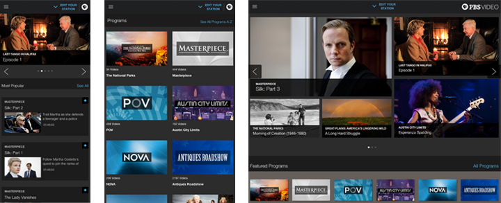
Just as people have grown up watching PBS, the nonprofit corporation dedicated to education has grown too. By 2012 the organization knew many users viewed their videos on mobile devices: tablets, smartphones, roku boxes, more. But their video site had not grown to fit these needs.
PBS used Foundation for the 'foundation' of not just their site, but of their education in responsive web design.
Designers Answer Unique Challenges with Customized Solutions
In early 2013 the team, lead by Matt McManus, Senior Product Manager of Audience Facing Products, began to study responsive design in earnest. They wanted to serve a wide range of platforms, screen sizes and device orientations: 320, 480, and 600 pixels at least. Analytics showed they would need to support many platforms as well, including iPhones, iPads, Kindles, and large Samsung phones.
They faced several challenges:
- Flash video didn't work on iOS.
- Their existing website was optimized for desktop sites.
On August 5, PBS relaunched their flagship video website with a new responsive design. Here's how they did it.
PBS uses a single, customized system to manage their content regardless of destination. They had also been adapting their years-long collection of videos to MP4 and HTTP Live Streaming formats, which they found ideal for storing and distributing responsive videos.
Designers Hone Both Their Skills and Their Framework
A central system and uniform formats would make management easier. But the team's real responsive challenge is serving content to many devices. So while the front-end designers looked to CSS frameworks like Foundation, they decided to build a framework tailor-made to their unique needs.
To invent that, the team learned mobile-first techniques from studying the Foundation 4 grid and media queries. In fact, early iterations of their video site used Foundation to quickly iterate through ideas by letting the team adjust different layouts across many devices with minimal code changes.
Although we ended up not moving forward with it due to the nature of our infrastructure, the fundamentals of the mobile-first Foundation framework strongly influenced how we built our own custom solution.
That influence had a positive impact, and by mid-2013 the new video.pbs.org was up and running. But the team wasn't done. Getting the site to work well was critical not just for its own sake, but because it would be a forerunner for future web projects.
Keeping an Open Mind on the Future of Video and the Web
Although they're happy with the way their site has turned out, Matt said this iteration is just one step in an ongoing process.
- They're continuing to refine Merlin, their CMS.
- They have thousands of hours of archived videos to upgrade from a variety of older formats.
- And like any creative designers, they're always watching for new technologies.
Inventing their own system was a lot of work. Was it worth the effort? Matt thinks so.
Based on the sheer volume of users we have, I believe that we are the first site to figure out how to provide a smooth and most importantly scalable video streaming experience across a wide range of devices and operating systems.
The future looks bright for designers as we move forward with Foundation 5, the next major release of our CSS framework. While version 4 adopted a mobile-first stance, version 5 will offer designers greater flexibility for creating products that fit a wider variety of devices.
We often see sites built with Foundation. But it's rare to see our CSS framework lead to new frameworks. It goes to show that Foundation is well named: a platform on which to build. PBS drew inspiration from its principles to develop their own products. We can't wait to see what they build next.


