Even more than websites, emails give you a chance to run all kinds of experiments. Every email you send is a chance to test out ideas and gather data. Earlier, Brandon wrote about the importance of transactional emails, and how Foundation for Emails 2 will enable you to more easily create rich, responsive layouts for those emails. But another great thing about transactional emails is that, because of their frequency and volume, they can provide you with a massive amount of data to play with, becoming an ideal playground for experiments.
Best practices can take you a long way, but every email is different, and without running experiments it is easy to end up doing a lot of work that doesn't actually move you in the right direction. As a product design company we care deeply about the qualitative experience we create, but we're also always looking for numbers to back up our decisions and show us that we're moving in the right direction.
Choosing a Target
As we've been working on Foundation for Emails 2, we've been realizing how many places we could improve upon our own use of transactional emails throughout the business. Email has come a long way, and with such a powerful tool now in our toolbox, the problem becomes less about 'how do we improve these' and 'what do we do first'? With two decades of history as a company, we have hundreds of different email templates we *could* attack, but as a small team with limited resources, we need to aggressively prioritize.
Once we started having these conversations, opportunities for improvement seemed to jump out at us. It almost seemed like some of our old systems started to misbehave just to try to get our attention - Our older version of Notable REALLY seems to want Peep from ConversionXL to join:
Hmm, Bryan from @ZURBnotable is inviting me to join again... still no info on context - which project, who sent etc... cc: @bryanzmijewski
' Peep Laja (@peeplaja) February 9, 2016
(Sorry Peep!)
However, to maximize our leverage and rate of learning, we decided to start in the places we send the most emails, and gradually work down into the less common emails. This led us to our Foundation Forum, where we've had over a million visitors in the last year and send thousands of emails a month.
We're doing this experiment out in the open, both to share our process and get your feedback so we can continue to improve. Today, we'll go through the changes we made, and next week we'll check back in with the results. Full disclosure: These changes went live today, so we don't actually know if the results will be positive. We think we're moving things in the right direction, but data is where the rubber hits the road.
What We're Optimizing
The emails we're working on optimizing this week are for our Foundation Forum. Every time someone replies to a post in a forum, a set of transactional emails are triggered to the author of the post, anyone else in the thread, or folks who have been @mentioned. This is a great opportunity to increase engagement - getting folks back to the forum helps us build community and keep the amazing project that is Foundation growing. We get pretty good click rates on these emails - ranging from 59% for a post owner getting notified to 24% for notifications about a post you follow - but looking at the email content we still see plenty of opportunity to improve. Let's see if making those improvements result in better click rates.
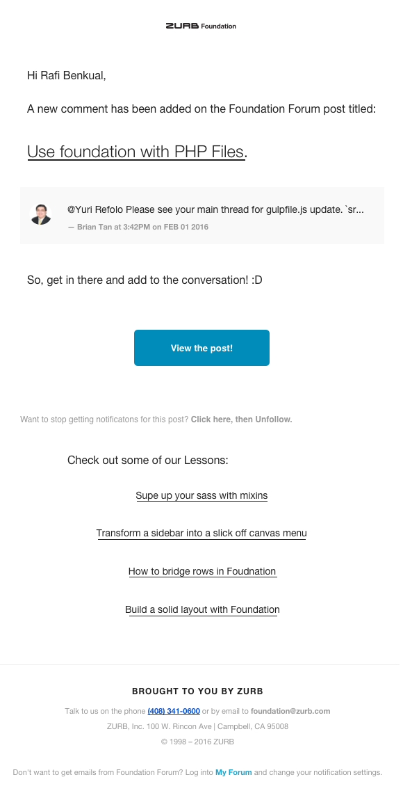
Before:
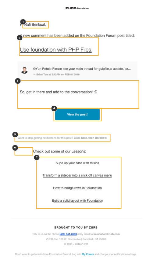
Our old emails get a pretty good click through, but had a lot of areas that we highlighted for improvement. Below is an image of what we used to send. As you can see, there's a lot of room for improvement, with weird layout issues and a lack of personalization. To figure out what to target, we threw a screenshot into a Notable Notebook and started marking it up, highlighting issues like impersonal feel and funky spacing.
Click on the image for an interactive view of all the items we highlighted to address:
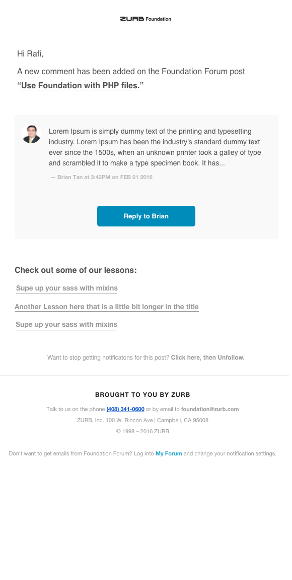
After:
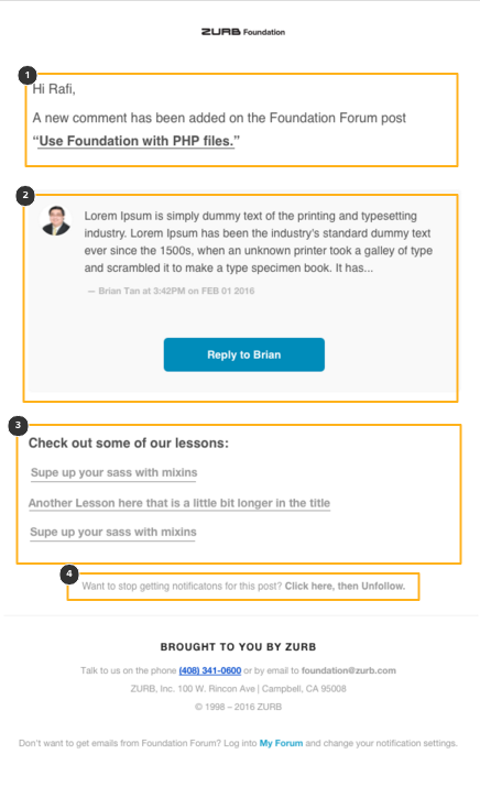
Post redesign, we have a much cleaner email format with much more personal feeling content. The call to action is more relevant, and the lesson content is now customized based on the topic of your post.
See the screenshot below and click on it for an in-depth dive on what we improved.
And the two side by side:


The Results?
With this rework, we have a cleaner, more personal email. But will it help? We think this will improve our click-through rates, but we won't know the results until we check in next week. What's your prediction? Will this improve our click-through rates? Why or why not? What have we missed?


