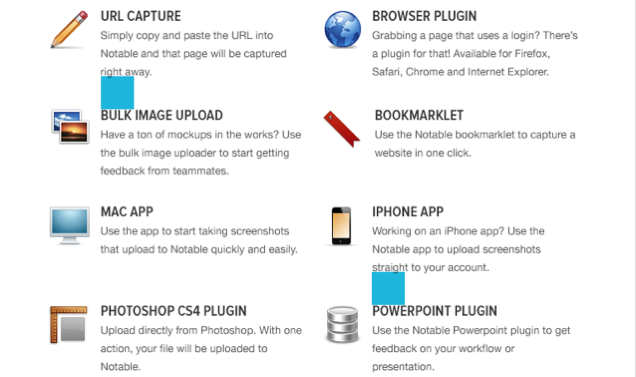
Spacing in visual design is crucial. Too much space and it looks like you could drive a truck between the text and pictures. Too little and it seems that everything is just smashed together haphazardly. But we have a little trick around the offices at ZURB that makes sure we get the spaces just right.
There are several tips and examples of why spacing is important. So how do you make sure everything is laid out on the page correctly? Anthony, one of our designers, usually fixes the spacing on visual designs by creating equally-sized blocks in Photoshop and placing them in the gutters, kinda like a Gauge block for visual design.
It's a trick our designers use. So we thought we'd take you through the trick to show you how to make sure everything is balanced.
A Quick And Dirty Way To Reduce Visual Noise
When laying out a visual design, the first thing we do is put in all the content — text, images, etc. — where we think they should go. However, things aren't quite finalized yet. This is quick and dirty, and things are unorganized and all over the place. So we have to start playing with the spacing, evening things out.
 A 40px block being used to check the spacing between text.
First, we space blocks of content out. Usually, we start with a bigger block, say a 40px block. We take that block and use that to even out space between one section and another. By having a number of equal-sized blocks, you just put them in all the gutters and can quickly see what the spacing is like.
 A 20px block near a 40px block.
We can then use multiples of that 40px block, halving it into a 20px. This lets us even out the spacing for places that need less space. However, we don't have to limit ourselves to just using multiples of a larger block. We can use different blocks, say a 15 px or a 30 px or whatever. But don't go crazy and start using a whole bunch of different blocks. If you do, you could find yourself with a very lopsided design.
Balanced Look and Feel
These blocks are extremely helpful in giving a design a balanced look and feel. Better still, it's a quick and dirty way that makes sure there's very little visual noise that becomes noticeable when the spacing doesn't feel right.
The trick has worked so well for us that Anthony thought it'd be pretty neat to have a similar feature in Spur. So now it's possible to grab a design, slam it into Spur and use blocks to check out the spacing.


