I tried to uphold as many national traditions as possible on Thanksgiving. I had fun with close family and did myself proud at the dinner table, but fell short on my hours of belt-loosened, armchair sports spectating. Even if I had managed to sidle up to the boob tube for a while, the fact remains that 99.9% of all sports are going to happen when I'm not watching. This is a sad but universal truth all sports fans have to face and we all address it the same way: we obsess over scoreboards.
There was plenty of football on Turkey Day (all blowouts with the Lions keeping their streak alive at 12 games), but I'm a bigger fan of the game with the least parity in sports: basketball. College had plenty to offer, including a Top 25 upset that saw the No. 4 ranked Michigan State Spartans pummeled on their home turf by the unranked Maryland Terrapins 80-63. The NBA featured two games with Dwight Howard's Magic toppling the lowly Wizards 105-90 and Chris Paul's Hornets traveling to Denver to knock off the Nuggets 105-101.
Here's a typical example of what these scoreboard game summaries look like courtesy of Yahoo.com. It doesn't stray far from the traditional quarter-by-quarter timeline formula:

Game summaries like this and their accompanying box scores are a sports journalism formula that have remained untouched for over 50 years in basketball and even longer in sports like baseball that date back to the turn of the last century. The internet delivers a few more statistics and instant gratification, but hasn't triggered much innovation in this basic storytelling formula. Does this just work and that's all there is to it? Or is there a little room for design innovation yet?
Designing an alternate approach:

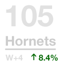
This is what I'd like to see when I glance at my sports page. It's more visual and tells a more complete story of the game if you spend a moment, but still gives you the basics at a glance.

This tells us about the game's winner, the Hornets. The solid blue areas show us the winner's margins minute-by-minute throughout the game. In this example we see the Hornets had big runs at the end of the second and fourth quarters. The total margin from those blue areas was enough for them to win the game by four points.

Here we see both team's margins overlaying each other.

The 8.4% and upward green arrow tell us that the Hornets played a better game than they usually do on the offensive end. Tying this to a statistic like John Hollinger's Offensive Efficiency--the average points a team scores per 100 possessions--would be a great start.
In this little example both teams had good games on the offensive end, but the Hornets both did better and are better to start with. In other games we could imagine seeing great teams having off nights and still beating red hot weaker opponents (as was the case when the Warriors lost to the defending champion Celtics the other night).

Finally we get the flavor of the game within the game. Possessions is our speedometer--fans love high paced games with a lot of action. Shooting is the combined shooting percentage of both teams--who wants to see a game where a bunch of high paid professional athletes can't put a ball in the hoop? Turnovers tells us how sloppy the game was--there's nothing better than a good, clean game. Together these stats can give us a good feel for what kind of game this was.
Sports isn't the only topic where we fixate on numbers in the news. For this little challenge I found inspiration in the recent political elections and stock market plunge that have both gripped the world's attention with an amazing variety of design solutions using numbers. These topics are very old journalism problems too, but unlike sports, there is a more lively effort to design the news better.
Could something like this catch on in sports? I think it's only a matter of time until somebody tries (or until ESPN hires ZURB).


