As more and more people flock to social networks, there's an emerging need for a platform that curates all of the content and empowers users to share important stories with one another.
One of the startups attempting to have a major impact on the space is Storify. Based in San Francisco's SOMA, Storify aims to curate the world's stories as told through social media. It's likely that you've seen a few of their stories embedded within key technology coverage on sites like Mashable.
We were beyond stoked when they launched their newest iteration on their design this morning (we got a brief sneak peek last week). The design was well-received by several technology writers. Designed with responsive in mind, we're also excited to see the service work really well across devices.
As with some other notable releases, we're excited to put these designs to the test. We ran a brief set of Verify tests on the new design — does it check out?
1. Does a user know where to go to find "Black Friday" stories?
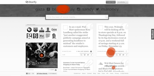
First, we wanted to test to see if users knew where to go to read stories on the topic of "Black Friday." Given this was one of the featured topics, we were mainly testing to see if a user would click on the topic or opt for the search bar.
Here are the results from our first test:

The response here was actually very clear. 17/20 (85%) selected the "Black Friday" featured topic. This leads us to believe that the featured stories — which CEO Burt Herman says will eventually become trending stories — have the ability to drive a significant amount of attention to specific parts of the site.
One of the most interesting parts of the new site is the prominence of the search bar in the top nav. It only goes to show that Storify probably wants to be a search-driven service, given the sheer amount of curated content the site amasses on a day-to-day basis.
2. Does a user know where to click to like or favorite a story?
One of the key features in Storify is a fairly simple social network action — liking something.
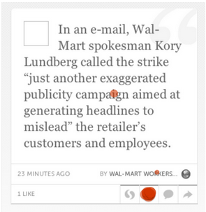
The new tile-focused design is certainly eye-catching, so we wanted to see if a user knew where to click to take action on one specific tile.
Here's the heatmap from this question.

We're happy to report that there was no confusion over this, either. 17/19 (89.5%) of testers selected the heart icon — the correct decision in this instance.
The bottom navigation of the tiles are fairly self-explanatory. The Storify icon allows a user to create a new story based off of the content, the heart button likes the content, the chat bubble icon allows a user to comment, and the arrow button has become a standard for a share.
3. Does a user know where to go to go to filter search results by Stories only?
Our final test examined whether a tester knew where to go to read Stories by search term.
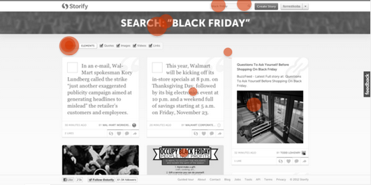
The clicks were slightly more scattered this time around, so let's dive into the heatmap and break it down:

Clicks on this heatmap were more sporadic than other tests, so let's break down the key areas where users clicked.
The good news: some users were able to identify and find the "Stories" filter underneath the top nav. But outside of a few users — the majority of others seemed fairly lost. Two users selected the top search bar, but this brings you back to the search page — seen here, and defaulted to Elements.
Six users selected either the top nav or a story, which was the incorrect selection.
This test exposes a potential hiccup in an otherwise great design. When "Stories" is selected, the nav collapses to only feature "Stories" and "Elements." However, when "Elements" is selected, the nav expands to allow a user to sort through specific types of elements they want to see.
The one potential issue with this is that with the extended nav, it may be harder for a user to find the "Stories" part to the search bar.
Conclusion
We're big fans of the Storify design, and despite some minor hiccups with the search page in our tests, we're excited to report that the redesign is very well-done. For a site with the impact that Storify has on a day-to-day basis, we're excited to see it take a big step forward from a design perspective.
Whether you're an active social media user or not, Storify's new site is definitely worth checking out. Even for the most passive user, there's bound to be a story or two that catches your eye.


