.jpg?1328730240)
At ZURB, we are huge proponents of being able to touch and feel a design, so that we can better understand how it works, and where the gaps are. Visual designs are great, but they are static and flat. It's very tough to get a feel for how people will interact with them.
Creating a clickable prototype is the next best thing to coding the product up, and for any interface with multiple screens, it's the only way to really see how it will work. People have been using paper prototypes for years to bring their interfaces to life without coding them up and to see how others would interact with them.
Creating a Clickable Prototype is a Pain
Ask any designer and they'll tell you that creating a clickable prototype is a royal pain in the ass. Coding a prototype in static code requires a pretty good amount of effort and hacking it in Keynote is also filled with gotchas and pitfalls. If you want to create a prototype early in the product development lifecycle, you need an easy way to create a clickable prototype from nothing more than a few images.
Gathering Feedback and Analytics on a Clickable Prototype is Even Tougher
Once you have your prototype, you run into the problem of getting feedback on it. User tests are awesome, but very time consuming. Sometimes you have a question on a focused feature or a click flow. You just want to know if it works or not. This is where quantitative data is useful. By collecting data on prototypes, you can send them to a larger audience and quickly see the overall trends.
When we were revamping our app Notable here at ZURB, we wanted to test if people would understand how to add a new team member to their account. All we had were new static wireframes we created and did not want to spend too much time creating a clickable prototype.
We created the following prototype test by uploading the static images and linking them up with hot spot click areas and giving the test takers a directive: try to add a team member to your account.
Try to add a team member with our prototype testRemember these are just static wireframes that we had at the time. The beauty of all this was that we did not have to write one line of code or mess around in Keynote to create this prototype. All we did was upload these screens and linked them up between each other.
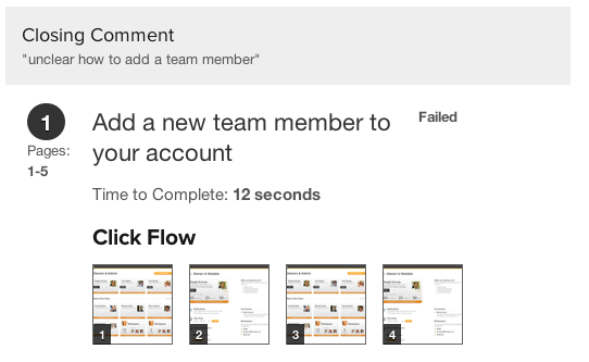
We distributed this test among our friends and team members and quickly got the feedback that only 67% of people who took this test were able to add a team member. It took them on average 3.3 clicks and 12.5 seconds!

We could also see the specific click flow each test taker took to add a new team member.

We immediately had data we can act on. We knew we had to do another pass on our wireframes and see if we can improve the process of adding a team member. We spent a total of 5 minutes creating the prototype and perhaps another 5 minutes asking people to take the prototype test.
Solidify and ZURBapps Product Design Suite
As you can probably tell by now, the app we used to create the clickable prototype we talked about above is a brand new one we are launching today! We're stoked to announce the private release of Solidify, the fourth app of ZURBapps product design suite, which lets you quickly create, test, and share prototype screens to get actionable feedback.
We will start letting people in to the Solidify private release starting today. If you register, we'll do our best to let you in. We are looking forward to hearing your feedback as you give Solidify a try.


